
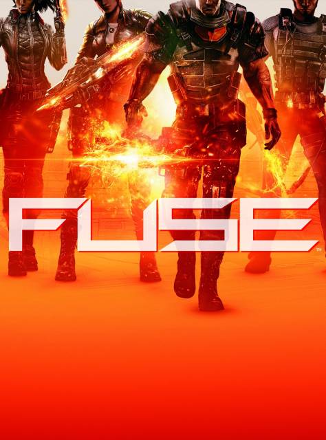
The box art was just revealed today. It looks to me like they messed up centering the image and just went with it. The NTSC logo is even covering that guy's face. Come on.
Game » consists of 7 releases. Released May 28, 2013

The box art was just revealed today. It looks to me like they messed up centering the image and just went with it. The NTSC logo is even covering that guy's face. Come on.

Yeah, the fuck? Who thought this looked good?
It's like when you give your grandma the camera and she cuts everyone's heads off.

THe name is kind of terrible also. Fuse, like the fruit drink?


@PlasmaBeam44: Needs more blue. You know, because all boxarts need to mix blue and orange in some sort of contrasting and visually-popping way.

I expect this to be on the list of EA partners games that sell shitty. I don't know what hell Insomniac was thinking because everything other than the initial Overstrike CG trailer has screamed mediocre. They are more talented than this.
@benspyda: Nice spoiler
I think that if they moved the image down so I could see their faces it would be better. Otherwise it looks like some typical boxart for what looks to be a typical shooter. (Especially since Insomniac is in on it, expectations were higher)
The position of the characters and the font are kinda meh but I don't really mind so much. But the orange glow, what the hell is going on here? You can't even tell what's in dudes hand cause it's covered in electric orange cyber goo. What is going on here?

Don't like it, liked the previous art style better.
I'd like to know whose bright idea it was to absolutely destroy any ounce of originality this game had. I just feel depressed every time I see it. Whoever thought "this game would sell better if it looked less cartoony" needs to compare Team Fortress 2 and Homefront. Or Borderlands and Medal of Honor.
I remember when this game was one of the games I anticipated the most...but it was called Overstrike then.
Man, things have just been going downhill (in my opinion) since they changed the aesthetics of this game. That orange explosion, I'm not even sure what it's supposed to be or where it's coming out of.

I feel like there's got to be some design choice behind their heads being cut off like that. Normally I'd say it has something to do with the faceless nature of war or something along those lines, but considering this game is supposed to be all about how distinct its characters are (or at least it was when it was Overstrike) it makes no fucking sense at all to me.

http://imgur.com/0Ghj8 Sticker placement like this on RE: 6 and Hitman Absolution is appalling.

Oh god that shit is horrible.http://imgur.com/0Ghj8 Sticker placement like this on RE: 6 and Hitman Absolution is appalling.

Looks like COD boxart times 4.

Sticker placement like this on Sleeping Dogs and Hitman Absolution as well as others is appalling. At least this box art isn't that bad. But something that's offset and printed to say the least, like such, is pretty bad :/

Yeah.
*sigh*
It's awful.
Yeah, I'm disappointed by the art especially since the design for Resistance 3 by Olly Moss was so innovative and stylish. This looks really generic, like it was designed by a focus group. This game has a GI Joe vibe to it and now they are starting to rip off the art direction from the lame movie remake.

They're too edgy to have eyes.

It is pretty terrible, and seems like more of a mistake rather than a design choice. It's sad, because that would look pretty neat if it wasn't cropped improperly.

Oh god that shit is horrible.http://imgur.com/0Ghj8 Sticker placement like this on RE: 6 and Hitman Absolution is appalling.
Ya I discovered that when I bought an Assassins Creed game there a few years back. Will never buy a game from there again.

I hope one day we get an interview from someone at Insomniac and find out what the fuck happened to Overstrike.
This game has just been downhill after that initial reveal.
Please Log In to post.
This edit will also create new pages on Giant Bomb for:
Beware, you are proposing to add brand new pages to the wiki along with your edits. Make sure this is what you intended. This will likely increase the time it takes for your changes to go live.Until you earn 1000 points all your submissions need to be vetted by other Giant Bomb users. This process takes no more than a few hours and we'll send you an email once approved.


Log in to comment