Brief Diablo 3 Note (Rashomon Edition)
By ahoodedfigure 5 Comments
Maybe others have talked about this before, but as I remember it, the "Diablo 3's too bright" controversy began when people complained in forums about a public showing of the graphics... a LONG time ago. It became a bit of a meme, I rolled my eyes and concentrated on stuff I was interested in, while secretly thinking that while, yes, it was bright, it was also pretty.
Anyway, apparently one of the people in charge of art direction at Blizzard stepped up and defended the game's design against these accusations. He was promptly fired, the PR folks said this wasn't how Blizzard acts, and I got the impression they'd listen to fan complaints and make it darker.
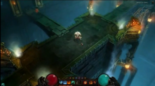
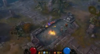
Seeing the beta now it does look darker than I remember those initial shots being, although those brighter shots may be in a different place altogether for all I know. (Three "all" words in one clause. Ding!) It seems, from my outsider's perspective, that they responded to the criticism and made things darker, but I can't tell for sure.
Cue the many running commentaries that say "pff, this doesn't light bright at all, those guys are idiots", showing that the memory of the meme outlasted the brief, controversy on the part of one of the design staff stepping up to defend his game and getting the axe for it.
If I don't remember how this all went down please help me with this timeline; I'm curious if my memory truly is this hazy or if there was a major change in direction at some point.
EDIT: Now that I've done some research, it's been suggested that this editor's departure was apparently unrelated.
It now seems like they've been saying it never was going to be changed... yet it does look different to me in its current form than it did back when those first screens came out so long ago. Here's another complaint from back in 2009 by someone who used to work at Blizzard, and in 2008 Leigh Alexander interviewed Jay Wilson about the art style.
I get the feeling it may be because what we see in the Beta may not reflect what we see later in the game, that it might look brighter or more colorful in spots depending upon the environment. It doesn't bother me a whole lot either way; I can't see myself purchasing this game any time soon anyway. I've only beaten Diablo 2 once (though I've started it plenty of times), and I tend to feel that it more tweaks my loot compulsions than delivers enough fun for time spent. I think most of the time I spend is stuffing my coffers full of gems, bee-lining it for the Horadric Cube, then combining them all obsessively to get more space.


These two shots certainly seem brighter than what we've seen in the Beta, at least as far as light levels. But maybe they meant color or bleakness during that petition? They have two IGN tagged links in one petition here and here, but they're zoomed in... I guess that's the Barbarian? Seems so.
If anyone's had the chance to play the game, do you feel that the Diablo 3 style violates your expectations? I figure as long as it delivers loot, clean controls, and skill ups that's pretty much the Diablo formula.
This was going to be a short article, but I'm reminded of my earlier discussion about how player criticism should be smart and not reflexive. I guess you can't really help it if so many people just react this way and instantly respond to it. But it's hard to tell how many people still care about the art direction now, however it's perceived. It's one of the perils of revealing your content early, I guess. Things don't always go as planned.
