Something went wrong. Try again later

Akrid

This user has not updated recently.

1397 0 65 90
Forum Posts Wiki Points Following Followers

What a Great Year for Stealth Games!

So,

it occurs to me that this has been a great year for those who like sneakin' in their video-games. Maybe it's at least partially because these last couple months have been particularly laden with stealth-type games that I feel that way, with Mark of the Ninja, ACIII, Far Cry 3, Dishonored, and Hitman: Absolution being dumped on us somewhat end-to-end over the past while. But consider for a moment that this has been dubbed "The Year of the Bow". Y'know what the bow is used for in games? Stealth. Boom. Therefore, I demand that stealth games should be given equal and/or greater billing on that dumb joke.

Quantity, though, means nothing. What's really remarkable is the stellar quality of the stealth games released this year. In fact, the three best stealth games I've ever played ever have somehow managed to come out within the same span of 12 months, and - in my mind - managed to revolutionize three entirely different aspects of stealth gameplay. And I suppose logically, the genre as a whole. Lemme break it down.

There was Klei with their shockingly nigh-perfect Mark of the Ninja.

Look at that info!
Look at that info!

It's a bit ironic that a Western developer has come out of nowhere and captured exactly what makes ninjas so damn cool. There's a clear and singular vision guiding the game to make sure you feel like a positively preternatural and legendary being, and they sought out to deliver that with every single mechanic in the game - which culminates in something that feels more like an action game in comparison to the usual plodding pace of stealth. It's really impressive to me that they seemed to have achieved as 'perfect' a version as possible of this game they made, particularly considering that it seems rather one of a kind. This game apparently had a very long development, and the polish and hard work has made it into a diamond.
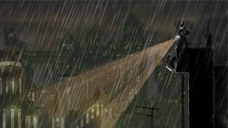
Pretty badass.
Pretty badass.

This is was my game of the year, largely in part because it solved the ever-present problem in stealth games of lack of feedback by simply layering mechanic upon detection mechanic until it became pure, blissful awareness of the world around you. The 2D nature of the game allowed them an easier avenue to convey all this information than would be possible in a 3D game, and they do so with more gusto then any stealth game before it. Every time I was killed, I knew what mistake I made. I never felt cheated when a guard spotted me, or when a dog sniffed me out. It's almost entirely free of the baggage that comes with a stealth-based game.

There was Dishono(u)red,
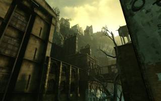
Stealth mechanics be damned, it had a great world.

which delivered on a more well-trodden avenue of stealth previously occupied mostly by the Thief series. The most telling thing they did to diverge from Thief though is the fact that they forwent a darkness system. The idea that darkness is what keeps you hidden has always bothered me, because it's kind of inherently flawed as a game concept. It's using an ever-changing state to dictate a binary one, and so there's always a seed of doubt in the player if they're going to be spotted or not. Outside of that problem, sticking to shadows is really a restrictive and not terribly fun thing to do.
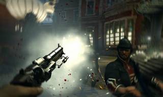
Combat = Pretty close to being great.

Dishonored does no favours for itself by not allowing 'safe' dark zones, and that makes it all the more impressive when it really doesn't give you much information at all about how the guards will spot you, and plainly challenges the player to tackle situations simply as you would in the real world with the magical tools at your disposal. And magically, it just works. The AI is perfectly balanced between appearing truly, frustratingly self-aware and perceptibly dim - an impressive feat, given that most of the game is spent in well-lit environments, where the dissonance is easier to spot. The result is a game with very little compromised for the sake of being a game, and it works that to it's advantage in it being primarily a role-playing game. That tact of design makes it much easier for the player to wholeheartedly jump in and participate in the universe.

By not laying it's mechanics bare, it's essentially doing the exact opposite of Mark of the Ninja. Maybe the reason why there are still some frustrating problems inherent to stealth games left in there is because of that fact, but either way, while it doesn't aim to be transformatively curative of the many ails of stealth games like Mark of the Ninja tries to be, it still exceeds it's predecessors in some interesting and progressive ways in my eyes.

And then there's Far Cry 3.

This...
This...

Now, this isn't a stealth game strictly speaking, but that's why it's the best stealth game I've ever played. See, I like stealth games. I really do. But the inherent flaw is the fact that when you're caught, you die. Or more often then that, you're given the option to fight your way through. But that option has always been the lesser appealing of the two. In all proper stealth games I can think of, whipping out your biggest gun and start blasting in that situation is just incredibly unsatisfying in comparison to playing well and stealthily. It feels like the game is penalizing me by making me play the kind of not-good part of it. Call it the perfectionist in me, but I have never been content in just pushing through the last 30%, be it MGS, Thief, Hitman... Hell, even the stealth system in Uncharted 2 hooked me. Even if I know I'm totally capable of killing the rest of the way through, I usually just sit around and let the enemies kill me. And that's incredibly deflating to the experience, having to 'reset' like that.

Or this...
Or this...

Amongst it's many other triumphs, Far Cry 3 has cured me of that mindset. It does so by not making the point where I get spotted the point where the fun stops, because getting spotted in Far Cry sends you into another mode of play that's equally entertaining. And it's not even the fact that I find the gunplay totally on par with the stealth aspect that the game remains to be fun, although that certainly helps. It's the fact that It doesn't feel like it's punishing me for having resorted to shooting a bunch of dudes. On hard, both methods are equally tough and thus equally rewarding, and it's that parity that makes the stealth feel tightly knit with the shooting.
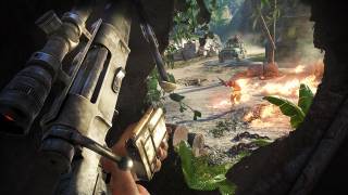
Or somewhere inbetween.

What's even more important in establishing that bond between the game's two play styles though is the degrees between them. When you get spotted in FC3, it's very much not a permanent state. You can slip back into the shadows given the skill, and you'll now be dealing with alerted and erratic enemies trying to find you in the brush. Through out every encounter, you have the ability to mix in as much stealth or as much brute force as you like. No matter how you play, it still nails the predatory nature of stealth games even when you're being less than stealthy. It feels like they learned a lot from Conviction in this aspect, except refined and invested into a much more logical place.

"Combat Puzzle". Didn't get that till this game.

While the seamlessness between Far Cry's two halves is the aspect I found to be personally the most laudable, it does something else that I think is totally unprecedented in making it's open world stealth just amazingly well put together. People talk about combat puzzles a lot, and Far Cry hits that moniker better then I've ever seen. Units and unit types seem placed with purpose in each encounter, buildings and hills and valleys are important and smartly placed. It just doesn't feel at all like an open world game in it's attention to gameplay details, which is incredible. This is something that I felt ACIII really didn't make good on when it really needed to, and coming right off that game I was surprised to find that Far Cry had that secret ingredient I felt the lack of.

Far Cry 3 is tentatively my personal game of the year - tentatively of course seeing as how I'm not quite finished yet (About 75%), though I feel I've already experienced all it's warts and I'm okay with them. It is after all the only game this year that has disrupted my sleeping habits. Mark of the Ninja and Dishonored probably occupy my 2nd and 3rd slots. While two of those three games involve bows, this year will not be named as such for me. What really innovated this year was stealth. I think this year marks a rather abrupt change in thinking with these games, which makes me very interested in how Ground Zeroes is going to fair in my eyes now that I've seen another way of doing things.

Anyone feel similarly on how crazy stealth has been this year? Any other stealth games I missed out on that you thought were notable?

6 Comments

TF2: Falls (PT 3)

Once again, an update on my TF2 map. 
 

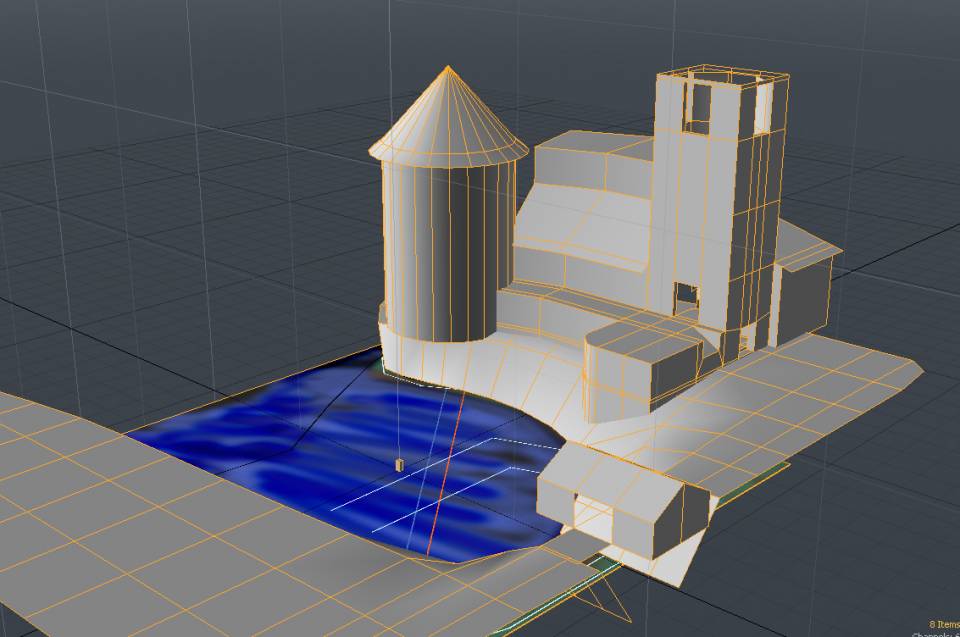
No Caption Provided
Last time you heard from me, I was finishing up the conceptualization of my map. I felt I had a pretty strong idea of where I wanted to take it, both visually and gameplay-wise. So this past while, I've been taking everything I've done thus far and remaking it in Hammer, Source engine's editor. That certainly sounds like a stupid task, to redo literally everything I've done again simply for the fact that the data is non-transferable, And to be honest, it is, but I soon learned it was fairly simple one. Free from the requirement of having to think about how to style and construct my map, the task turned in to simple labor, and I finished it quick-smart.
 
When building a map in Hammer, the main tool is a simple device called a "brush", primitive geometry that - using a couple of complimentary tools - are easy to mold into whatever shape is required. The interesting conceit here that makes it quite a bit different than working with regular polygons: There is no option to make a simple plane. That is to say, there is no way to make an object with a hole. 
 
Typical brush room (left) Vs. typical polygonal room (right). On the brush room, the (not pictured) inside faces are the ones that actually are important. 
See, when working with polygons, the plane is your best friend. When making a wall, that wall does not have to consist of anything more then one face. But when working with brushes, everything has to be a solid shape - no holes. That means the most basic shape you can make is a rectangular prism. This alters the approach slightly between the two methods. For instance, it's bad to have two brush faces overlap, and the solution to this is to have only the one edge of each brush touching. Failure to do so can apparently lead to a performance hit.  
  
 It also changes the simple act of ctrl+click and tap F once (the polygonal way), to making six rectangle and carefully aligning them to make an inner cube, making sure there are no gaps. Sounds kind of ridiculous, no? In truth, there's something appealing to me about this decidedly methodical way of doing things. It really makes you think of exactly what you're doing at all times. The downtime gives me more time to consider what I'm doing, whereas with polygons I start and don't stop for nothin'. There's also the added bonus of not having to worry at all about 5 sided polygons or any of that malarkey. There are few such impeding devices when working with brushes. Or, at least, I haven't encountered many.
 
The room now with
The room now with "nodraw" on all outside faces. We finally achieve the shape that takes about 3 seconds to make polygonally. 
Now, obviously it's an awful waste of resources to have all these polygons (as that is what the brushes are as soon as you're in game) serving no purpose on the "negative" side of the map, the side where with any luck no player will see. That's why it's vital to make sure that the computer doesn't even consider those faces. In source engine, this is done through the "Nodraw" tool, a simple way to tell the computer to ignore the existence of any chosen face of a brush. This once again gives you the ability to have a simple plane. Which, in my opinion, makes this whole system seem a bit crazy. 
  
If you want anything more complicated then a block, then use of the clipping tool would be in order. The clipping tool allows you to cut a brush in to two brushes, at any chosen angle. This allows you to quickly make complicated shapes, though at a certain point it becomes more efficient resource-wise to import a polygonal model in lieu of having 20 brushes defining a complicated shape. 
 
all this plus a simple vertex tool combines into an extremely intuitive modelling system that literally anyone can pick up. I'd even say that this method is far more straightforward then the regular polygonal method, though of course it can't compete when creating objects any more complicated then a hallway. The nature of brushes also lend themselves to extreme accuracy well, which is essential when you're making something that needs to be absolutely seamless. When working in straight 3d, I know that people are only going to see what I am willing to show, so I can be really as sloppy as I can personally stand. Not so here.
 
 Holy image compression Giant Bomb!
 Holy image compression Giant Bomb!
So, applying these tools, I created my map, not straying too far from the original design. There's really nothing more I can say about that. It was extremely straightforward.  
  
 Overall I had a good time working in Hammer: It was quick, intuitive, and easy. Had I been working from scratch, I think the brush method really lends itself well to quick creation of levels. If anything, working fairly strictly from a reference actually impeded my progress a bit. If I ever do another one of these, I probably won't bother with the preliminary conceptualization and instead jump straight in to Hammer.   
 
Having all the vital geometry laid out, I compiled the map and messed around on it with a few friends. I now have my doubts that this map will prove to be interesting and fun in it's current form. I think I have a long way to go to make this map what I want it to be.
 
For those keeping track, I am well past my deadline of August 21st. I meant to post this blog on that day, but my schedule was absolutely packed and I didn't have the time. From then till now, I have been busy moving house (twice) in preparation for college. I'm finally settled in, just in time for classes starting on Wednesday. Regretfully, my schooling probably won't leave me much time to work on this map, and so I'm going to have to put this project on indefinite hold. I'm sorry that I wasn't able to meet the amount of support Giant Bomb showed towards me for this project. But I'll come back to this map some day in the future, and undoubtedly be better equipped to handle it. 
 
In the mean time, you may or may not see some drawings of some kind from me, depending on how satisfied I am with what I accomplish in the next two years. Having never put much effort in to traditional art before, I'm a little fearful of how this will turn out, but excited by the challenge at the same time.  
 
I actually remembered to take pictures this time! So there's a lot of them. I'd recommend going to the slick gallery viewer instead of clicking them individually here, but whatever floats your boat.     
12 Comments

TF2: Falls (PT 2)

Hi everybody! (Hi doctor Nick!) Just an update on my TF2 map
    

No Caption Provided
So, I set out from the place you last saw me with a somewhat drastic goal: what if the waterfall... Went the other way?!!! I know, crazy right? Well, after thinking about it, I determined that the map would be much better off if, instead of a shear drop right at the horizon, your eyes would behold a vast and beauty-ous waterfall. Plus it didn't really make sense for such a small channel to be supplying so much water...
 
Changing the waterfall also allows me to work in what I think is a decent gimmick: Water current. I still haven't sussed out the details as I want to keep myself as open as possible for the moment, but there are many possible ways I can take it. Certain classes could be washed away to their death (Heavies), some could cross instantaneously (Soldier, scout, demos) and some could be slowed down fairly severely, having to fight against the current (snipers, pyros, medics). Heck, if I want to get really gimmicky, I could animate a log that allows all to cross that shows up and leaves at 60 second intervals. The possibilities are endless, which makes it easy to balance.

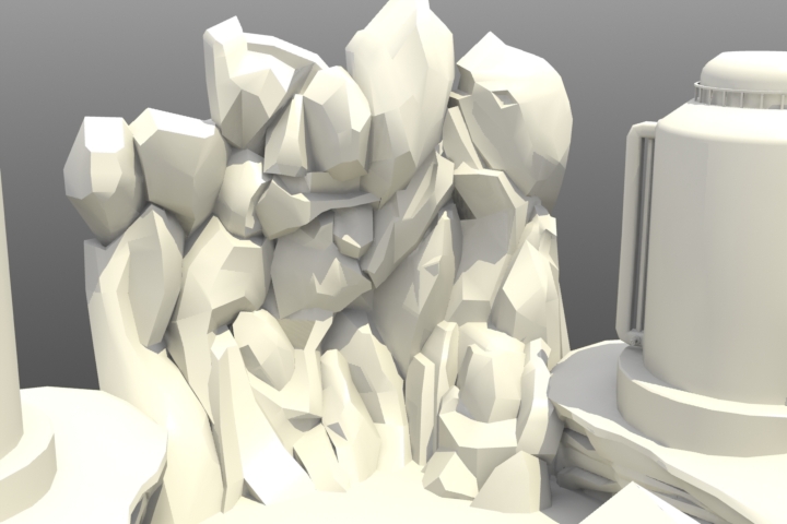
 Rocks

 
 Heavy: 500k
 Heavy: 500k
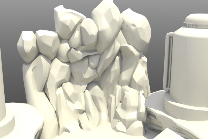
In service of this new objective, I had to make a nice and rocky cliff face for one to gaze at. So I turned the industry standard in rocks: Zbrush. For those who don't know, Zbrush is an application that allows one to sculpt digitally. Over the past few years it has absolutely revolutionized the industry, and continues to do so. The above was the outcome of my foray into the program.  
 
But the big issue with Zbrush is, it makes a lot of polygons. That fairly simply model is 500k polygons, a pittance for Zbrush (Not uncommon for a great Zbrush artist to push 15 mil.) but totally insane for source engine. Don't ask me why Zbrush can do this stuff with ease and no other program can't. I'm pretty sure Pixologic made a contract with the devil.  
      
 Low: 1171     
 Low: 1171     
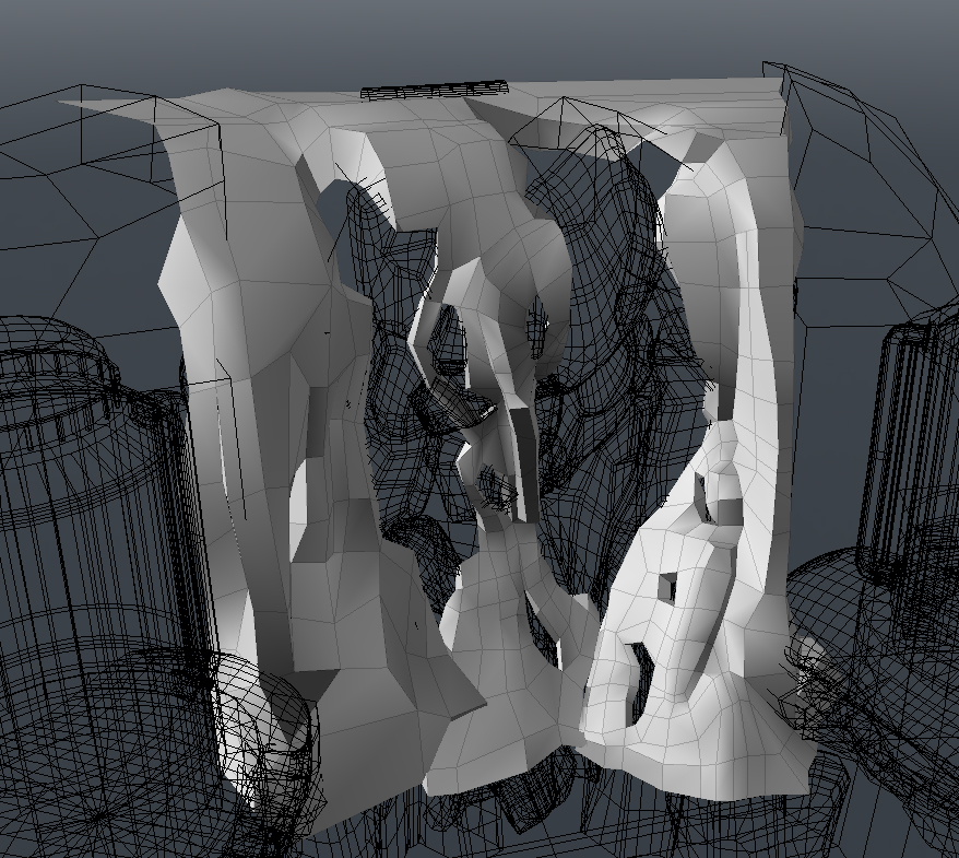
So I can't use it as is, unfortunately. Instead I have to retopologize the model, a process that I outlined in my very first blog. Go read that if you want, but the important part here is that I turned 500k into 1171, and it took me forever
No Caption Provided
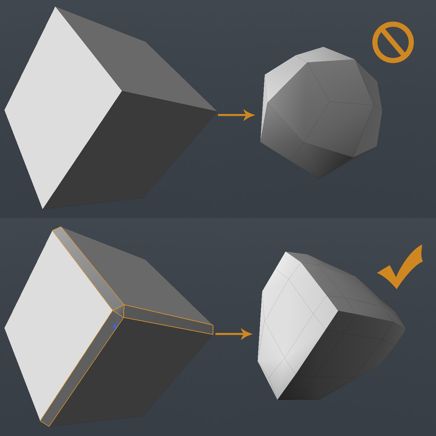
  Well, that looked alright and fit the "raw polygon" style of TF2, but I knew I could make it better if it was just a bit higher res. But trouble is, it's not as easy as just hitting the divide button. If I do they all instantly become ridiculously smooth boulders. No, I wanted to keep those rough edges. So I dug in there and selected the edges I wanted to keep, and gave them a slight radius. This changes how the computer approaches dividing the mesh, and retains the chosen edges. I may have to revert back to the lower res if I bump up to the constraints of the source engine, but it's nice to have on hand. 
 
 Mid: ~9000
 Mid: ~9000
So yeah, that was done. It looks alright. 

Water

Now I moved on to the water that falls. I could've created and interpreted this part myself like a real artist, but hey man, this is the 21st century. Let's simulate it!
   
  
I used RealFlow - a really excellent fluid vfx program - to simulate a waterfall. I imported my mesh, and created a domain around the area I would be simulating in. The domain dictates the area that the simulation will take place in. It's important to only encompass what you need with the domain, else the computer will have to go through additional calculations. I created my emitter - the object that the water particles spawn from - at the top of my waterfall. I hit simulate. It looked weird. After much fooling around (around a day's worth), I figured out that my emitting speed was too high. I fixed it, meshed the particles from one frame and moved on. 
 
VFX is not a part of CG that gets an overwhelming amount of notice (because honestly it can be quite boring to talk about), but it is truly 1/2 of the whole that is today's modern artist.
 
So back in modo (My 3d package), I've got this ugly looking, triangulated mesh. The sad realization that I had to retop again reached me. So yeah. I did that.  
 
 Probably going to have to rework this at some point.
 Probably going to have to rework this at some point.
To make it clear, I'm not going to have some awesome particle simulation going in this map like in that video. I just have one static shape and will be using good ol' texture trickery to make it "move", a process I'll outline when I get to there. 

Oh Yeah, and the Rest of the Things I Did.

 
  •  Began to differentiate the two sides through differing architecture 
  • added stairs/tentative logs across the body of water 
  • animated a log going down the falls for the aforementioned idea that I may or may not carry out 
  • created underground path through midpoint 
  • tentative design of stairs linking upper and lower of midpoint  
  • got a rough idea of how I'm going to style the unreachable scenery 
  • restricted sniper/sentry views 
 I think I'm nearly ready to take this all in to Hammer and start to make it all playable. The rest of the props and details will be built to order as I progress. I am in no way stopping in developing the map conceptually though, so I'd still love to hear more suggestions/questions/criticisms if you have some.
32 Comments

TF2: Falls (PT 1)

 Hi there! This is a blog about all things polygonal. As in, those things you've been shooting, stabbing, and generally murdering since 1997.          
 
It's been nearly two months now since my last blog. My utter failure to execute on my past two projects (and the outcome of one that I deemed not worth showing) brought my motivation down a few pegs. I've been feeling the itch to get back into working for at least one of those two months now (it's comforting to know that I've developed a genuine craving), but even then I felt the glaring absence of a kernel of a good idea. I felt that if I tried to execute anything lacking this element, my work would remain the same.  
 
But you know what? That's bullshit. There are no great ideas, it's only the execution that matters, because I know that people will enjoy - on some level - the vision that I have in my minds eye. Following out that vision is the only barrier between me and where I want to be, and the only way you can possibly get to where you want to be is to keep moving towards that point, suffering through whatever is standing in the way. If you want it in a metaphorical format: It's a better idea to butt your head against a wall instead of waiting for a sledgehammer to be delivered to you. So that's my advice, I hope it wasn't too "motivational". Anyway.

 How 'Bout that Team Fortress 2?

 I've been playing a decent amount of TF2 since it went free-to-play, and I love it! When I began playing, I was immediately struck by the beautiful, truly timeless art style, and the sheer ingenuity found in the design of the game. It occurred to me that Team Fortress 2 may be the most well designed FPS I've ever played. If we compare it to it's peers in terms of map design, none of them hold a candle: COD has always been a somewhat rough collection of ideas (It would be like totally wicked if we had like a window here and you'd be like BLAT BLAT BLAT), and BFBC2 requires even less finesse as far as maps are concerned (Okay, middle-eastern town, scatter with vehicles aaaand done).  
 
Of course, that's a pretty unfair summation, as there are very much "good" and "bad" maps for those games, but you can't deny that TF2 tends to take a little more finesse then many others in the genre. Balancing the games 9 classes is an absolute feat when so much of their effectiveness comes from the ways they can utilize and exploit the map to their advantage. It must have been an absolutely terrifying prospect for the folks at Valve, attempting to build around a game that had such a complex core, to the point where I'm even amazed they went through with it. And pulled it off to boot! 
 
So obviously, that short meditation on this game led me to thinking: The tools are there, I have less than a quarter of the know-how: Let's do this. 

And Lo, 

 
     It's pretty liberating to be able to run around the thing I just made after all the times I've waited for 10 hour renders...
     It's pretty liberating to be able to run around the thing I just made after all the times I've waited for 10 hour renders...
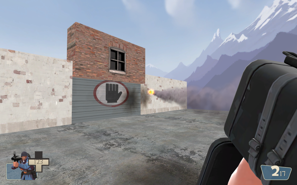
thus began my journey into the source engine. I followed a short tutorial through their proprietary editor, Hammer, and the image above is the result. It's built purely with something they call "Brushes", highly adaptable pieces of geometry that will bear any type of reshaping with fairly clean results. That door works too! Courtesy of "Entities", simple and intuitive little functions that handle most of the interactive bits of the game.  These two tools and many more directly associated with them are what the editor comprises of.
 
I found my first hitch: I have to use their kind of crappy editor to make this thing. It's certainly not bad, but oh how great it would be to be able to export a fully furnished map from my 3D package of choice. Importing/exporting is certainly possible (and necessary if you want to do anything complicated), but - from what I gather - cannot be used exclusively. The major parts of the level (I.E., walls, floors, ceilings) should comprise of brushes. Nevertheless, I thought it prudent to initially create my level in a familiar environment, and so I decided to go ahead and make it externally before finalizing as needed within the Hammer editor. 
 
My first thought was focused on developing a theme for my map in order to establish a style from which to work from. Honestly, looking at the current list of maps it seemed like all the good ones were taken! A dam, a sawmill, a granary, and that one with the trains. How am I expected to beat trains? Eventually I settled upon the idea of a waterfall. Not as good as trains, but it's the best I could do. I also just kind of assumed it was possible to do a waterfall in source. I still don't know if it is. I have a feeling that I opened a large can of worms when I picked this theme. The implications are slowly sinking in.
 
Art. 
Art. 
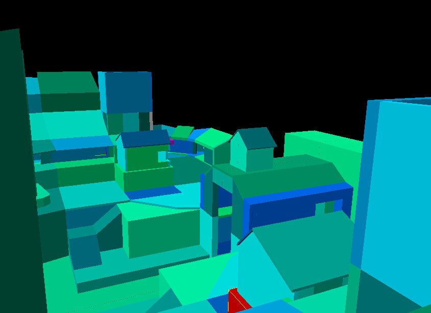
So, theme established, I began blindly designing my map. I did the quick and dirty schematic you see here, flying directly in the face of aesthetics for once and utilizing it simply as a drawing board for my vague ideas. What was produced through this steered me towards the idea of a CTF map, incidentally the hardest to make... 
 
I even tried at developing some "concept art" at a point, but unfortunately my hands failed me again and I was unable to put what was in my mind to paper. I decided to take it in to the only medium I was capable in: 3D.                     
 
Simple. Basic. Primitive. 
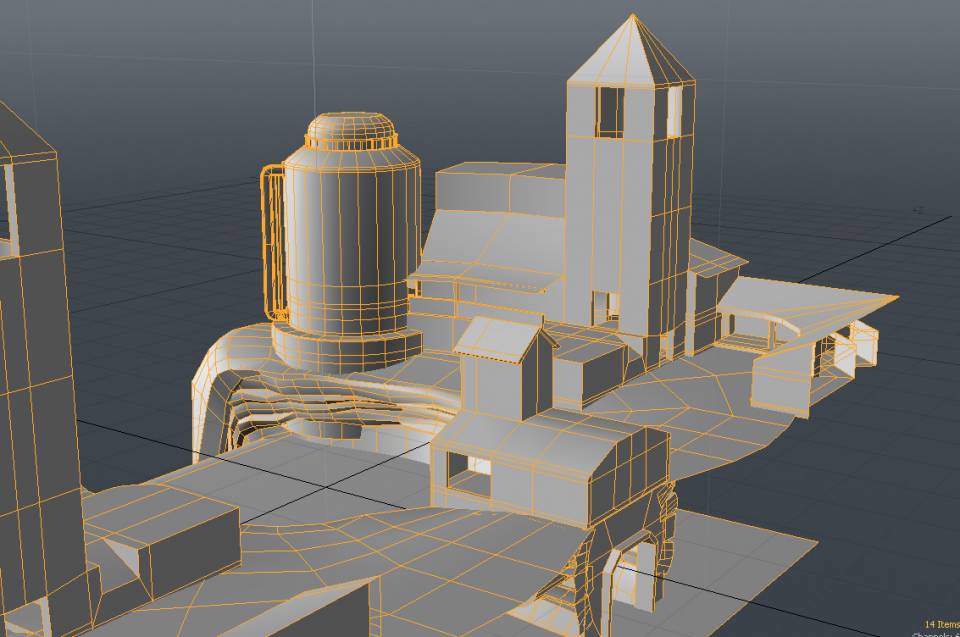
Using my swiftly scribbled schematic as a reference, I made the land and buildings. It was fairly easy to get it to 'click' from there, as the idea in my head now gained a tangible dimension. I filled out the blindspots that were present and changed the idea of the map considerably. I created interiors for the base, something that I had previously not given a single thought to, and then turned my attention to the midpoint of the map. This still remains my biggest concern, since I'm not entirely clear on how I'm going to make the most important area in the map interesting to play in. 
 
Current state of things. 
I then took my completely unrefined ideas and started to give them additional consideration, both aesthetically and design-wise. But mostly aesthetically. I admit, I am truly clueless when it comes to figuring out how to make this map an actually fun one.   
 
I'm giving myself a meaty deadline for this one: August 21st. From my progress thus far it seems pretty likely that I'll need all, if not more then that time, but I'll mostly be engaged in other things past that date so I have little leeway. Till then, I will be reporting in on my progress at appropriate intervals.

 Help Me Out

I've noticed from my older blogs that many expressed some trepidation when commenting and criticizing my work simply because they felt they lacked knowledge of 3D. First of all, I don't care; criticism really helps me out, so fire away. Secondly, in this case, you guys have just as much expertise as I when it comes to video games, if not more. As far as I'm concerned, most of you guys are qualified to be a designer already. So I'm calling on the collective powers of Giantbomb in order to figure out how to make this rough copy eventually work, in the gameplay sense.
 
 Rest assured, this map will get made, but I fear that it's primary function will prove less then fun if I'm the only one thinking on it. All you see is not even close to final. Hell, it's unplayable in this state. So I'd like to hear some suggested changes from you guys, drastic or small. It would help me out infinitely if you can provide me some sort of feedback.
 
 Here are a few more renders that are a bit more "diagnostical", to give a clearer picture of what I have going on here so far: 
22 Comments

My Best Portal Impression and a Blind Venture into Fractal Art.


No Caption Provided
I did this model. Nothing to write home about. The inspiration should be pretty clear. It was meant as a speed modelling challenge to ease me back in to working again, Though it quickly became less than speedy. Pretty well 95% of what you see was made within a couple of hours, but I always end up spending several hours on top of that trying to find ways to make it better. Any improvement I gained from this is decidedly artificial, my time would have been better spent making the model again than scrutinizing it and trying to escape the confines of what I had already wrought. I found it really hard to escape from a concentric design, and it was difficult to find ample justification to break the silhouette of the sphere. 
 
This is still in progress. I have some pretty ambitious plans for this guy, so hopefully it'll turn out well. 
 

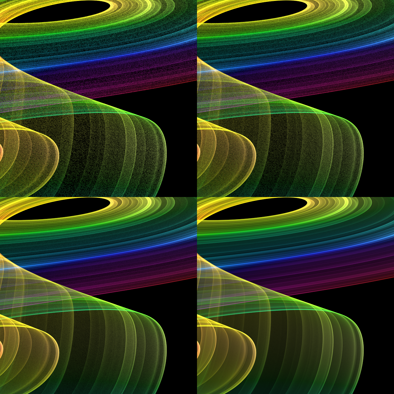
I also messed around with a program called Chaoscope. 

 
Lorenz, Light 
Lorenz, Light 
Chaoscope is a free program that makes beautiful things with math that I cannot even pretend to understand. Yet despite this ignorance I was able to operate it to it's fullest potential. 
 
No Caption Provided
There are obviously very complex things going on within this program, but on a surface level it's dead simple: You choose the attractor, each it's own equation that defines how points are plotted in 3d space. Once chosen you'll be presented by an intimidating list of arcane parameters. The great thing here is that you will never have to worry about those if you don't want to. Hit F3 and those parameters will randomize, giving you a bona fide piece of fractal art in a split second. If you find something you like but isn't quite there yet, lowering the randomization parameter will narrow your search, changing each parameter by only a small degree rather than changing it to a completely different number. It's with this method that you can quickly narrow your search to something you want.
 
No Caption Provided
You then choose the rendering modes, and this is where the program really shines. Much of fractal art tends to be extremely gaudy and 90's-looking, often largely in part because of the quality of the renderer. Chaoscope solves this by offering a narrower breadth of options - in comparison to something like xenodream - and executing them very well. It's this commitment to quality that makes Chaoscope so fantastic. Updates continue to be carefully dripped out through several years of development, and there are plans to keep going for a long time yet if the version number is any indication (0.3.1). There are only a handful of rendering modes: gas, liquid, light, plasma, and solid. All of them look and work beautifully, with the exception of the solid mode which is gimped by a lack of antialiasing, long render times, poor meshing, and need for extremely high iterations. It's a sort of "between versions" implementation. The other downer is that there is no gradient editor, an essential part of all of the rendering modes. Instead you can only randomize colors and save the ones you like for later use.
 
No Caption Provided
Speaking of iterations, they're what determine the quality of the render. The default value of 20 million is good for preview or low resolution rendering, but you'd probably want to increase it some regardless. Adding zeroes will essentially times your quality by 10, but it'll also times your rendering time by 10. At default iterations I get something like 6 seconds, at high quality no more then 15-20mins.
 
Julia, Solid. Mad iterations/rendertime. 
Chaoscope produces things that should take careful and concise work and makes it so simple that it feels like a toy. What once would earn someone the reputation of an artist has now been democratized to the point where it loses any meaning. I could not, in good conscience, claim that anything I made with the program as my art. In fact, anything produced from the program could almost be considered the developers art by default and we are merely cycling through it. The person who presses the button to make a beautiful painting is not the artist, the one who made the button is.
 
Oh yeah, did I mention this program is totally free? Go get it, make stuff, and post it here! It's really easy.

1 Comments

Zero, Part Deux

This Week,

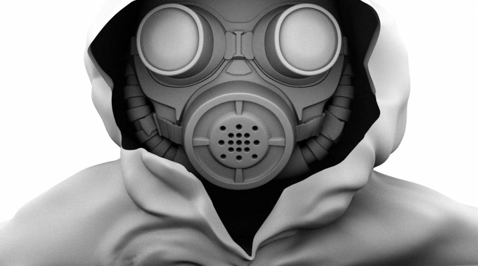
I continued on with my Zero model (From 999). I was unexpectedly busy, so I didn't get it finished, or even get it to a presentable state for that matter. Keep in mind that I usually try and get to a good point for show-and-tell when I do these. This time I didn't have that luxury.

Illustration by Kinu Nishimura (I think).

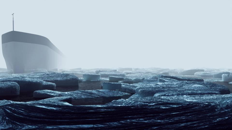
It quickly became clear that I wouldn't be able to reproduce the illustration perfectly without resorting to drastic, borderlands-esque methods. The scale is too crazy (That boat is supposed to be a cruise ship...), the lighting is completely impossible, and the shading is inconsistent. In order to reproduce this perfectly, I'd basically have to forgo any benefit you usually gain by working in 3d, which would really entirely defeat the purpose. I decided not to worry too much about accuracy any longer and just make something nice.

All of the textures you see are 100% procedural, meaning they're all generated on the fly within the program. No .jpg's were harmed in the making of this image.

I couldn't very well keep the hood so boring so I figured some fur would look nice. But then, common sense dictates that a fur-lined coat would only be worn in a cold environment, so I rolled with it from there. The fur looks alright, but it would look even better if I could replace that stupid cloak completely with something a little more natural. Meanwhile, I'm running into a plethora of issues with the background.

Background, in all it's glory. This is very much a work-in-progress people.

The ship is obviously untextured, and please ignore the floating icebergs. I distributed the icebergs with the same method described a while ago. I modeled 5 "Prototypes", just basic iceberg-y shapes. I then replicated them along the surface of the water geometry, using specific parameters to randomize their scale, rotation, and position.

Still really unsure where I'm going to go with all this. The only thing I'm satisfied with at this point is the mask itself, the rest is still looking pretty terrible. That's also kind of the problem. I'm trying to conform everything to the fraction that I think is decent, which is proving to be quite difficult. I'm also running into crippling technical difficulties, getting crashes every other minute as well as combating the dreaded NaN artifact, a well documented issue that basically causes chunks of pixels to render black for no apparent reason.

I'm not entirely confident that I can salvage this direction I've taken with this project, and under normal circumstances I'd probably be already calling it quits since it seems fate is conspiring against me on this one, but for some reason I feel like trying a little longer. If I can't manage I'll have to lower my scope a bit.

Comments/criticisms very welcome! I'd love some advice on where I should be going with this.

3 Comments

Re-making Zero

This Week,

  I was pretty set on not doing a blog. I came to the conclusion that to really give my work that extra oomph , I think I need to bump up my research. I figure I was pretty successful with the guitar project because I'm well acquainted with the subject and I took extensive measurements. All my previous work reeks of amateur because I didn't put the time in to understand the objects and scene I was trying to replicate. I spent the week in pursuit of this research but the idea never materialized into anything, hence the expectation to have nothing to fill this blog with. But Sunday night I all of a sudden felt like modeling and out popped something that was fairly interesting!

Zero

I've started playing a bit of 999. From my first impressions it looks like it's going to be a fantastic game. Somehow it popped into my mind that I should model the main villain of the game, Zero. I'm not sure why, it's not like I found it particularly striking.

Expect the cloak to undergo some changes.
(Wireframe) I started this model just Sunday night. It probably took me about 4-5 hours total, as it's fairly simple. It's not a perfect likeness, and I still have some tweaks to do, but I'm happy with it. This is my first time working directly off of someone else's artwork (GB informs me that the art is [probably] done by Kinu Nishimura). I've tried to avoid doing so simply because I want to do my own thing and hand in a portfolio that I can be confident in saying it was all me. This is generally an impractical approach though. A modeler and an artist have to work together to make anything half decent. I am more or less neither at this point, but I hope to learn to become both. Working off of someone else's art for once was nice though, and it gave me a much better result in far less time then usual.

Anyways, it's amazing to me how accurate the drawing was perspective wise (The difference you see between mine and it are probably my fault), but it also astounds me how much bullshit is employed that doesn't set off alarms in our heads informing us that something is wrong with the image. First and foremost, where do all those straps and tubes go, and what purpose do they serve?! This is something I had to solve to a certain degree while modeling. The cloak also has a certain weightless simplicity that I'm frankly not sure how to approach. It's mostly comprised of texture as opposed to form.

It's going to be fun texturing and lighting this guy, since the image is very ambiguous shading-wise and relies on a possibly impossible lighting scheme. I'm going to try and recreate the painting as closely as possible in 3D, boat and everything. It should make for a very interesting challenge!

That's it! I'd appreciate comments and criticisms! It'd be great, for one, if you notified me of any differences between my model and the painting.
8 Comments

Guitar Modeling - Part 4 (Final)

This Week,

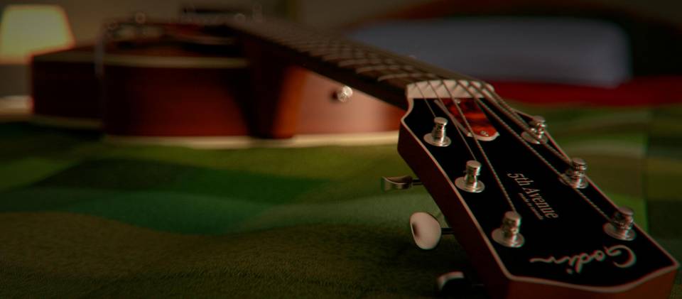
 I'm still on easy street, waiting for renders to finish up. I managed to increase my processing power by more than two-fold by setting up a network between my computer and another in the household, which is pretty sweet. I now have 8 cores (4 of those hyper-threaded) at my disposal, as opposed to my former 4. I leveraged this power to double the render quality, taking about the same render time it would have with my old setup. This boost couldn't have come at a better time as it turns out. I had to increase the light sampling to the astronomically high value of 16,000 in some of these images, in order to eliminate some extremely pervasive artifacts (And even then they weren't completely eliminated). For reference, light sampling is usually set to 512-1024. Either I did something horribly wrong to cause this or it's time to re-evaluate my choice of rendering engine.
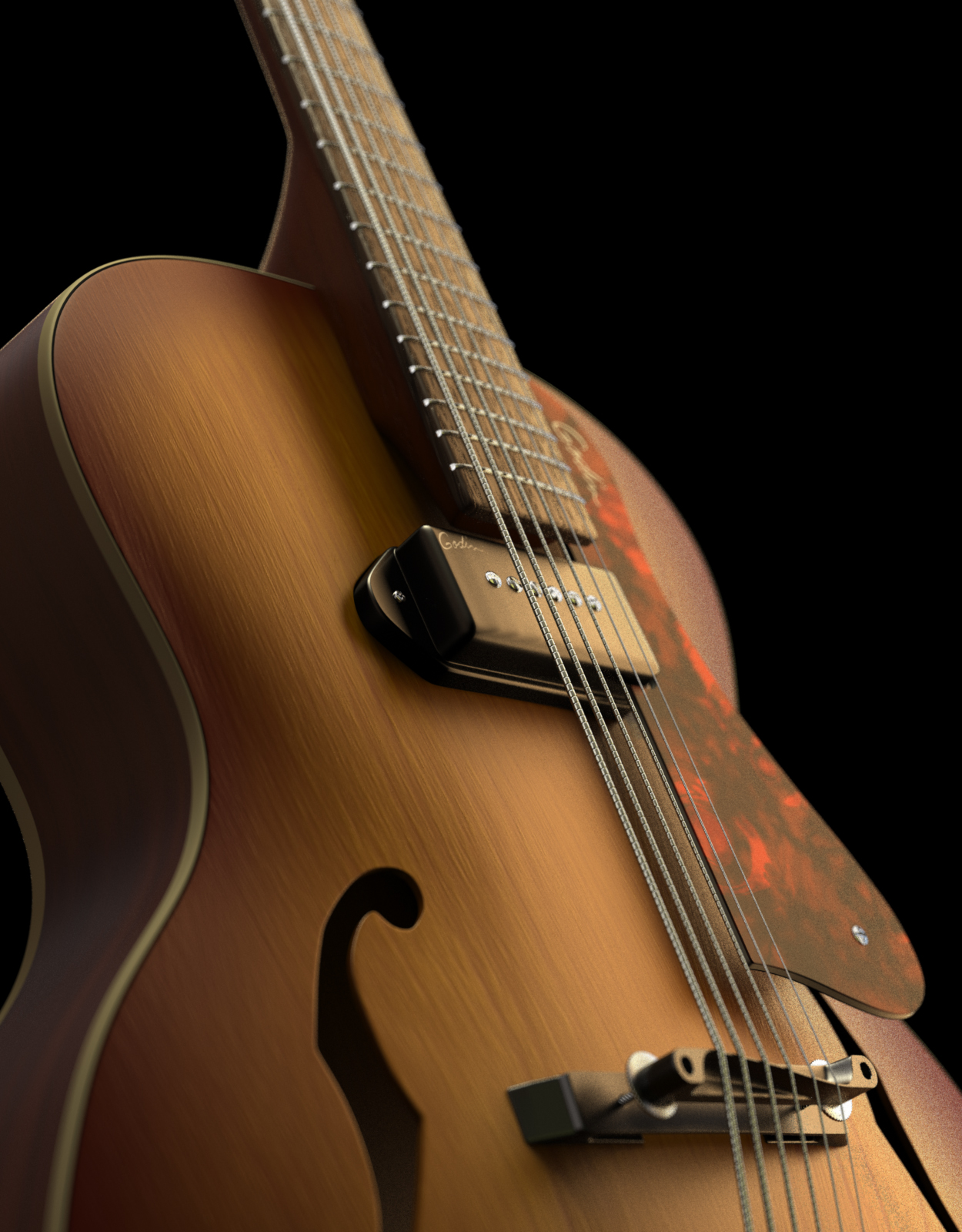
No Caption Provided
No Caption Provided

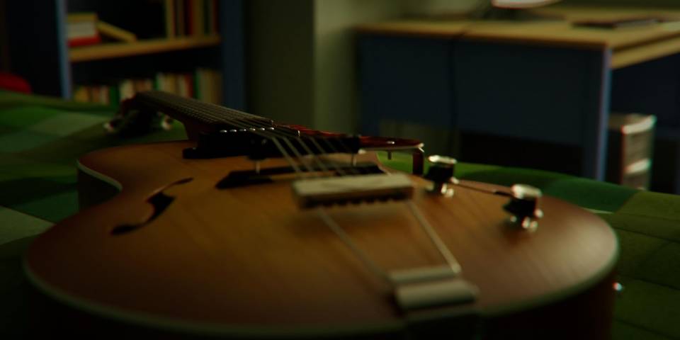
Taking some advice from SSully, I resisted my urge to just make it as pretty as possible and tried to create a more photo-real look for my guitar. I did this mainly by establishing some context in the scene, which really helps the viewer understand how and why the guitar is picking up the light the way it is. I then post-processed the image using a really nifty (and free) program called Motiva Realcamera which simulates camera lenses, adding a slight amount of vignetting and chromatic aberration. This jazzes up the image in a fairly realistic way. Here is the original un-processed version for comparison.
 Great example of the aforementioned artifacts. I'll replace this with the clean one once it's done rendering.
 Great example of the aforementioned artifacts. I'll replace this with the clean one once it's done rendering.
No Caption Provided
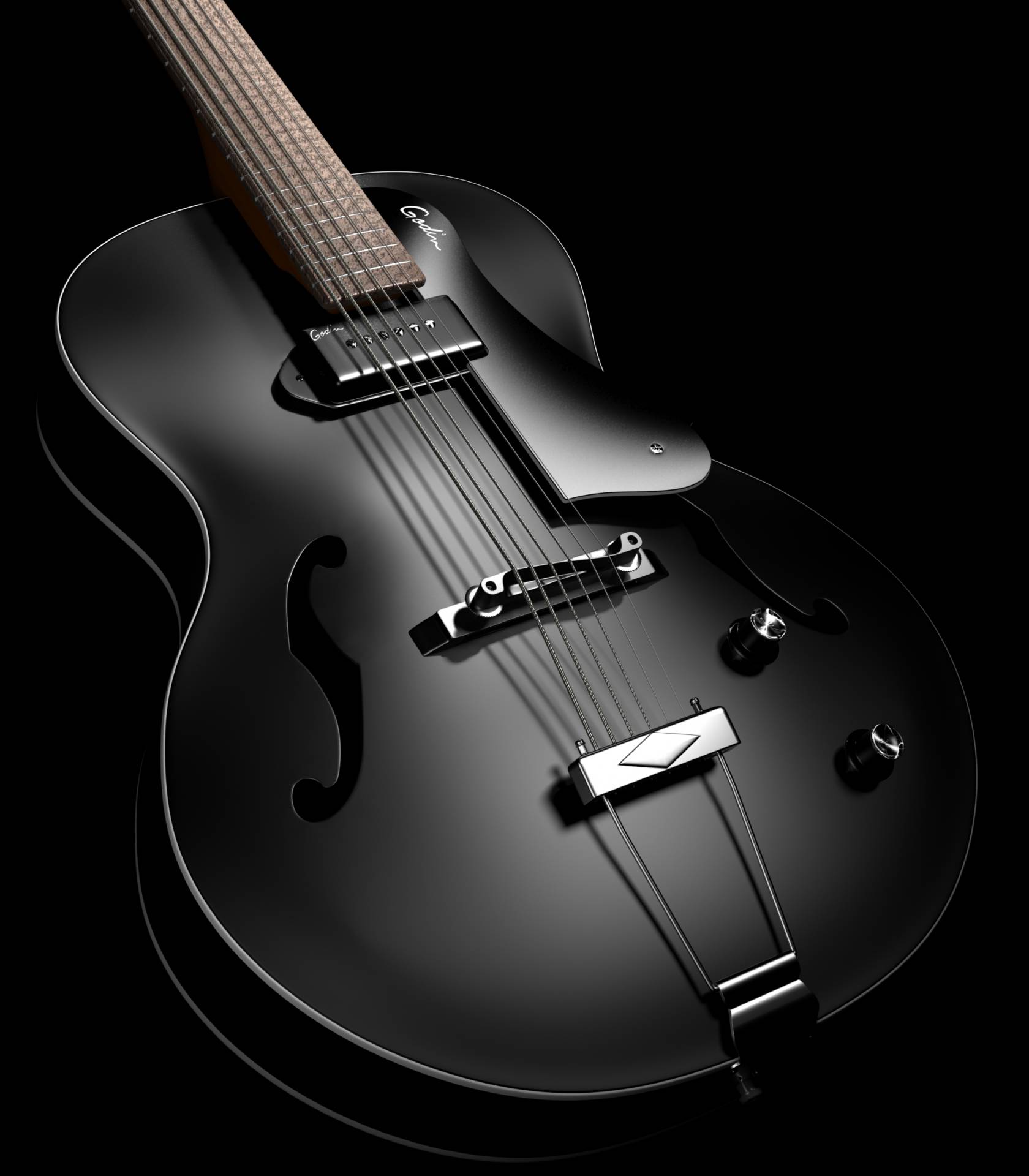
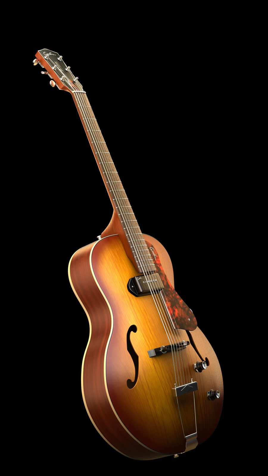
I also did a few more "Product" shots, scenes that were carefully lit in a studio environment. I made the black version of the guitar for one of them, which on a shader level was a simple task, but getting the lighting right on a predominantly black render is a challenge. Fortunately the white trim helped in distinguishing the outline of the guitar from the background, but getting the right shine on the body was a bit of trouble. There are a bunch of things wrong with the black render too, the shading errors that I said wouldn't show up did, the shine on the pickguard is not to my liking, and I completely screwed up the texture of the fingerboard somehow.

Pretty well all of these need to be re-rendered for some small reason or another (None of them have textures for the volume/tone dials for instance...), but they took so goddamn long. I'll eventually get around to it though. For now I'm back to thinking up something else to do!

Regarding my usual Edumacational Section,

 does anyone actually enjoy those? I read some of the old ones this weekend and I'm not really sure that I'm doing the covered subjects justice. They're really scattershot since I make it up as it pertains to my work, and I'm not very good at being long-winded so they all read very... Briskly. It's hard for me to determine if this information is of any value to somebody. It's also kind of weird that I'm doing this when my own understanding is still in a somewhat tentative stage.
I went in to this with the grand ambition of instilling some degree of understanding of this field throughout the entirety of GB. I don't think I'll be able to accomplish this the way this is going. Nevertheless, I'd like some feedback:

Should I continue with the explanatory sections or simply post my work with the intention of receiving comments/criticisms?
6 Comments

Guitar Modeling - Part 3

This week was a bit of a break for me. I'm in the rendering stage of my guitar project which mainly consists of tweaking for 15 minutes and then waiting an hour or two for it to render out, ad nauseam. It's times like these when I wish I had a little more power under the hood, It's only been a few months since I upgraded to a quad-core but it's already starting to lose it's novelty.


 Just noticed I forgot the fret dots... How in the hell did I miss that?
 Just noticed I forgot the fret dots... How in the hell did I miss that?
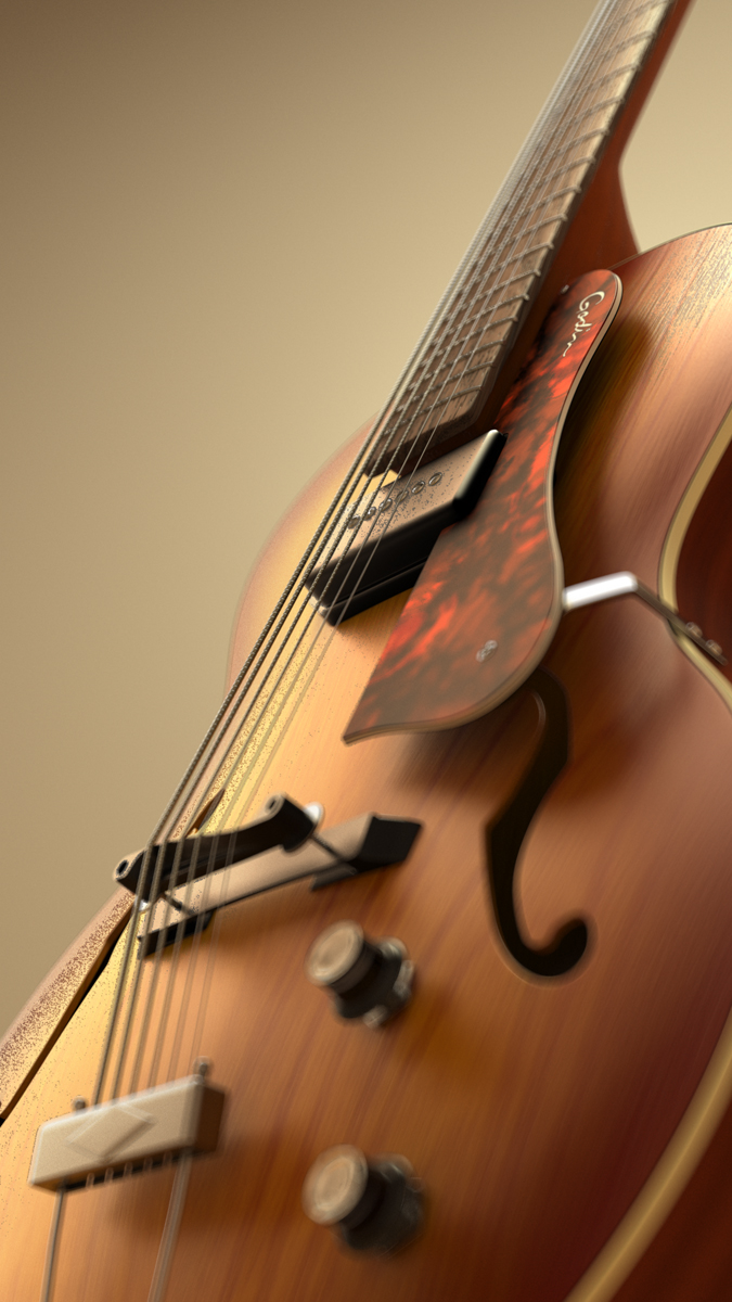
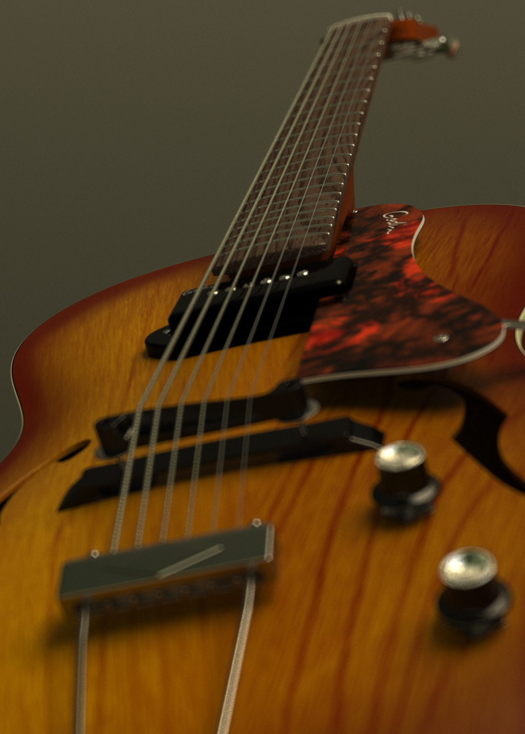
I changed the guitar to the "Cognac Burst" style. I own a "Natural", as I found the burst to be rather ostentatious, but I'm none to confident in my ability to pull off the delicate simplicity of my own guitar effectively. Above is my horrendously over-lit render, it's main intention being to bring out the colors as vibrantly as possible.


  Would probably look better with some context as well..
  Would probably look better with some context as well..
In pursuit of a more natural looking lighting scheme, I threw the model into an old medium-sized scene. It certainly produces a fairly natural and realistic result, but that's also the problem. Sometimes, things just aren't pretty in the real world. This is something that I run into all the time when I'm going for photo-realism; I take a look at the finished product and think to myself: Boring. Can't help but try and make it larger than life.

No Caption Provided

I think the main thing letting these renders down are the the textures. Despite my best efforts, these were the best I could find, and for those I couldn't find I had to generate procedurally (Neck, fingerboard, pickguard). In fact, I think the body and the branding textures are the only image based textures I used.

In any case, the prettiest renders are yet to come. In the mean time,

Shaders

The world around us is entirely defined by light. The science behind light is fairly straightforward: Rays are cast from a light source onto a surface. The ray of light changes direction upon striking it, it's course altered according to the attributes of said surface. A shader is simply the container for those attributes. For practicalities sake, these attributes can then be broken down into two groups: Reflective and refractive.

Reflective Properties


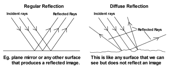
 Brought to you by: Some science-y site.
 Brought to you by: Some science-y site.
The law of reflection states that the outgoing angle of a ray is always equal to the incoming angle. This makes perfect sense in the context of a mirror; if you take a laser pointer and aim it at a mirror, the angle will always be perfectly predictable in that it is always the opposite and equal angle. However, all non-transparent surfaces are defined by reflection, not just mirrors. If this law of reflection is true, how does light interact with surfaces that are not perfectly reflective like a mirror?

All reflection based shading is based on the concept of roughness. The reason that a mirror is perfectly reflective is because it's a completely smooth surface. Take a look at an object near to you that is generally not considered "reflective", and feel it. It has, without a doubt, some degree of roughness to it. This provides an inexorable subconscious link in your mind that relates smooth surfaces as reflective and rough surfaces as not. However, this is not true. All non-transparent surfaces are defined by reflection.


No Caption Provided
If you compare a rough surface and a smooth surface at a microscopic level, there is a stark contrast in their profile. Now, if you think of the rays hitting those surfaces, what will happen? The rough surface bounces the light in all sorts of directions, as well as having a good chance of inter-reflecting with itself. This is called a diffuse reflection. Meanwhile on the smooth surface, the light hits the surface and exits at the equal opposite angle in a fairly uniform manner. This is called a specular reflection.

All this is from a purely scientific perspective. Which I explained because I think understanding how light works has helped me better understand how to construct shaders. Let's look at the application of this in regards to CG.

One of the few things that is truly universal among CG programs is that reflectance is always defined by three parameters: Diffuse, specular, and reflection. 

 80%, 40%, 0% diffuse respectively. Diffuse amount ends up being just a brightness modifier for the color. 0% here shows the complete absence of reflections.
 80%, 40%, 0% diffuse respectively. Diffuse amount ends up being just a brightness modifier for the color. 0% here shows the complete absence of reflections.
Diffuse can be largely considered the actual color of the object; if I wanted to apply a wood texture to something, I would put the texture in the diffuse input. An example of a purely diffuse surface would be drywall, or pretty much anything that's soft.


 40/40, 30/40, 40/90 (Specular amount/roughness)
 40/40, 30/40, 40/90 (Specular amount/roughness)

Specular(ity) is essentially the "Highlight" of the object. Look around and you will see that almost all objects have a particular shine where the light hits hardest, but this couldn't be considered a reflection in the traditional sense of the word. I think the cause of this has something to do with the way a surface absorbs and releases light energy, though that's purely an observation. Also note that on a smoother object the highlight becomes more pronounced and "Sharp", while on rough surfaces the energy is dispersed over a larger area and as a result is not as strong. This effect is controlled by an independent parameter called either roughness or glossiness depending on who you ask.

No Caption Provided
Reflection does exactly what it says on the tin: reflect light rays. Another important part of mirror-like reflections is a phenomenon referred to as fresnel. Simply put, this modulates the reflectivity of an object depending on the viewing angle. The best example of this would be a still lake. When looking out across the lake, the water provides an almost perfect reflection, but when you look down at your feet you can see fairly clearly through the water. Another example of fresnel would be a slab of marble. Reflection has it's own roughness as well, changing it causes blurrier reflections.

Some very basic shaders. Bottom middle is an example of reflections with roughness.
The combination of these three base parameters and their interaction with each other allow for nearly infinite shading variations. Combined with texturing and other techniques, you can make just about anything. This method of reflection shading is referred to as BRDF, or bidirectional reflectance distribution function, A name that always reminds me that something must be going on that's more complicated then these three parameters. 

 Modo 501's (The program I use) shader editor. Any parameters that went unmentioned are probably not important... Probably.
 Modo 501's (The program I use) shader editor. Any parameters that went unmentioned are probably not important... Probably.

The significant deviation from true science in this method is that a choice was made to separate specular reflections and just *plain* reflections into two separate parameters, when in reality they are supposed to be one and the same. This leads to some artists insisting that specularity is not a real-world phenomenon and attempt to boycott it, trying to substitute it with reflections with roughness applied.

And of course, the other fallacy is that a rendering engine is never really sending out millions of light rays and bouncing them off a microscopic surface to determine how it diffuses. It's always a predetermined outcome, the entire shading system is based upon fakery of known quantities.

If you're reading this, thanks for reading this! I hope it wasn't boring. I'll go into refraction at some other point in time, this blog is long enough as it is.

Any sort of feedback would be appreciated, though there is admittedly very little to comment on...
11 Comments

Guitar Modeling - Part 2

This Week,


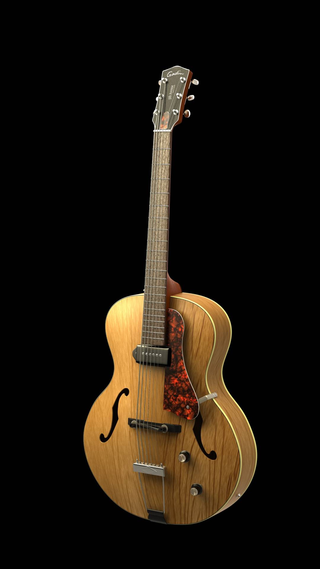
 12mins for 1440x2560, 2.5mil polygons.
 12mins for 1440x2560, 2.5mil polygons.

(High-res) I finished up my guitar modeling in record time! Took me 3 days of constant work, but I managed to overtake my deadline beyond my expectations. I resolved to take a well deserved couple days off, and as a result I was rather bored for the remainder of the week! Looking at it again, there are many things I could have busied myself with, mainly of the shading variety. I'll tie up the loose ends and finish up all the rendering/lighting bits this week. 

Shit, I don't even know where to start... Booleans! Yeah, they're pretty cool...

Booleans

The term boolean when used in a programming environment refers to a true or false value. The term boolean in a modeling environment means, uh... This:

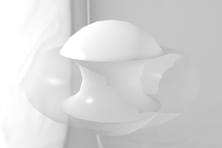
No Caption Provided

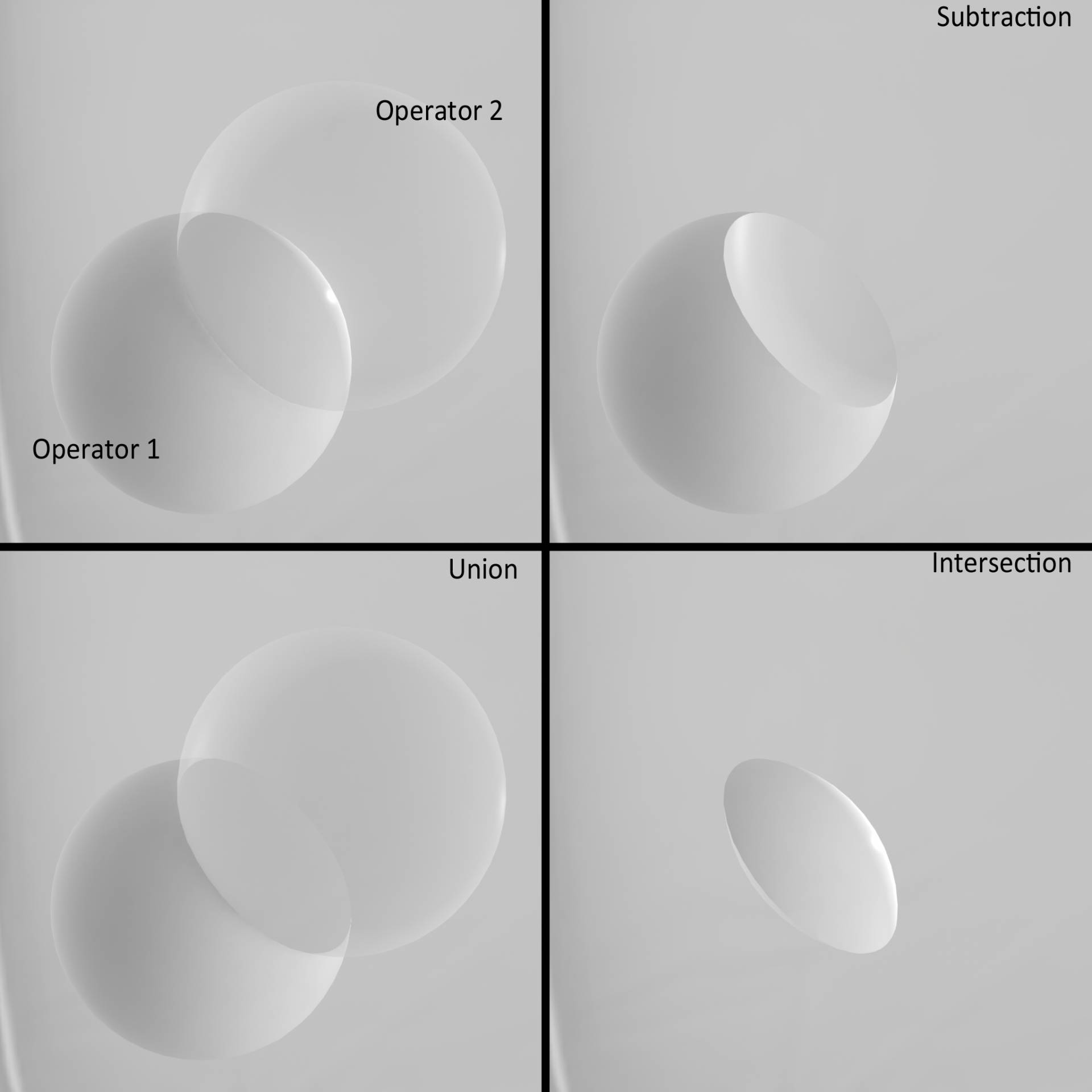
Booleans allow you to work with the relationship between two meshes, using your typical math with their typical meanings.

No Caption Provided

Subtraction

Operator 2 is being subtracted from operator 1.

Union

Operators are being added with equal priority, intersecting polygons are deleted.
Intersection
Operators are added with equal priority, non-intersecting polygons are deleted.
Add (Not pictured)
Operators are added with equal priority, no polygons are deleted.

Using booleans, you can make extremely complex shapes that may take 20-30 minutes using traditional methods in mere seconds! However, when you take a closer look at it from a polygonal perspective, a problem is presented.

No Caption Provided

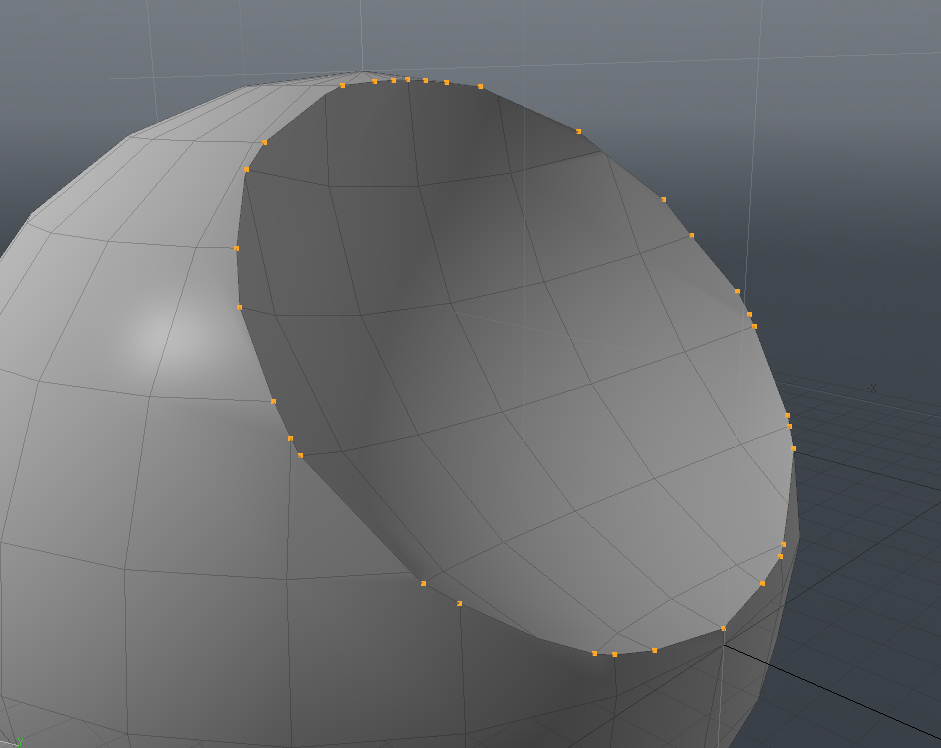
The subtraction is very literal, operator 2 leaves an imprint of itself on operator 1. That means vertices are places they shouldn't be and certain edges are not fused properly and are disconnected from each other. Compound this with the fact that a boolean operation only works on a "closed" mesh (A mesh with no gaps) and hopes for additional booleans to achieve your final shape are lost (can be done in a single boolean, but I digress). The mesh can be repaired with a bit of hard work though, and often enough it proves to be completely justified in the face of other more arduous methods. Booleans are most often used as a means as opposed to an end.

There are programs that use booleans as the main modeling method, usually referred to as CAD (Computer assisted design) modeling. UDK is an example of one, any modelling done inside that program is done with booleans only. This is used for mapping out basic level designs. In boolean-only programs, the mesh is generated procedurally, constantly changing in order to accommodate any new changes. The only real weakness to this method is that the meshes produced are rather poorly optimized. We're getting to a point where poly counts on these models are not too much of an issue, but their's no chance that they can be animated in an organic fashion. 

CAD programs are predominantly used in engineering, creating highly accurate models of their product for proof of concept and many other purposes. CAD is a very wide and very important field, even encompassing things like simulating the structural integrity of buildings!

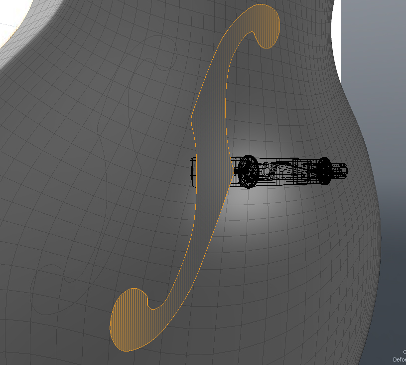
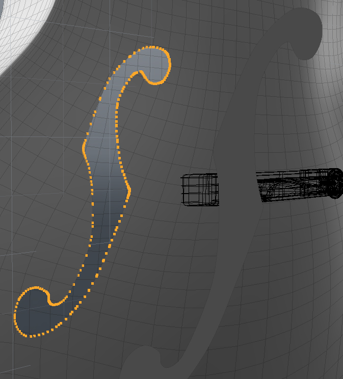
This all relates to this project because I used a boolean in order to create the F-note holes in the guitar.

No Caption Provided

In order to accomplish this, I used what could be referred to as a 2D boolean. A 2D boolean, as you may have guessed, only cuts in 2 dimensions in the X,Y, or Z direction. I made a single polygon in the shape of the F-note and used it as the operator to imprint the shape on the body of the guitar.

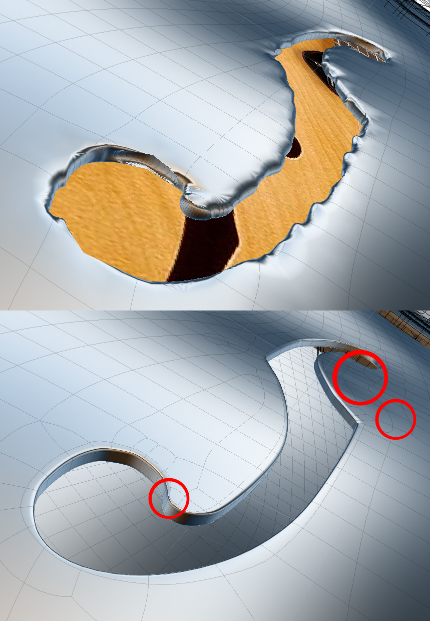
No Caption Provided

I then delete the area and start reducing the amount of vertices around the edge. The same result could have been achieved by reducing the vertices on the actual F-note shape before the boolean. Once I'm reasonably satisfied, I use a tool that gives the mesh some thickness.

 highlighted areas are minor shading and smoothing errors that persisted.
 highlighted areas are minor shading and smoothing errors that persisted.
Then it's just down to securing the shape so it works when I sub-divide the mesh again. This mostly consisted of deleting edges that were really not doing much in terms of defining the shape, and securing the ones that were. I used a special realtime shader that approximates the way a mesh would reflect, which gives me important information on how the mesh is smoothing. The rule that quads (Polygons with four edges) are best largely goes out the window here; It's alright to do whatever it takes in this instance as long as you pay close attention to the smoothing and shading of the mesh. The areas I highlighted are not exactly perfect but it's within the allowable limit for me, especially when the material of the body won't be particularly reflective, nor would it be viewed at such an oblique angle. I also used this exact same method to cut the hole for the pickup in the body.

Oh jeez! I have a surplus of blog here, haven't even started in on the shading part! I'll leave it at that for now, nobody likes reading long things and I don't like typing them. I might continue on this subject next week or I may just proceed onward to something new, who knows.

I hope that made some degree of sense. Comments/Criticisms welcome!
1 Comments
  • 21 results
  • 1
  • 2
  • 3