Something went wrong. Try again later

BlazeHedgehog

This user has not updated recently.

1286 16034 51 164
Forum Posts Wiki Points Following Followers

The New Xbox Dashboard is slightly a trainwreck

I've hardly been a critic of the previous iterations of the Xbox Dashboard. Sure, there have been some small complaints here or there, but never have I felt genuine offended by the way things were laid out. That all changed with the release of the 2011 Xbox Dashboard. While on the surface it's generally pretty usable, there are a lot of things about it that feel like they were constructed by unfeeling logic robots who don't really understand how human beings comprehend interface.
 

 1000/1000 in Sonic Generations and STILL playing it. Word.
 1000/1000 in Sonic Generations and STILL playing it. Word.
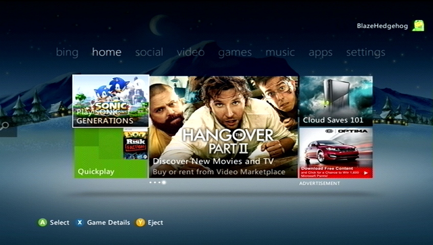
Let's start at the first screen you're met with, the home screen. While an improvement over the "Spotlight" channel from the previous dashboard iteration, it's really not much better. The major complaint people had with the Spotlight channel was that it was essentially a row of unskippable ads you were met with when you first booted your console up, forcing you to manually scroll up to the "Launch Game" option. On the new 2011 Dashboard, your cursor starts on the "Launch Game" option, but they've still worked as hard as possible to flood the bulk of your screen with as many advertisements as there is room for them.
 
STOP PLAYING SO MANY VIDEOGAMES AND BUY SOMETHING ALREADY
To a certain degree, I get why they would want to do this. The best comparison would be Valve's Steam platform on the PC; if you go in to their marketplace, you're basically looking at a huge string of advertisements for everything on their site. It's how they get you to discover new content. If they can't advertise what they have, then you won't know it's available for purchase. There is, however, a pretty significant difference between the way Steam does business and the way Microsoft is trying to do business. When I open Steam to play a game, this is the first thing I see:
 
 You don't think it's too subtle, Marty, you don't think people are going to drive down and not see the sign?
 You don't think it's too subtle, Marty, you don't think people are going to drive down and not see the sign?
That's because Steam lets me customize my view. By default it's set up to take you to the store page first thing, but with a few simple clicks you can launch Steam directly in to your game library and skip the whole "Dude check it out, Orcs Must Die is only $3 today" advertisement screen. Microsoft still doesn't let you do this, even if you're a paying Xbox Live Gold customer. This was actually the primary feature request with the Spotlight channel - there needed to be some way to let people skip all the ads and get right to playing a game. Instead, Microsoft's solution is to give you the option to play whatever is in the disc drive and the ten most recently used/downloaded games and "apps". One step in the right direction, but two steps back, given that the ads are bigger and more pervasive than ever. (this is saying nothing of the fact that Steam only advertises games on Steam, but the Xbox Dashboard has no problem trying to sell me cars and pizza and movie tickets and World of Warcraft subscriptions)
 
But all of that would be fine if it was the only transgression. But no - the new Xbox Live Dashboard commits sins far more egregious than simply bloated advertising space. Namely, what a pain in the ass it is to get to anything actually related to videogames. Sure, you have the two launch options on the Home menu - but if what you want to play isn't located in either of those options, you have to scroll through two other sections just to get to the "games" part of your game console. Again, comparisons to Steam are apt: I start with a list of every game I own and every game I have installed staring me in the face in that piece of software. On the Xbox Dashboard, I have to go on some kind of safari to find the games I have installed, braving the wilderness of the "social" and "video" categories. And while I own over $400 worth of Xbox Live content, you'd never know it because the dashboard still does not have any way of showing you a complete list of content you've purchase - you're only shown what's currently on the console at that point in time. It's completely up to you to keep track of what you own ( Backloggery has been a lifesaver in this regard), and if you want to replay any of it, you're forced to manually hunt that content down through the hellish landscape known as the "Game Marketplace".
 
 Look upon my visage, ye mighty, and despair!
 Look upon my visage, ye mighty, and despair!
For years, Microsoft has struggled to find a way to organize content on the Xbox Marketplace to allow room for growth while also organizing everything in a way that everybody can easily find it. The problem it came down to in the past is that it required too many "clicks" in order to drill down and find what you wanted. Again, not to keep going back to it, but Steam can be made to either show you a list of games you might want to buy or a list of games you might want to play as the first thing you see when you launch the software. Previous iterations of Xbox Live required you to flip through multiple sections and sub-categories just to finally get to a page that showed the most recent Xbox Live Arcade releases.
 
This, unfortunately, has not changed. Infact, given the fact that you have to scroll through the "Social" and "Video" tabs just to get to "Games" where the marketplace button is located, everything is potentially buried even deeper now than it ever has been. To make matters even worse, the actual Game Marketplace itself has been transformed in to a nearly unusable disaster. Broken out in to its own six categories, the Game Marketplace as it stands right now on the 2011 Xbox Live dashboard update is bloated and obtuse in a way that is genuinely shocking to me. It's so bad that I'm kind of at a loss for where to start, so we'll start by simply running down each category and it's function: 

  1. "Picks" - This is where games are recommended for purchase based on what the user has recently played and/or purchased.
  2. "Featured" - This is where games are recommended for purchase based on how much money Microsoft has been paid to advertise them.
  3. "Games" - This is theoretically where you are meant to discover new games for purchase.
  4. "Add-ons" - This is where downloadable content lives.
  5. "Extras" - This is where frivolous, overpriced garbage like avatar clothes and premium themes/gamerpics live, in addition to stuff like Halo Waypoint/Call of Duty Elite.
  6. "Demos" - Provided its own entire category, because, uh... well, er....

You may immediately notice that the first three categories are actually the exact same thing presented in three different ways: They are categories designed to get you to find and buy new games. Imagine logging in to Netflix and having three separate categories for recommendations instead of just one (one based on a computer algorithm, another based on how much Netflix was paid to recommend them to you, and a third category called "recommend a movie to yourself"). These three categories could be pretty easily be wrapped up in to one singular place with "Recommendations" and "Featured Games" being sub-sections in the "Games" category. 
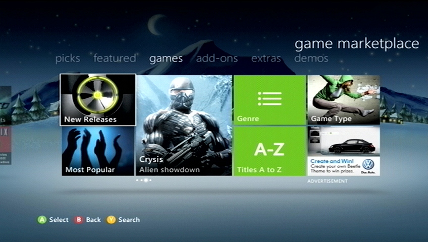
 

It's so horrifying, and yet I can't look away!

Instead, we get the worst jumble of icons in the history of interface. This page right here is bad enough on its own that it deserves to be broken down point by point. To start: The icons they use for these features. We have a strange mish-mash of stock photos and more common pictograph-like icon artwork. The most immediate effect this had was that at first glance I seriously thought the only way to view a list of games was either by genre or alphabetically. "New Releases" and "Most Popular" didn't even register as filtering options, and even when they did, it literally took repeated visits to this category before I discovered that "Game Type" was the way I chose between Xbox Live Arcade, Xbox Indies, Games on Demand, and Xbox Originals. There was a period of about 15 minutes where I was genuinely pissed off that they had taken away the ability to sort games "by platform" because there is no way an actual human brain makes the connection between an image of a stupid asshole in a hoodie doing parkour with choosing whether or not I want to look at Xbox Indies or Xbox Live Arcade games. They all need to be green background with white text icons because that's how you let the user know they are system functions and not advertisements or temporary promotions. And you especially do not mix and match one style with another style. Either go whole-hog with your stupid unrelated stock photos or don't because this is bad enough that it almost seems like you're deliberately sabotaging yourselves, Microsoft.
 
Similarly, there's not enough immediate distinction between "Add-Ons" and "Extras". Both terms basically mean the same thing, but Microsoft has to have their gross little corner where they charge people $7 for an intangible, completely worthless Master Chief costume for their fake computer person (or $3 for what essentially equates to a few JPEG thumbnails). Another problem with this section? The "Most Popular" sorting filter makes a return appearance, but in a completely different spot than it is in other Game Marketplace categories.
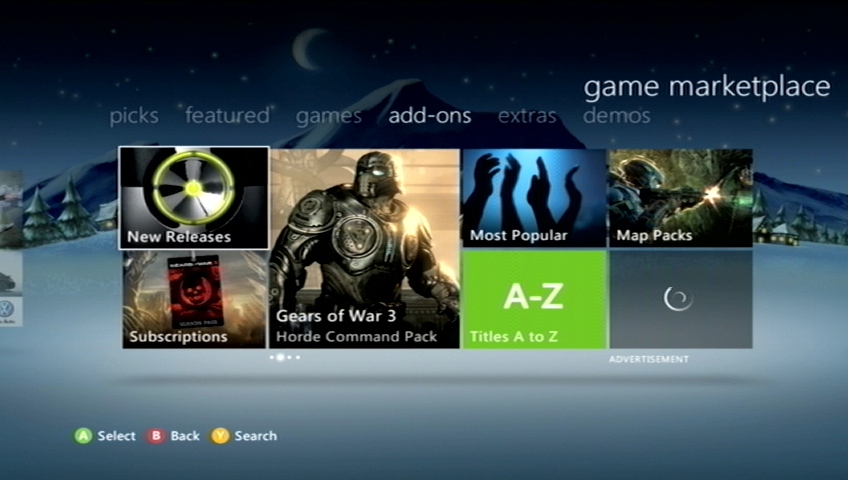
 

 Consistency is not Microsoft's strongest suit
 Consistency is not Microsoft's strongest suit

Are you deliberately trying to make users get lost? It only reinforces the idea that "Most Popular" isn't a specific system menu function, but is instead some kind of temporary promotional deal. I realize you just had to make room for the new "Subscriptions" sub-section (fits with the massive amount of Gears of War 3 branding in this category) but I'm pretty sure it would have made more sense to keep "Most Popular" in the same location and move "Subscriptions" up above "A to Z", given that's the space that was removed to make room for "Subscriptions" in the first place!
 
Which of course brings us to "Demos", another category that could've probably been rolled in to simply "Games" somehow (if only Microsoft wasn't so keen on me buying a new Volkswagen). There's simply not enough content here to justify having it's own entire category, as evident by the fact that Kinect demos get broken out in to their own unique sub-section. 
 
And the worst part is? If they simply scaled back the advertising space and really stopped to think about how to effectively use the space they've been given, there's plenty of ways to shortcut a lot of these things to make product exposure easier and more streamlined. It took me 20 minutes to come up with this idea: 
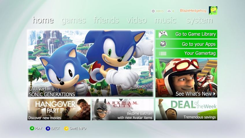
 

A bit of a rough draft, but workable


The most important information all on one screen. Launch the game, go straight to your game library, and most importantly, a direct link to the game marketplace without having to thumb through multiple menus to get there. Not only that, but advertising links to video content, avatar content, and the deal of the week. On one screen. It's really not very difficult. It just means you don't give the advertisements top billing - something Microsoft probably isn't willing to do.
 
But until they they, we're always going to have dashboard revisions where you constantly have some Microsoft mouthpiece telling us how they're "redesigning the dashboard to make it easier to find content" when all they really mean is "we're making the ads bigger and shuffling some buttons around". 
 
And this isn't even touching any of the other problems with the new dashboard I've heard from other folks, either! (See: Netflix) It's kind of gross!

68 Comments

71 Comments

Avatar image for pitta
Pitta

222

Forum Posts

633

Wiki Points

0

Followers

Reviews: 1

User Lists: 0

Edited By Pitta

These complaints are weak. The ad space is used for related content to the tab you ate on for all spaces except the bottom corner labeled 'advertisement'. Home mixes them all, games shows new releases and sales, etc. I love having all that stuff surfaced. It's no different than the previous dash. But it wouldn't be a MS release without someone crying over spilt milk... *sigh*

Avatar image for imsorrymsjackson
Imsorrymsjackson

866

Forum Posts

0

Wiki Points

0

Followers

Reviews: 0

User Lists: 0

Edited By Imsorrymsjackson

I don't notice it, I boot up my Xbox and click A to start my game up, done.

Avatar image for dany
Dany

8019

Forum Posts

416

Wiki Points

0

Followers

Reviews: 0

User Lists: 4

Edited By Dany

The blades do not work in 2011. Everyone goes back to them as the pinnacle of great UI layout but considering where the xbox was and not realizing that 'marketplace' would be a huge deal the iterative changes they've made to the blades to compensate to people buying from the marketplace just made it bad.

Avatar image for blazehedgehog
BlazeHedgehog

1286

Forum Posts

16034

Wiki Points

0

Followers

Reviews: 30

User Lists: 3

Edited By BlazeHedgehog
@Imsorrymsjackson said:

I don't notice it, I boot up my Xbox and click A to start my game up, done.

So you've never bought anything from Xbox Live Arcade, nor any DLC? 
 
@Pitta said:
These complaints are weak. The ad space is used for related content to the tab you ate on for all spaces except the bottom corner labeled 'advertisement'. Home mixes them all, games shows new releases and sales, etc. I love having all that stuff surfaced. It's no different than the previous dash. But it wouldn't be a MS release without someone crying over spilt milk... *sigh*

But it's not organized, it's all jumbled up and all none of the icons look consistent. Browsing GAF and other sites, there's plenty of people who don't even know what the "Game Type" button does in the game marketplace, because the icon for it doesn't make a lick of sense, and that's the whole dashboard in a nutshell right there.
 
Things like suggesting new games based on ones you already own is nice. The new dash does make some strides forward, but it also takes some pretty massive ones back, too.
Avatar image for theseductivemoose
TheSeductiveMoose

3629

Forum Posts

274

Wiki Points

0

Followers

Reviews: 0

User Lists: 3

Fuck. It's been a long time since I turned on my 360.

Avatar image for imsorrymsjackson
Imsorrymsjackson

866

Forum Posts

0

Wiki Points

0

Followers

Reviews: 0

User Lists: 0

Edited By Imsorrymsjackson

@BlazeHedgehog: Nah, never, I have had DLC come on discs before, but I just hit the xbox button and go that way to type in the code.

Avatar image for blatantninja23
BlatantNinja23

933

Forum Posts

267

Wiki Points

0

Followers

Reviews: 0

User Lists: 0

Edited By BlatantNinja23

I have no issues with the "ads"... the majority of them are all stuff which is on the marketplace or new features. They are things I want the dashboard to be telling me thats available. Should the bottom right ad really be there? Probably no, but its always muted and honestly doesn't bother me either.

I still "enjoy" using the Xbox's marketplace though more then I ever do PSN's

Avatar image for vegetable_side_dish
Vegetable_Side_Dish

1783

Forum Posts

274

Wiki Points

0

Followers

Reviews: 0

User Lists: 0

While I agree that the square panels can look a bit cluttered, I don't think, on it's own, that the design is bad. 
What's bad is when you compare it to Steam and the XMB; both free, both ad-free, and both with features that the 360 dashboard needs. 

Avatar image for andorski
Andorski

5482

Forum Posts

2310

Wiki Points

0

Followers

Reviews: 0

User Lists: 3

Edited By Andorski

Not sure if it means much, but I think the newest UI makes a lot more sense than the previous two. In each panel, the most pertinent options (which are usually your content and the marketplace) are on the left side of the screen. That is where the cursor starts at also, so you don't have to move over all the ads in order to select the appropriate option you want. The new layout also displays much more information on the screen compared to the last two NXEs while also feeling less cluttered.

The mini-guide still stands as the best interface on the 360. It has the functionality of the old Blades but with a minimalist design that is more aesthetically pleasing.

Avatar image for pitta
Pitta

222

Forum Posts

633

Wiki Points

0

Followers

Reviews: 1

User Lists: 0

Edited By Pitta

OP - I disagree entirely. I don't personally care about Steam comparisons because I don't pc game anymore for the most part. And ANY version of the Xbox Dash is better than the trash on competing consoles.

Avatar image for blazehedgehog
BlazeHedgehog

1286

Forum Posts

16034

Wiki Points

0

Followers

Reviews: 30

User Lists: 3

Edited By BlazeHedgehog
@Andorski said:

Not sure if it means much, but I think the newest UI makes a lot more sense than the previous two. In each panel, the most pertinent options (which are usually your content and the marketplace) are on the left side of the screen. That is where the cursor starts at also, so you don't have to move over all the ads in order to select the appropriate option you want. The new layout also displays much more information on the screen compared to the last two NXEs while also feeling less cluttered.

The mini-guide still stands as the best interface on the 360. It has the functionality of the old Blades but with a minimalist design that is more aesthetically pleasing.

 
But none of the icons look consistent. None of them are in consistent locations. Sometimes they're stylized to look like system functions, sometimes they're stylized to look like ads, sometimes the sorting option you want is on the left side of the screen, sometimes the exact same sorting icon has been moved to the right side of the screen for absolutely no reason. That is the complete opposite of "making sense".
 
Think of it this way: part of the "fun" (if you can call it that) of learning an interface is memorizing where everything is so that you can get to what you need strictly by muscle memory alone. Forget about keyboard shortcuts for a minute and consider the difference between watching somebody who knows computers copy/paste a file and watching an old person using the computer for the first time copy/paste that same file. Consistency in interface means that the "copy" and "paste" features are in the same place on all menus, allowing you to quickly and easily identify those options and use them with as little effort as possible.
 
But imagine you're using Windows and every time you open a menu, all of the features were in a completely different order. Instead of "Undo", "Cut", "Copy", "Paste, "Delete", and "Select All" in that order, the next time you open that menu, it's "Delete", "Paste", "Select All", "Copy", "Undo", "Cut", and for some reason, some (but not all!) of the options are now represented by photographs of scissors, glue, and some random girl doing parkour. 
 
That's what's going on here and it's patently ridiculous.
 
@Pitta said:

OP - I disagree entirely. I don't personally care about Steam comparisons because I don't pc game anymore for the most part. And ANY version of the Xbox Dash is better than the trash on competing consoles.


It doesn't matter if you play PC games or not and choosing ignorance like that is sort of a dumb counter-argument to what I'm saying. "This turd smells slightly worse than the other piles of crap" isn't exactly the most sound reasoning, either.
Avatar image for andorski
Andorski

5482

Forum Posts

2310

Wiki Points

0

Followers

Reviews: 0

User Lists: 3

Edited By Andorski

@BlazeHedgehog said:

@Andorski said:

Not sure if it means much, but I think the newest UI makes a lot more sense than the previous two. In each panel, the most pertinent options (which are usually your content and the marketplace) are on the left side of the screen. That is where the cursor starts at also, so you don't have to move over all the ads in order to select the appropriate option you want. The new layout also displays much more information on the screen compared to the last two NXEs while also feeling less cluttered.

The mini-guide still stands as the best interface on the 360. It has the functionality of the old Blades but with a minimalist design that is more aesthetically pleasing.


But none of the icons look consistent. None of them are in consistent locations. Sometimes they're stylized to look like system functions, sometimes they're stylized to look like ads, sometimes the sorting option you want is on the left side of the screen, sometimes the exact same sorting icon has been moved to the right side of the screen for absolutely no reason. That is the complete opposite of "making sense".

Think of it this way: part of the "fun" (if you can call it that) of learning an interface is memorizing where everything is so that you can get to what you need strictly by muscle memory alone. Forget about keyboard shortcuts for a minute and consider the difference between watching somebody who knows computers copy/paste a file and watching an old person using the computer for the first time copy/paste that same file. Consistency in interface means that the "copy" and "paste" features are in the same place on all menus, allowing you to quickly and easily identify those options and use them with as little effort as possible.

But imagine you're using Windows and every time you open a menu, all of the features were in a completely different order. Instead of "Undo", "Cut", "Copy", "Paste, "Delete", and "Select All" in that order, the next time you open that menu, it's "Delete", "Paste", "Select All", "Copy", "Undo", "Cut", and for some reason, some (but not all!) of the options are now represented by photographs of scissors, glue, and some random girl doing parkour.

That's what's going on here and it's patently ridiculous.

As far as the front end of the UI goes, all the icons look like system functions (as in they are green and contain a symbol rather than a picture of something). In all panels that have a sorting feature, the sorting option is always on the top left (unless there is an app that has the sorting option on the top right; all the apps I have put it top left just like the rest of the UI). In the marketplace is where options to open up sub menus and advertisements can be confused with each other since some options have pictures on them while others are the plain green icon with symbol. It can be befuddling at first, but since they always stay in the same place, then muscle memory will compensate for any visual confusion. Not to mention that all icons, whether it is just a green button with a symbol or a picture that looks like an advertisement, has it's function written at the bottom (e.g. The New Releases icon that is a picture of the 360's power button has "New Releases" written on it; The A to Z icon that is just a green button with A-Z as it's symbol has "A to Z" written on it).

This is where your "Right Click on Windows OS" metaphor is flawed. All options in the marketplace to open up sub-menus stay in the same place. The "Most Popular" sub-menu option for the Add-Ons panel in the Games Marketplace will always be in the top, second-to-the-left position. It's not going to one day move to the bottom left corner. Now, the "A to Z" option in the Movie panel of the Video Marketplace is not in the same position as the "A to Z" option in the Demos panel of the Games Marketplace. That isn't different from how right clicking in Windows works though. Right clicking in this textbox has "Copy" as its fourth option. If I open a .pdf in this browser, then "Copy" is listed as its first option. If I open Microsoft Word and right click, then "Copy" is listed as its second option and has a symbol to the left of it.

Avatar image for pitta
Pitta

222

Forum Posts

633

Wiki Points

0

Followers

Reviews: 1

User Lists: 0

Edited By Pitta

All the of system level functions on the dash are ALWAYS in the same place. Arguing with OP is exaushting. New dash is great, and best in class. OP is probably just a tech sperg that crows anytime something changes. I encourage anyone with half a brain to use the thing objectively, and process where things are and how the new design language is read.

Avatar image for pitta
Pitta

222

Forum Posts

633

Wiki Points

0

Followers

Reviews: 1

User Lists: 0

Edited By Pitta

The only thing I dislike is the layout of the game marketplace itself. It needs some more TLC. and the new Netflix looks like it was made by a stoned intern.

Avatar image for will_m
will_m

385

Forum Posts

120

Wiki Points

0

Followers

Reviews: 0

User Lists: 0

Edited By will_m

The new dash is garbage. It caters to the millions of people who went out a bought a the 360+Kinect bundle so that they could go home and see all the wonderful things MS can offer on the 360. Like the Zune marketplace. And Netflix. And the... Today Show?

Anyways, it just feels like the dashboard has evolved into a bunch of stuff thats... nice to have, but doesnt work nearly as well as it should. MS has made it pretty clear that the 360 now does, "this, this and that and oh yeah, you can play some games". Its great that this system can do a million other things than what it did at launch. But why not let us pick what we want on our home screen? I could go on forever about this so i'll just stop now.

Avatar image for kontx
KontX

124

Forum Posts

1

Wiki Points

0

Followers

Reviews: 0

User Lists: 1

Edited By KontX

I personally loved the previous version. This new one is meh. I can deal with it till a (hopefully better) new version is out. But, my God, they broke Netflix. Unforgivable.

Avatar image for zippedbinders
Zippedbinders

1198

Forum Posts

258

Wiki Points

0

Followers

Reviews: 1

User Lists: 14

Edited By Zippedbinders

@Pitta said:

OP - I disagree entirely. I don't personally care about Steam comparisons because I don't pc game anymore for the most part. And ANY version of the Xbox Dash is better than the trash on competing consoles.

Sony's current system is leaps and bounds above the 360's garbage menus, and disavowing Steam's interface because you don't care doesn't support your point. It just makes you look ignorant.

Avatar image for mtcantor
mtcantor

986

Forum Posts

1180

Wiki Points

0

Followers

Reviews: 0

User Lists: 1

Edited By mtcantor

RISE FROM YOUR GRAVE!

Anyhow, the "new" dashboard is still awful.

The real issue is that every time Microsoft does anything to update it, everything gets slower and slightly less stable. Booting up my system is starting to take longer and longer, loading netflix or HBO Go is intolerable, and I have had way more crashes since the updates than I used to.

Great stuff.

Avatar image for justin258
Justin258

16684

Forum Posts

26

Wiki Points

0

Followers

Reviews: 11

User Lists: 8

Edited By Justin258

Yeah, the layout is awful and ugly and a major turn-off, but it's still usable. The real issue here - and one that is completely undeniable - is the multitude of people, myself included, complaining about the long fucking load times. Thirty second long boot time? Sure. All right. Thirty seconds for every fucking menu to load? No, no, that's not good. That indicates a massive flaw in your system, and this is no small issue. And some people have reported menu loading issues of more than thirty seconds, sometimes up to two minutes or more just for quickplay to load. Quickplay, people!

Also, obligatory "old thread" comment.

Avatar image for mtcantor
mtcantor

986

Forum Posts

1180

Wiki Points

0

Followers

Reviews: 0

User Lists: 1

Edited By mtcantor

@believer258 said:

Yeah, the layout is awful and ugly and a major turn-off, but it's still usable. The real issue here - and one that is completely undeniable - is the multitude of people, myself included, complaining about the long fucking load times. Thirty second long boot time? Sure. All right. Thirty seconds for every fucking menu to load? No, no, that's not good. That indicates a massive flaw in your system, and this is no small issue. And some people have reported menu loading issues of more than thirty seconds, sometimes up to two minutes or more just for quickplay to load. Quickplay, people!

Also, obligatory "old thread" comment.

"Quick"play.

Avatar image for pitta
Pitta

222

Forum Posts

633

Wiki Points

0

Followers

Reviews: 1

User Lists: 0

Edited By Pitta

I was more so saying that I don't really know much about Steams interface because I don't use it. The fact that anyone can say the shitshow PS3 interface is better than the 360 dash is on some killer drugs, and isn't sharing with me.