
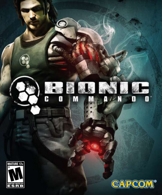
Achievement Icons - The Worst!
Ugh.. We understand your Lead Artist is busy, but these look like an afterthought. And could you please go easy on the Photoshop filters?
(Numeric order not important)
Ugh.. We understand your Lead Artist is busy, but these look like an afterthought. And could you please go easy on the Photoshop filters?
(Numeric order not important)
The metaphors shall never die, but they are a bit of a stretch.
And glass bevels. o rly? ya rly.
Dull art, dull descriptions.
Very repetitive.
Very repetitive.
Painfully repetitive.
SCORE. CLEAR. ROOM. CRAP.
Repetitive!
Repetitive!
Repetitive!
Boring.
Numbers?
Simplistic and unrelated to achievement.
Repetitive w/ numbers.
Glass button experiment?
Ranked repetition.
Much like the gameplay, there's a lot of repetition.
Much like the gameplay, plenty of repeats.
Excessive overuse of portraits.
"Give me a pic, Vasili. One pic only, please."
An odd experiment of glass effect and combining vaguely related transparent layers.
Ahhhh.. all the same, AND a 321G to top it off.
Such a thing as too much bling.
They look very pretty, but no consistency on one regard and too repetitive in another.
No real connection between the award and the... is Unrelenting Rage a "happy meal"?? Wtf?
Using that damn checkered flag clip art is just for starters. Using text that states the goal is proof you didn't even have time to give the job to your artist.
Artistically cohesive, but... boobs with dollar signs. Shared to facebook. What a brave and terrible world we live in.