Something went wrong. Try again later
    Follow

    Street Fighter IV

    Game » consists of 9 releases. Released Jul 18, 2008

    After nearly a decade in hiatus, Capcom's signature mainline fighting game series resurfaces with its fourth main installment, combining the traditional 2D gameplay with modern fully-3D graphics.

    Crit my TE art

    Avatar image for animoney
    AniMoney

    962

    Forum Posts

    5

    Wiki Points

    0

    Followers

    Reviews: 0

    User Lists: 1

    #1  Edited By AniMoney

     
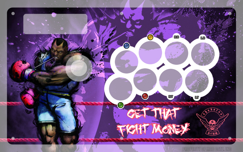
    So I'm planning on doing the plexi + art mod for my TE stick soon. But I wasn't really sure what I should put on it though. I made this template when I first got my TE but was too scared to mod it then. 
     
     Do you think I should go with this or make a new one? If you think I should change something on this one let me know. Or If you think I should make a new one feel free to shout out some suggestions or ideas. I'm open to anything. 


    Avatar image for symphony
    Symphony

    1933

    Forum Posts

    284

    Wiki Points

    0

    Followers

    Reviews: 33

    User Lists: 0

    #2  Edited By Symphony

    Love the purple. The text and the symbol in the bottom right don't do anything for me, but they're not bad per se.
     
    Honestly, I don't see anything wrong with it. Again, purple wins.

    Avatar image for beargirl1
    beargirl1

    12935

    Forum Posts

    14417

    Wiki Points

    0

    Followers

    Reviews: 1

    User Lists: 24

    #3  Edited By beargirl1
    @Symphony said:
    " Love the purple. The text and the symbol in the bottom right don't do anything for me, but they're not bad per se.  Honestly, I don't see anything wrong with it. Again, purple wins. "
    yeah, exactly what she said
    Avatar image for lordofultima
    lordofultima

    6592

    Forum Posts

    25303

    Wiki Points

    0

    Followers

    Reviews: 4

    User Lists: 9

    #4  Edited By lordofultima

    Text and symbol are the best part IMO, looks dope as hell. Love the fight ropes.

    Avatar image for jjor64
    JJOR64

    19700

    Forum Posts

    417

    Wiki Points

    0

    Followers

    Reviews: 3

    User Lists: 5

    #5  Edited By JJOR64

    BALROG SUCKS, HONDA FTW!!!!!!!!!!!!!!!!!!!!!!!!!!!!!!               j/k
     
    That looks sick.  I should get some awesome artwork for my stick, but I'm to fucking lazy.

    Avatar image for jeffsekai
    Jeffsekai

    7162

    Forum Posts

    1060

    Wiki Points

    0

    Followers

    Reviews: 0

    User Lists: 5

    #6  Edited By Jeffsekai

    MAH FIGHT MONEYYYYYYYYYYYYYYYYYYYYYYYYYYYYYYYYYYYYYYYYYYYYYYYYYYYYYYYYYYYYYY

    Avatar image for foodchainn
    foodchaiNN

    217

    Forum Posts

    0

    Wiki Points

    0

    Followers

    Reviews: 0

    User Lists: 0

    #7  Edited By foodchaiNN

    GOOD:  I like the purple although its a bit soft for a character like Balrog and I think the ropes are cool along with the larger background shadow of Balrog.
     
     
    BAD: I think Balrog himself is a bit tacky for the kind of usage because he's tightening up his glove laces in the ring.. who does that? The text and symbol should have been places above the buttons since your hands will cover the current position most of the time and I'm not sure how much you want to represent the obvious fact you have an XBOX TE stick with the XBOX button labels but that's a bit unnecessary unless you have personal reasons such as playing other types of games on mame32 or something. Also its just my personal preference but the button borders need a little bit more creativity to them because right now they are not only dominating your design but also giving a in-store product feel instead of a custom design feel.
     
    I hope I don't come off as arrogant but those are my honest picks on it. Overall its a great design and concept.

    Avatar image for dbz1995
    dbz1995

    4962

    Forum Posts

    3989

    Wiki Points

    0

    Followers

    Reviews: 2

    User Lists: 2

    #8  Edited By dbz1995

    NO THAT SUCKS GET RID OF IT AND GIVE THAT ONE TO ME
     
    Honestly, its awesome.

    Avatar image for deactivated-57beb9d651361
    deactivated-57beb9d651361

    4541

    Forum Posts

    0

    Wiki Points

    0

    Followers

    Reviews: 0

    User Lists: 4

    I usually like them a lot cleaner looking, simple lines and that, but this is actually pretty nice.

    Avatar image for c1337us
    c1337us

    5877

    Forum Posts

    56

    Wiki Points

    0

    Followers

    Reviews: 0

    User Lists: 0

    #10  Edited By c1337us

    I really like it. The colours and designs are generally great, I like the purple. But the text and logo aren't quite right. I am not sure exactly it's not that they are bad they just dont quite fit.

    Avatar image for evilgreendevil
    EvilGreenDevil

    221

    Forum Posts

    27

    Wiki Points

    0

    Followers

    Reviews: 0

    User Lists: 2

    #11  Edited By EvilGreenDevil

    Looks good to me for the most part. It might be a little too busy under the buttons. I dunno maybe get rid of the symbol or the words but not both. Where are you doing to print it and are you going to be regluing it to the top plate of the stick? 
    Avatar image for ineedaname
    Ineedaname

    4276

    Forum Posts

    410

    Wiki Points

    0

    Followers

    Reviews: 3

    User Lists: 0

    #12  Edited By Ineedaname

    I don't think you need the buttons, ruins the flow a little, I think they feel a little out of place, after all I'll assume you'll be using it, so you'll know where the buttons are.

    Avatar image for turbomonkey138
    turbomonkey138

    5288

    Forum Posts

    283

    Wiki Points

    0

    Followers

    Reviews: 0

    User Lists: 1

    #13  Edited By turbomonkey138

    Love it . :)

    Avatar image for lordofultima
    lordofultima

    6592

    Forum Posts

    25303

    Wiki Points

    0

    Followers

    Reviews: 4

    User Lists: 9

    #14  Edited By lordofultima
    @foodchaiNN said:

    " GOOD:  I like the purple although its a bit soft for a character like Balrog and I think the ropes are cool along with the larger background shadow of Balrog.     

    I agree.

      BAD: I think Balrog himself is a bit tacky for the kind of usage because he's tightening up his glove laces in the ring.. who does that? The text and symbol should have been places above the buttons since your hands will cover the current position most of the time and I'm not sure how much you want to represent the obvious fact you have an XBOX TE stick with the XBOX button labels but that's a bit unnecessary unless you have personal reasons such as playing other types of games on mame32 or something. Also its just my personal preference but the button borders need a little bit more creativity to them because right now they are not only dominating your design but also giving a in-store product feel instead of a custom design feel.  I hope I don't come off as arrogant but those are my honest picks on it. Overall its a great design and concept. "

    The SF4 Balrog art looks awesome, definitely better than the new SSF4 art of him, in my opinion anyway. The text is fine where it is, there's a lot more retail below the buttons, and who needs to look at your fancy stick slogan AS you're playing the game? I like the button labels, this way if someone else uses his stick they could tell immediately what buttons are what. When people use my SE, they try to hit the confirm (a) button and realize that I've rewired the stick and it is no longer in that location. Which then I have to explain all that crap. The button borders them self I think are also fine, it's just personal preference. It would be dope to see some brass knuckle style around them instead, but that might be difficult to do.
    Avatar image for foodchainn
    foodchaiNN

    217

    Forum Posts

    0

    Wiki Points

    0

    Followers

    Reviews: 0

    User Lists: 0

    #15  Edited By foodchaiNN
    @lordofultima said:

    " @foodchaiNN said:

    " GOOD:  I like the purple although its a bit soft for a character like Balrog and I think the ropes are cool along with the larger background shadow of Balrog.     

    I agree.

      BAD: I think Balrog himself is a bit tacky for the kind of usage because he's tightening up his glove laces in the ring.. who does that? The text and symbol should have been places above the buttons since your hands will cover the current position most of the time and I'm not sure how much you want to represent the obvious fact you have an XBOX TE stick with the XBOX button labels but that's a bit unnecessary unless you have personal reasons such as playing other types of games on mame32 or something. Also its just my personal preference but the button borders need a little bit more creativity to them because right now they are not only dominating your design but also giving a in-store product feel instead of a custom design feel.  I hope I don't come off as arrogant but those are my honest picks on it. Overall its a great design and concept. "

    The SF4 Balrog art looks awesome, definitely better than the new SSF4 art of him, in my opinion anyway. The text is fine where it is, there's a lot more retail below the buttons, and who needs to look at your fancy stick slogan AS you're playing the game? I like the button labels, this way if someone else uses his stick they could tell immediately what buttons are what. When people use my SE, they try to hit the confirm (a) button and realize that I've rewired the stick and it is no longer in that location. Which then I have to explain all that crap. The button borders them self I think are also fine, it's just personal preference. It would be dope to see some brass knuckle style around them instead, but that might be difficult to do. "

    The SF4 Balrog art looks awesome, definitely better than the new SSF4 art of him, in my opinion anyway.
     
    your opinion but I think that balrog pic sucks, in my opinion anyway.
     
    "
    The text is fine where it is, there's a lot more retail below the buttons, and who needs to look at your fancy stick slogan AS you're playing the game?
     
    Wrong, there is less text on the retail TE stick and any decent brain can look down at his stick and see that. Also since your hands are covering most of the stick AS you are playing.. it would be cool and creative to have something showing above your hands corresponding with the buttons.
     

    I like the button labels, this way if someone else uses his stick they could tell immediately what buttons are what.
     
    Anybody who doesn't know the standard street fighter button layout after all of these years or even get a good hint from the owner of the stick should not pick it up. 
     

    When people use my SE, they try to hit the confirm (a) button and realize that I've rewired the stick and it is no longer in that location.
     
    First of all I'm sure Animoney has posted artwork in concerns of his TE stick and not a modified SE stick. according to his button artwork, I believe his wiring is default like the majority of TE stick owners. 
     

    Which then I have to explain all that crap.
     
    One less problem he would have to go through. 
     

    The button borders them self I think are also fine, it's just personal preference.
     
    The button borders aren't a real threat but effectively dominate everything else because of the contrast from black, blue, purple, and then you have "white" on "white".
     
    "
    It would be dope to see some brass knuckle style around them instead, but that might be difficult to do.
     
    Brass knuckles, Balrog, and ringside rope just does not go together. 
     
    -thx
    Avatar image for gunner_thor
    Gunner_Thor

    76

    Forum Posts

    0

    Wiki Points

    0

    Followers

    Reviews: 0

    User Lists: 0

    #16  Edited By Gunner_Thor
    @AniMoney:

    lose the button icons that are near the actual buttons.  I like the idea with the ropes, but you should give them some dimension.  Try laying it out so that the turnbuckles are offset by an inch from Bolrog, andletting the ropes shoot out in perspective to both sides of the stick.  Play around with the brightness and contrast of the background so it doesnt fight with thhe image of Rog.  Digging the purple.
     
    Avatar image for stang
    Stang

    4755

    Forum Posts

    0

    Wiki Points

    0

    Followers

    Reviews: 0

    User Lists: 1

    #17  Edited By Stang

    That is sick as hell Ani. God I am jealous of you guys :(

    Avatar image for scooper
    Scooper

    7920

    Forum Posts

    1107

    Wiki Points

    0

    Followers

    Reviews: 0

    User Lists: 2

    #18  Edited By Scooper

    Looks great! I say go with it!

    Avatar image for kyreo
    Kyreo

    4680

    Forum Posts

    5544

    Wiki Points

    0

    Followers

    Reviews: 0

    User Lists: 9

    #19  Edited By Kyreo
    @foodchaiNN said:
    " GOOD:  I like the purple although its a bit soft for a character like Balrog and I think the ropes are cool along with the larger background shadow of Balrog.  BAD: I think Balrog himself is a bit tacky for the kind of usage because he's tightening up his glove laces in the ring.. who does that? The text and symbol should have been places above the buttons since your hands will cover the current position most of the time and I'm not sure how much you want to represent the obvious fact you have an XBOX TE stick with the XBOX button labels but that's a bit unnecessary unless you have personal reasons such as playing other types of games on mame32 or something. Also its just my personal preference but the button borders need a little bit more creativity to them because right now they are not only dominating your design but also giving a in-store product feel instead of a custom design feel.  I hope I don't come off as arrogant but those are my honest picks on it. Overall its a great design and concept. "  
    What he said.
    Avatar image for harris
    harris

    841

    Forum Posts

    11

    Wiki Points

    0

    Followers

    Reviews: 0

    User Lists: 3

    #20  Edited By harris

    Lookin' good! I would experiment with some ink splats around the text, perhaps.

    Avatar image for animoney
    AniMoney

    962

    Forum Posts

    5

    Wiki Points

    0

    Followers

    Reviews: 0

    User Lists: 1

    #21  Edited By AniMoney

    Thanks for all your comments guys. 
     
    I guess I'll be sticking with this design and not making a brand new one but I'll make some of the changes recommended.  Also there are too many responses to quote so I'll just bullet it.
     

    • Purple stays, I chose that because the SSF4 balrog art I got actually has hints of purple coming of the ink splatters, I think every character has a color like that. It's not my fav color but I think it looks pretty good.
    • Balrog art probably stays, it's the best of the one's I've found of him. The new SSFIV one isn't as good imo, and there's no vector for it. I could try drawing one myself though.
    • Ropes are the only unique thing about this design really so I think I'll keep them. I'll see if I can make a turnbuckle or bend the ropes to make it look 3d. My photoshop skills are not great though.
    • Some people don't like the shadaloo logo and text, but I can't remove both because it will look too empty. I'll play around with removing one or the other. I don't think they'll look good above the buttons either.
    • I need button labels because the T.E button layout is retarded. RB and RT are on the left of LB and LT? I'm not changing the layout when I rewire though, so I need to keep labels if anyone else wants to play with a different layout, or If I want to play other games. A lot of people said the button layout ruined the flow or w/e. So I'll see if I can change them to something less prominent. Or maybe I'll get them etched on the plexi...
    • The rings around the buttons can still be changed, brass knuckles don't make sense cause he's a boxer, but I'll try something else.
     
    I'll post again later when I've made some changes. I'm not in any rush to do this, so I want to get it looking just right.
    Avatar image for lordofultima
    lordofultima

    6592

    Forum Posts

    25303

    Wiki Points

    0

    Followers

    Reviews: 4

    User Lists: 9

    #22  Edited By lordofultima
    @foodchaiNN: Oh? My bad, didn't know that the Street Fighter layout has been X Y RB A B RT for the last 20 years...how'd you get your hands on a 360 back then? My point, I wouldn't know what button is which if I used the PS3 TE, so I would have trouble remapping them. Whenever I go into button config I still have to think about whether RB is on top, or RT. Text can't go above, because Balrog's beautiful face is on top, yes there is more retail below the buttons than above, not an opinion. The ropes and slogan are awesome, so they need to go somewhere. I really think you're just nit-picking mang. 
    Avatar image for ollyoxenfree
    OllyOxenFree

    5015

    Forum Posts

    19

    Wiki Points

    0

    Followers

    Reviews: 0

    User Lists: 9

    #23  Edited By OllyOxenFree

    Looks awesome!  Sip some grape drank while playing and you're good.

    Avatar image for nrain
    nrain

    1302

    Forum Posts

    9

    Wiki Points

    0

    Followers

    Reviews: 0

    User Lists: 6

    #24  Edited By nrain

    looks better than Cammy's ass...well actually no it doesn't, but it's close.
    Avatar image for tarakun
    Tarakun

    239

    Forum Posts

    12

    Wiki Points

    0

    Followers

    Reviews: 0

    User Lists: 0

    #25  Edited By Tarakun

    That looks awesome. I personally love the text. Balrog is a damn badass. 

    Avatar image for thegreatguero
    TheGreatGuero

    8881

    Forum Posts

    918

    Wiki Points

    0

    Followers

    Reviews: 0

    User Lists: 4

    #26  Edited By TheGreatGuero

    Totally awesome, dude.

    Avatar image for cl60
    CL60

    17117

    Forum Posts

    -1

    Wiki Points

    0

    Followers

    Reviews: 0

    User Lists: 5

    #27  Edited By CL60

    I like it.

    Avatar image for zombiehunterog
    ZombieHunterOG

    3529

    Forum Posts

    590

    Wiki Points

    0

    Followers

    Reviews: 1

    User Lists: 3

    #28  Edited By ZombieHunterOG

    DOPE if you can get a custom ball { stick toper} :P  that is a boxing glove then that would be sick 

    Avatar image for foodchainn
    foodchaiNN

    217

    Forum Posts

    0

    Wiki Points

    0

    Followers

    Reviews: 0

    User Lists: 0

    #29  Edited By foodchaiNN
    @lordofultima: Yes, I'm being a bully :)
    Avatar image for animoney
    AniMoney

    962

    Forum Posts

    5

    Wiki Points

    0

    Followers

    Reviews: 0

    User Lists: 1

    #30  Edited By AniMoney
    @ZombieHunter said:
    " DOPE if you can get a custom ball { stick toper} :P  that is a boxing glove then that would be sick  "
    lol that would be a good idea but I would probably draw a custom pose for balrog so his arm becomes the stick. Also I have no idea how to make a balltop or even if it would be comfortable to hold.
    Avatar image for demontium
    demontium

    5084

    Forum Posts

    1801

    Wiki Points

    0

    Followers

    Reviews: 7

    User Lists: 5

    #31  Edited By demontium
    @AniMoney said:
    "  
    So I'm planning on doing the plexi + art mod for my TE stick soon. But I wasn't really sure what I should put on it though. I made this template when I first got my TE but was too scared to mod it then. 
     
     Do you think I should go with this or make a new one? If you think I should change something on this one let me know. Or If you think I should make a new one feel free to shout out some suggestions or ideas. I'm open to anything. 


    "
    Thats.... fuckin awesome.
    Avatar image for animoney
    AniMoney

    962

    Forum Posts

    5

    Wiki Points

    0

    Followers

    Reviews: 0

    User Lists: 1

    #32  Edited By AniMoney

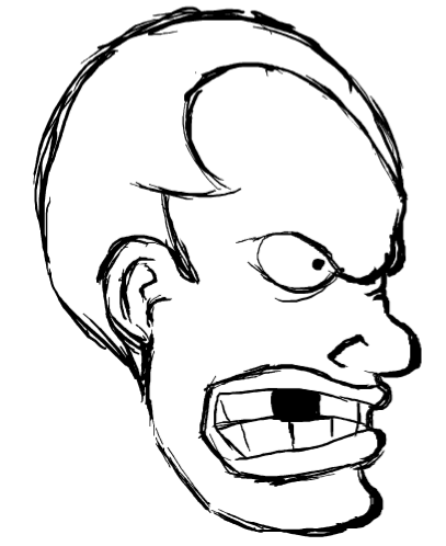
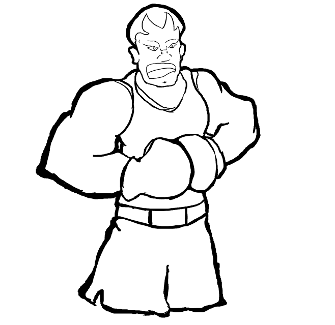
    So I took a stab at sketching balrog, I might try a few different styles later, but w/e. Didn't bother coloring but I obviously could if I was gonna actually use these or another drawing.
     

    No Caption Provided

    No Caption Provided
    Avatar image for demontium
    demontium

    5084

    Forum Posts

    1801

    Wiki Points

    0

    Followers

    Reviews: 7

    User Lists: 5

    #33  Edited By demontium
    @AniMoney said:
    " So I took a stab at sketching balrog, I might try a few different styles later, but w/e. Didn't bother coloring but I obviously could if I was gonna actually use these or another drawing.
     

    No Caption Provided

    No Caption Provided
    "
    ok, you ready for this immature joke? 
     
     
    color him in black..... teehee, 
     
    but seriously the first one is better, looks tight.
    Avatar image for plasma
    Plasma

    968

    Forum Posts

    300

    Wiki Points

    0

    Followers

    Reviews: 0

    User Lists: 3

    #34  Edited By Plasma

    I think we can forgive demontium for that, as he's obviously a child. 
     
    Anyway, although it'd be nice to have original art rather than press released stuff, maybe work on the face detail? The body is good, the face just doesn't remind me of boxer.

    This edit will also create new pages on Giant Bomb for:

    Beware, you are proposing to add brand new pages to the wiki along with your edits. Make sure this is what you intended. This will likely increase the time it takes for your changes to go live.

    Comment and Save

    Until you earn 1000 points all your submissions need to be vetted by other Giant Bomb users. This process takes no more than a few hours and we'll send you an email once approved.