Guys this is fucked up, I don't get a PM when people quote me any more.
New Bombcast image (pronounced ih-mahzghj)
This topic is locked from further discussion.
@teddie: I just want to roll Ryan Davis around like a Katamari. Rolling over frosted cakes and shit. Especially shit.
My "entry", but the competition blows it out of the water. Some awesome work so far duders.
My favorite so far. Nice job!
@wacomole: Gave it a shot with a hole in the middle, but it got lost in the darkness of the bomb. So here it is with a spindle.
EDIT: Updated to add an arm/needle, too.
This one is really great. My vote is definitely for one of your variants or perhaps the album cover with all their faces lined up.
@i_smell: Ryan has a sweet set of pins, yo
Man, the thought that only one of these amazing pictures will be chosen is heartbreaking.
They should just cycle through all of them (of course they can't do that but holy shit there is so much awesome in this thread)
@winternet: I think it's hilarious that every GiantBomb live show has been cursed with a huge fucking Nyan Cat for the passed year.
Its funny cos it's not funny.
@abendlaender said:
They should just cycle through all of them (of course they can't do that but holy shit there is so much awesome in this thread)
They can totally do that. It's not like podcast law makes you stick with one image. I imagine that only one person will "win", though.
@winternet: I think it's hilarious that every GiantBomb live show has been cursed with a huge fucking Nyan Cat for the passed year.
Its funny cos it's not funny.
I guess I'm the worst human being for still thinking Nyan Cat is awesome, then.
@winternet: I think it's hilarious that every GiantBomb live show has been cursed with a huge fucking Nyan Cat for the passed year.
Its funny cos it's not funny.
I guess I'm the worst human being for still thinking Nyan Cat is awesome, then.
Meh, not really. I think pedophiles are worst.
@teddie: I can't get over how Big Vin-Dawg's guns are, fantastic work!
My "entry", but the competition blows it out of the water. Some awesome work so far duders.
This is really good, I like it :)
Dat brad
Yeah, Brad totally makes it for me. Perfect.
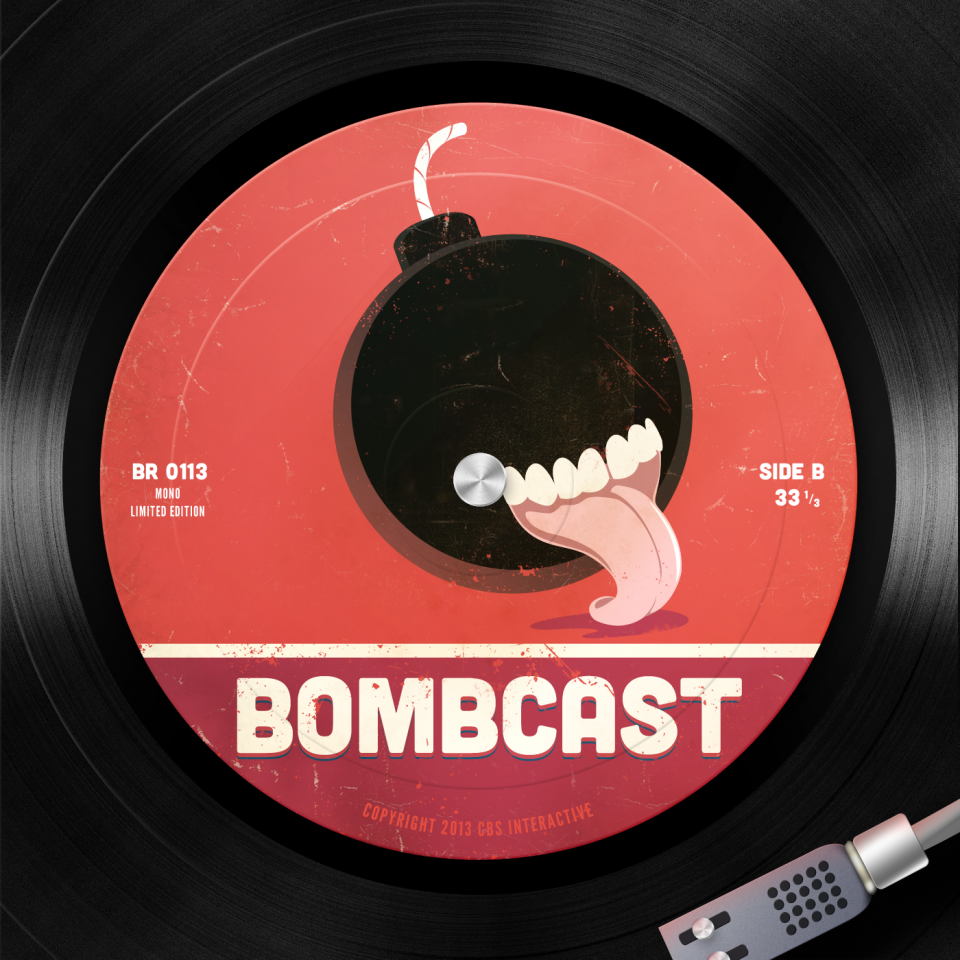
Edited mine to address some issues. Lightened the bomb to make the texture come through, removed the corner tears because they looked bootsy, and generally tweaked it. Continued to wrestle with the age old question "Should Bomb Have A Face?" but just couldn't get it to work in this style.
I love it! Great expression of character. Maybe the background could be flashed up a little? Nothing complicated, just... I dunno. Love it, though!
This isn't getting nearly enough love, so I just wanted to say it's my favourite.
I love it! Great expression of character. Maybe the background could be flashed up a little? Nothing complicated, just... I dunno. Love it, though!
Yeah, I went through about 10 different variations of backgrounds and today I decided I liked it with an actual floor. Backgrounds aren't really my strongpoint.
I also fixed up the "H" in "THE" because it kind of turned into a blob at smaller sizes. Also, thanks for all the kind words guys, really appreciate it :)
I used SupernormalStep's Images to put this together. I wish we could get a high-res version of the new logo Alexis did a great job with.
Holy shit yes
I really like your Idea but it lacked something. The first one is my favourite, those dark shades really make Pat's and Jeff's hair look great.
I used SupernormalStep's Images to put this together. I wish we could get a high-res version of the new logo Alexis did a great job with.
Holy shit yes
I really like your Idea but it lacked something. The first one is my favourite, those dark shades really make Pat's and Jeff's hair look great.
I really like your third one.
I may be too late to submit joke entries, but I'm doing it anyway. I'd like to see something like this.
I can see where this is/was going and I like it a lot.
My "entry", but the competition blows it out of the water. Some awesome work so far duders.
I like this the best.
This is exceptional
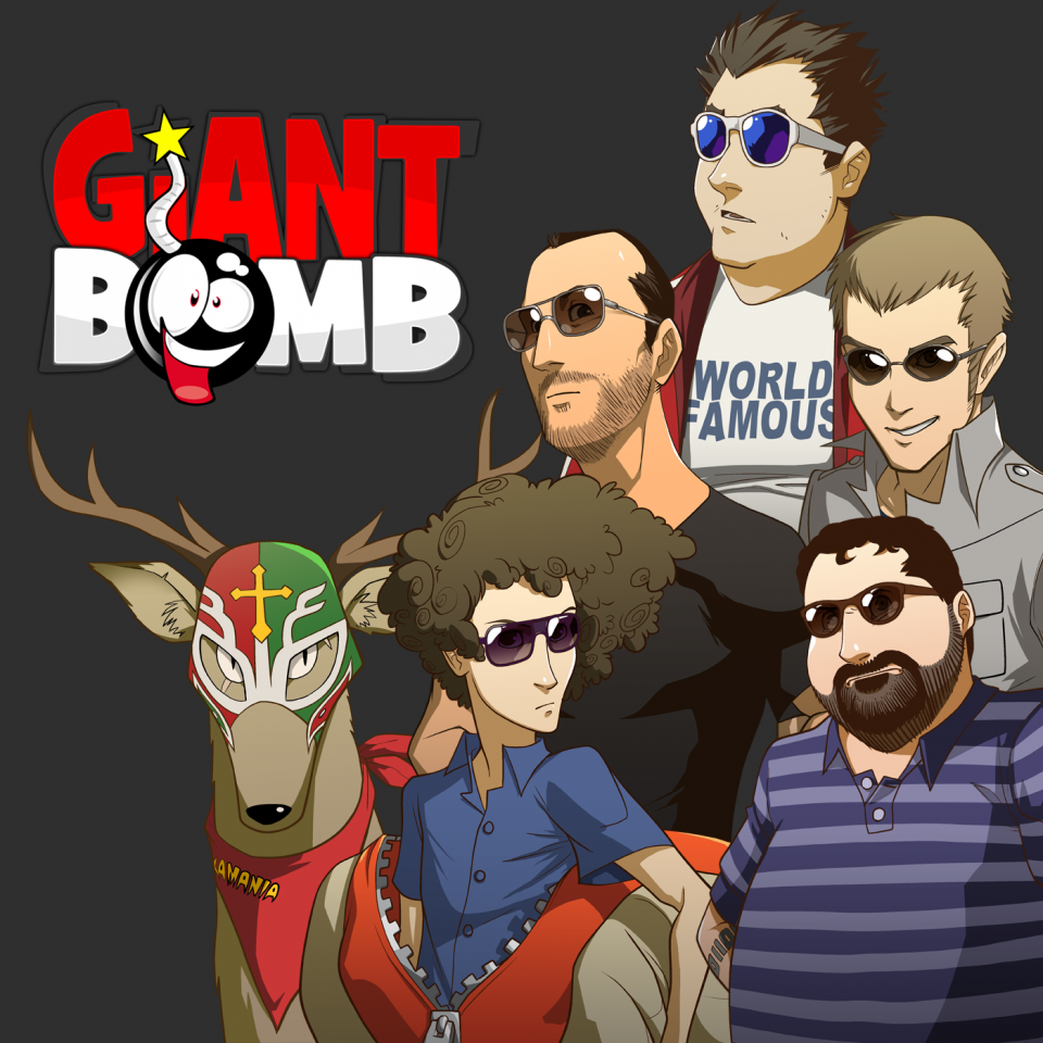
@winternet: @bisonhero: @bigjeffrey: Alright, I reordered the names to match the images. I had, as @bisonhero assumed, ordered the names by podcast tenure (or something like that anyway) but straight up names-to-faces does seem to work better. Thanks for the suggestion!
I swear, I got a full on boner from this one. It has to be this. This has to win.
@wacomole: Gave it a shot with a hole in the middle, but it got lost in the darkness of the bomb. So here it is with a spindle.
EDIT: Updated to add an arm/needle, too.
This one is really great. My vote is definitely for one of your variants or perhaps the album cover with all their faces lined up.
Pack it up people, here it is.
I feel like the Persona 4 art design that keeps being reposted is imbalanced. There's too much empty space on the left side of the image. I say scrap the logo and just throw all the other characters in there as well.
Just screwing around but in my head it looks kinda like this:
@wacomole: Gave it a shot with a hole in the middle, but it got lost in the darkness of the bomb. So here it is with a spindle.
EDIT: Updated to add an arm/needle, too.
This one is really great. My vote is definitely for one of your variants or perhaps the album cover with all their faces lined up.
Pack it up people, here it is.
My vote goes to this one, too. Hands down the best.
I may be too late to submit joke entries, but I'm doing it anyway. I'd like to see something like this.
sweet jebus Fob please finish this. looks amazing
@jazzyjeff: It looks promising.
I was just tooling around in Photoshop, trying to figure out how legible my submission would be, if actually used on an iphone (or in itunes). Ended up making this:
The podcast app has blurry text, so I might take a second pass at the mockup. But it all looks super crisp on my phone, so I'm not too worried about that. In general, just gives a decent idea of how it all might look.
Here's a link to my template, if you're interested in making your own:
https://www.dropbox.com/s/r08xb5zjji4byuv/Bombcast%20Mock.psd?m
Ignore the font warnings - just don't replace any text, and you'll be fine.
Should I keep rolling with this?
I do enjoy that Jeff and Brad are zombies for no particular reason.
After excruciating minutes of internal deliberations, I've decided to go with @conmused's disturbing blind tongue-bomb demon nightmare! Lot of really good work in here, particularly @hamst3r, @wacomole, and @teddie. If you've got something in progress, or you just wanna take another whack at this, you can be rest assured that I'll eventually get sick of this image and need something else to replace it with. So don't stop!
@thepickle: I don't care who wins, but just know that I love your idea.
Please Log In to post.
Log in to comment