Note: The following article contains mild spoilers for Dead Space 1-3.

For a video game, a communicative graphical interface is essential, yet when a developer implements one, it often goes unnoticed. If the UI is doing its job, you frequently won't be conscious of it any more than you're conscious of the movement of your legs when peddling a bike or the motions of your pen when writing a letter. But there is a vain kind of UI that gets its kicks from being the centre of attention: diegetic UI. Developers frequently butt up against the problem of communicating the game state to the audience without shattering their suspension of disbelief. Playing a game might require knowing what your pet's happiness score is or when you've levelled up, but score counters or XP meters signal that you're not occupying a real world, you're playing a video game.
That's fine if bare-faced systemisation is part of the work's identity. Some games are more about turning mechanics over in our hands than believing we're playing a fictional role. Then there are games which occupy an aesthetic DMZ between the former titles and experiences that want to keep us immersed in a world, e.g. Stat-heavy RPGs or multiplayer stadia. Breaking the fourth wall can also be appropriate for them. However, sometimes a game wants us to feel that we have a window on a genuine reality. When those world simulators have a completion bar appear over an object or throw up some text that tells us we have "+5 Skill Points", that can spoil the mood fast.
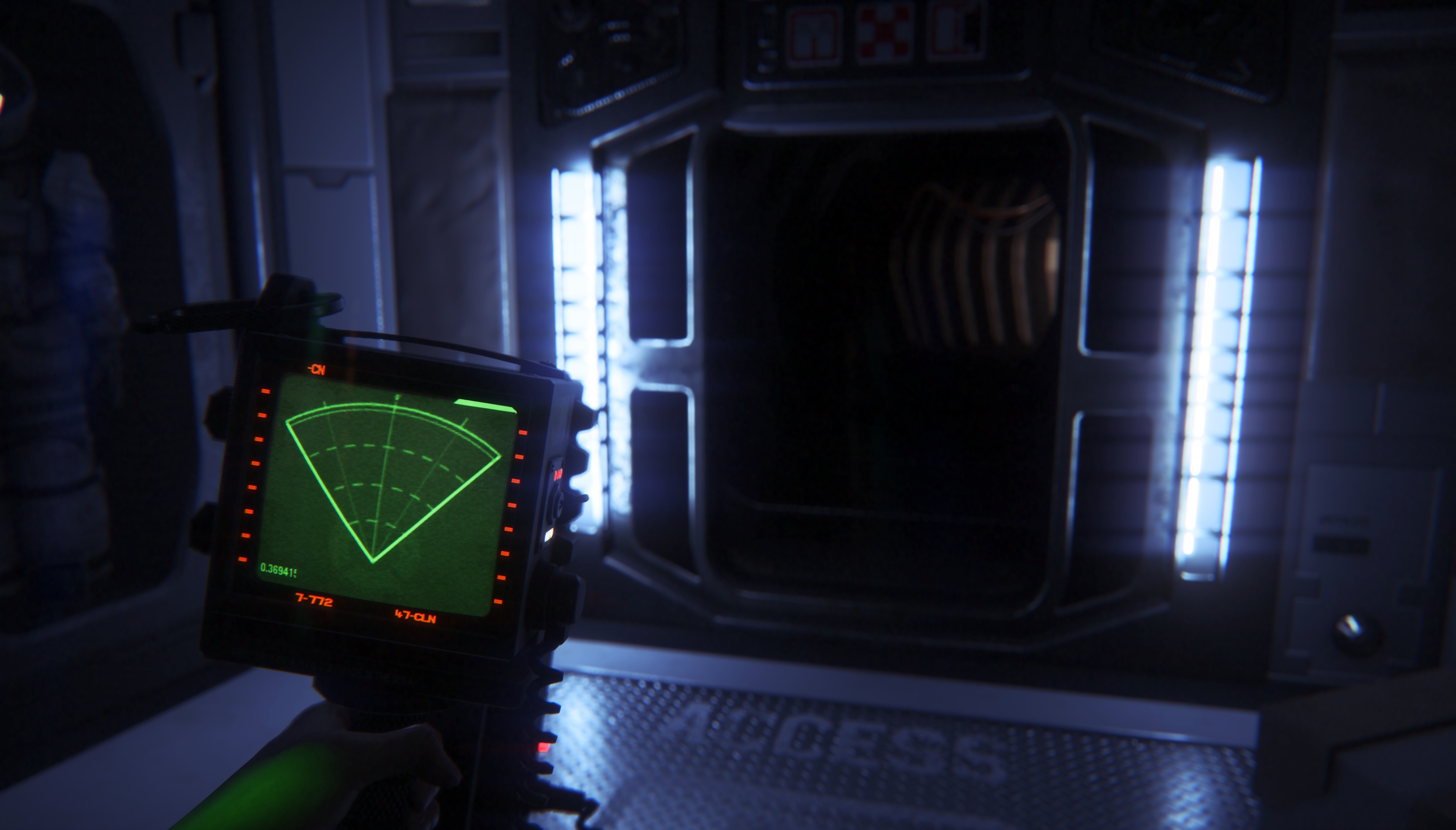
Those pop-ups are examples of non-diegetic interface. Any functional graphics which are not based in the game's fiction constitute non-diegetic UI elements. No character in a game's setting would see the "+5 Skill Points" or the progress bar, so they're not diegetic. The same would apply for most HUD or menu items. Diegetic UI is the opposite: it's the amalgam of UI components that exist within the game's world. For example, the motion tracker in Alien: Isolation or the coloured wires in Keep Talking and Nobody Explodes. Diegetic UI elements are not just a contrivance to signal a metric or state to the player but also exist for the characters.
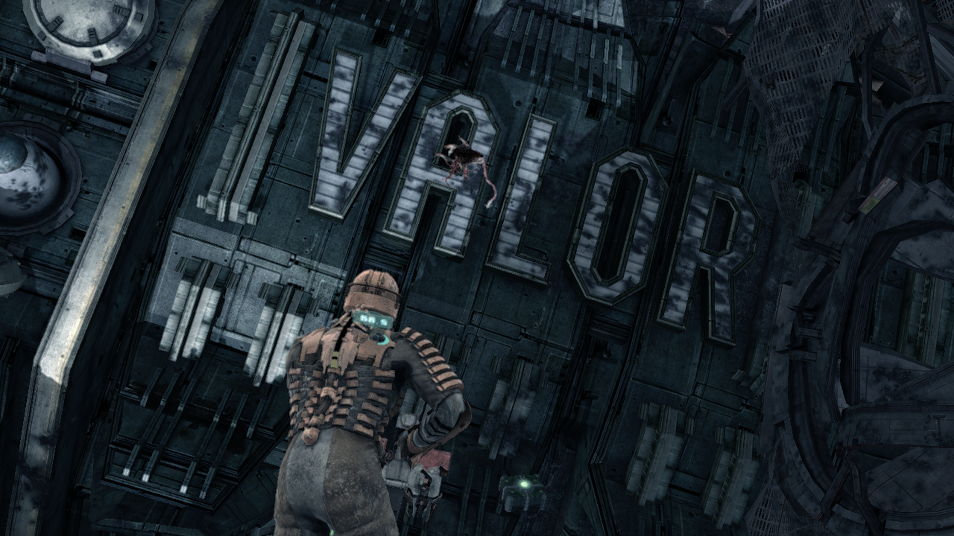
"User Interface" or "UI" can refer to non-graphical interfaces such as those using sound or haptic feedback, but here, we're going to use the term to mean graphical interface. And we're going to look at an application of diegetic UI so trailblazing, many people at the time thought it could be the future of communication between players and games. In 2008, Visceral's third-person horror shooter, Dead Space, first saw the light of day. Most games at the time were replete with non-diegetic interface, but Dead Space and its two mainline sequels (released 2011 and 2013) used diegetic graphics for almost everything.
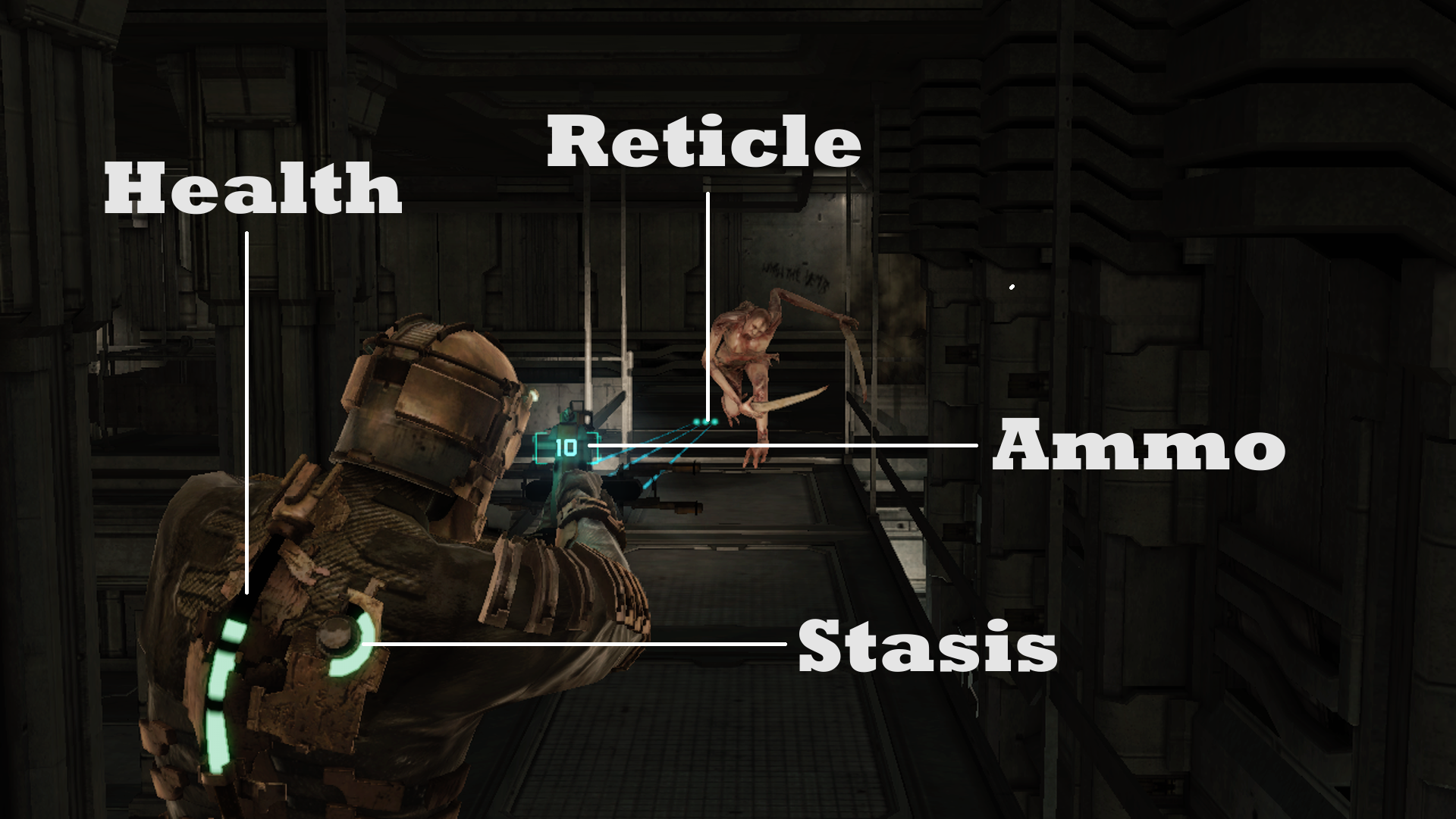
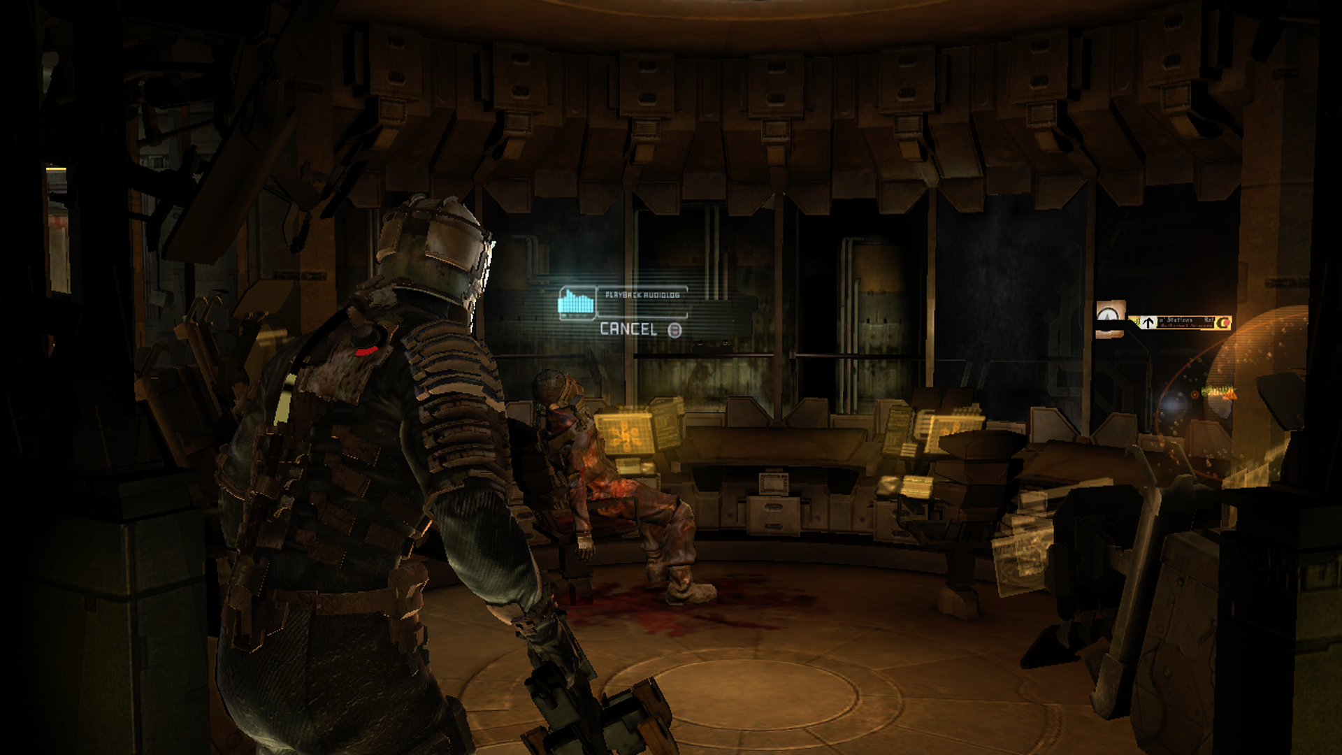
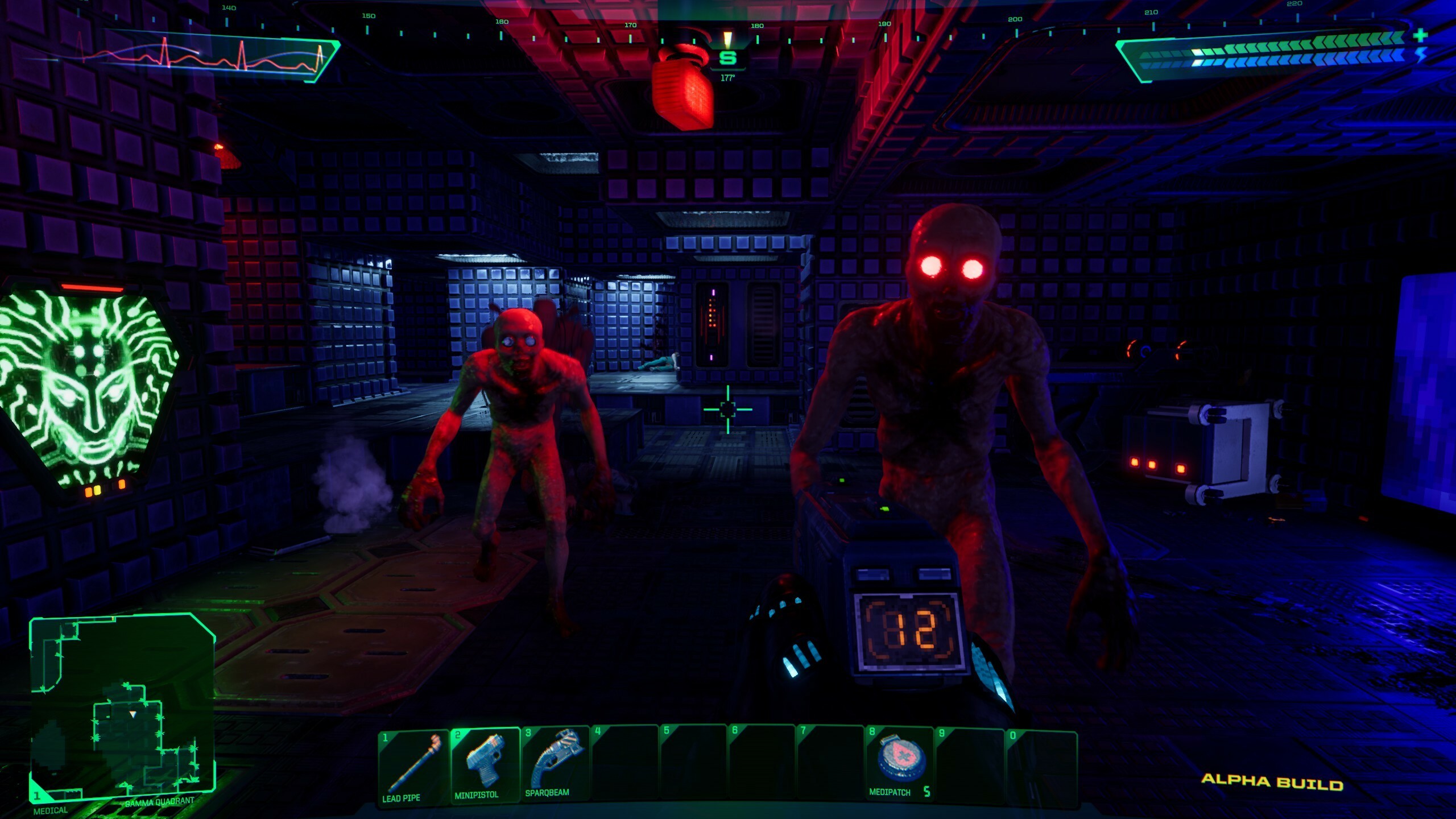
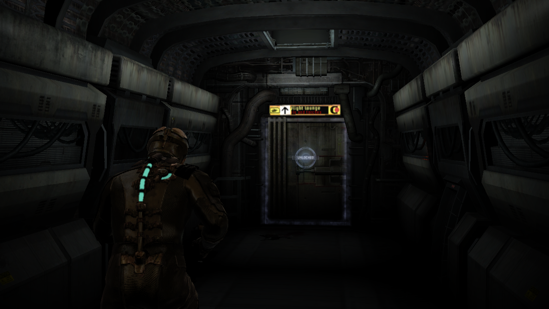
Dead Space's protagonist is Isaac Clarke, an engineer assisting the mining ship Ishimura in the year 2508. Isaac's fellow crew have mutated into murderous aliens called Necromorphs, and he doesn't so much have weapons and armour to fight them as he does mining tools and an engineer's suit. The plucky mechanic's health bar is built onto the spine of the outfit, and next to it, we find a meter telling us how much "stasis" energy he has left. Stasis is a power Isaac can use to slow time within a localised space. When we enter a vacuum, an oxygen meter appears on Isaac's shoulder, and at any time, we can press in the right stick to project the route to the next objective onto the floor. Ammo counters feature as headlines over Isaac's guns, and instead of the weapon reticle being an overlay on the screen, his tools project laser sights. Finally, holographic placards serve as in-world tutorial cards, upgrade menus, item tags, ship signage, save point markers, and other labels. When we peruse a menu, the camera keeps Isaac in-shot, showing that the UI is not just something we're staring at; the protagonist is looking at it too.

But why do those design choices make Dead Space any more appealing? The boilerplate explanation is that Dead Space's UI is "immersive", but we have a habit of using that word without unpacking what it implies. If by "immersive", we mean that Dead Space's UI is realistic, I partly agree. Diegetic UIs can be attractive to players because they broadcast gameplay information while keeping the fourth wall intact. That, in turn, bolsters the audience's suspension of disbelief.
That doesn't mean that diegetic UI is right for every game because not every game is as concerned with keeping the player submerged in a world. However, it's the right call for Dead Space. Without the game breaking character, the player has no safety line which might mercifully yank them away from the tension of the Ishimura. But there are plenty of places in Dead Space that the developers depict something that wouldn't exist. If the displays on Isaac's clothing are meant to convey life-saving information to the user, why are they all on the back where the wearer can't see them? What should we make of some panels referencing controller buttons or keyboard keys? Dino Ignacio, the lead UI designer on the trilogy, points out that artefacts such as scanlines wouldn't appear on futuristic digital monitors. These are just a few examples.
However, Ignacio uses an argument that justifies all these incongruities: his UI design isn't about making systems accurate to engineering principles; it's about making them feel right for the world. I think it's that internal consistency, rather than pure realism, which is instrumental for maintaining immersion. It is necessary to remember that diegetic UI is simply an artistic style and not a statement of quality; developers can execute it either in a way that enhances player experience or harms it. Dead Space's UI serves as exemplary game design, not just because it is diegetic, but because the diegetic UI is believable, accessible, and sometimes even scary.
We should also remain conscious that Dead Space was not the first piece of software to convey gameplay metrics and states through the matter of its narrative. I'd argue that anything in an environment that has a bearing on play constitutes diegetic UI. Can you see a market stall you can shop at? That's diegetic UI. Can you collect a coin that shows its denomination as part of its sprite? That's diegetic UI. Can you tell how far along the construction of one of your buildings is by looking at it? That's diegetic UI.
For years, video games have also explained away meters, markers, and maps by having them originate from a character's helmet display, cockpit HUD, or brain implants. Metroid Prime, Mechwarrior, and System Shock all, respectively, use those techniques. However, such framing can feel contrived, as though the UI does not exist for the sake of the fictional universe's occupants, but the practicalities of players. This tends to happen when the layout and appearance of such interfaces are no different than what you'd expect from a non-diegetic UI. The creators may find a justification to meld these graphics with the story or concoct a reason to seat you in front of them, but that doesn't mean the interface won't have the telltale signs of game design constructs. That's not to say that you won't see any improvement from such diegetic framing, but it is to highlight how even diegetic UI can break the fourth wall.
Visceral improves on earlier diegetic interfaces by melting its UI deeper into the environment and opening up a new emotional dimension for the format. You might not think that a system as utilitarian as a UI could frighten you, but Dead Space's design injects some adrenaline into our combing of the Ishimura. By default, Isaac and his instruments fall halfway between the absolute left of the frame and the middle. Naturally, you'll want to keep your eyes on your vitals, but as long as you do, your gaze falls close to an area of the screen from which monsters may jump out and shock you. If Dead Space had taken the lazy option of a heads-up display, your eyes could be resting on the corner of your TV while the game is trying to pull off a jump scare, diminishing its effects.
Then there's the oxygen counter which displays how much air you have left down to a single, pedantic decimal place. The game could get by fine without being that nerdy about your remaining reserves. Very few designers list out resource quantities down to a decimal place. Still, if the display didn't include the decimal point, it would be ten times as long before you'd see the value on it fall. With the decimal digit, it plummets like an elevator with the cord cut; it is express built for inspiring panic.
When health, energy, or oxygen is low, their respective UI elements will flash red. Red is a colour that tends to get our attention and may signal danger. It's for that reason that fire alarms and warning lights use that bloody hue. So, it can be useful for inciting dread in us, simulating the mindset of being close to death, and drawing our focus to our health. Plenty of interfaces create that fight or flight sensation: Sonic the Hedgehog plays a march at an increasing tempo when we're close to drowning, Rune Factory sounds an alarm when we've eaten too far into our life bar, and Alice: Madness Returns has red cracks fracture the screen when we're low on roses. Most of these methods are non-diegetic, and many can be overbearing. However, because Dead Space holds our vision on the centre of the screen where its red flashing happens, it can be both diegetic and relatively subtle.
Dead Space is also more forthcoming with information than the bulk of games sporting HUDs. The majority of video games banish radars and resource reports to the borders of the screen where they can't eclipse the action. But sometimes you need that data in a pinch. You don't want to take your eyes off of enemies or other hazards, but you can't afford to ignore what the HUD announces about your proximity to a fail state. Here, the UI is in conflict with itself.
Remember, Dead Space has indicators of the player character's state that fall close to but not in the centre of the screen. This layout allows us room to track enemies and laser sights in front of us while reducing the distance our eyes need to travel to check our health, stasis, or oxygen tank. That is, unless the camera is boxed-in. One of my Dead Space bugaboos is that you can get backed into a wall and your meters rudely shoved into the very corner of the screen. This placement can mean that the life bar doesn't scream out at you when it's bled down to its last dregs or may fall out of view entirely.
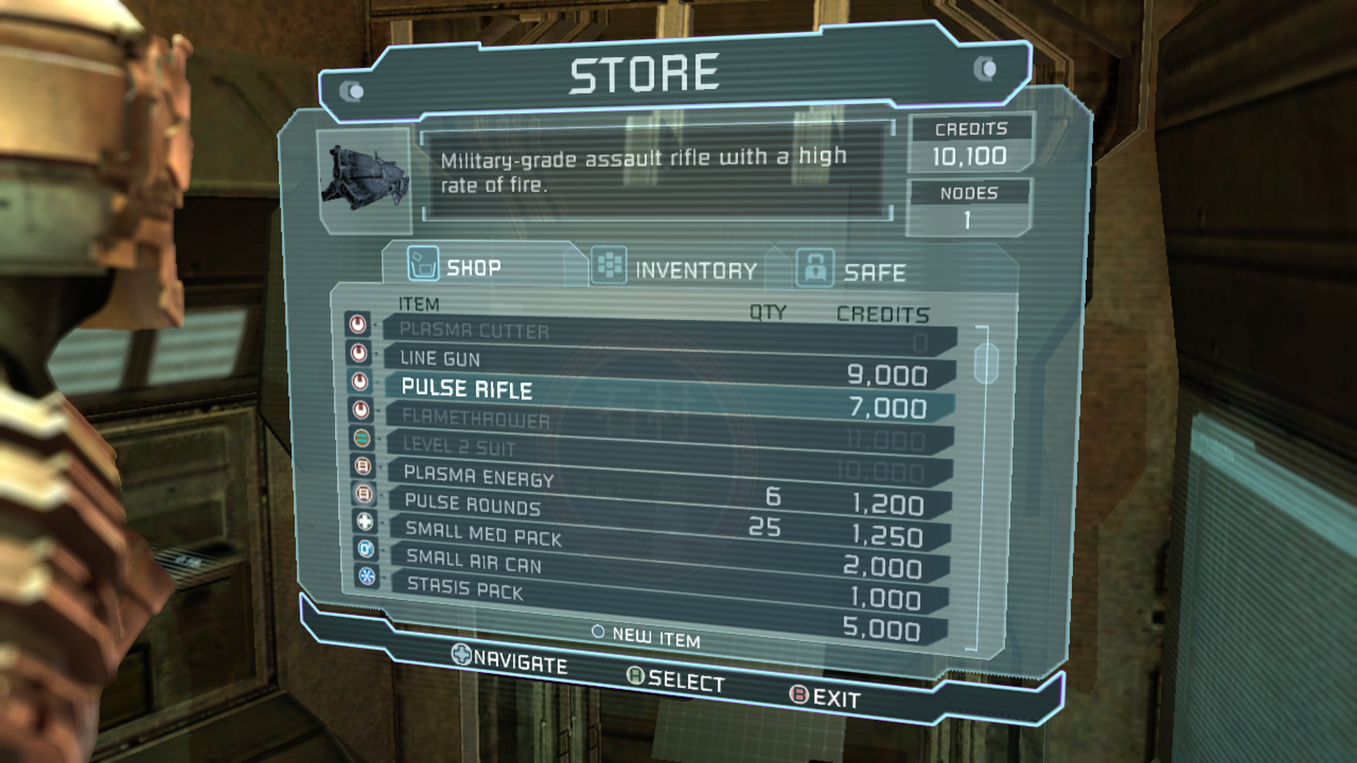
The UI design for the store kiosks also leaves something to be desired. When picking up new items, you have to have your carrying capacity at the back of your mind, but the store screen doesn't have any information on how full your inventory is. Worse, the shop and safe tabs do not tell you how many of an item you're holding, while the inventory tab doesn't tell you how much an item costs, so you're flipping between the three to play accountant. To its credit, the game otherwise does plenty to let you capture every pip of information in an instant.
First off, it's easy to distinguish the health and stasis meters from each other, even when they're in your peripheral vision, because they use different shapes. The health bar is a straight line and splits into segments, while the stasis bar is a crescent and is full of a faux-liquid. Note that other games often make their meters all the same shape and set them apart through colour. The red for HP, blue for MP, green for stamina scheme is ubiquitous. However, by using shape rather than shade to tell you which scores the bars represent, Dead Space can use colours to express the range those variables fall within. A blue bar is over halfway full, a yellow bar is a soft caution, and a red bar tells you your condition is desperate. This allows for these UI elements to catch your attention and relay information, at clutch points, even when you're not staring at them.
Your vital monitors, as well as environmental markers like door locks and upgrade stations, maintain their visibility by acting as light sources in dimly-lit levels. Organs on more dangerous Necromorphs like the "Regenerator" or "Crawler" also glow a sickly yellow that cuts through the dark. Given their lethality, it's only fair that the designers allow you to pick them out in a crowded room. Now, we have a broached a new concept in the design: Not only does Isaac wear the UI, so do the enemies.
It's common for games to distinguish enemy types visually and to have their appearance allow you to associate them with their unique properties. For example, Left 4 Dead has the "Jockey" that can jump onto a victim's back and steer them around. The visual shorthand it uses for that power is that it slouches forward and makes bounding motions with its arms and legs. It's natural to imagine it springing up and latching onto someone. Platformer series such as Kirby, Donkey Kong, and Shovel Knight inform you that an enemy can fly by giving them wings.
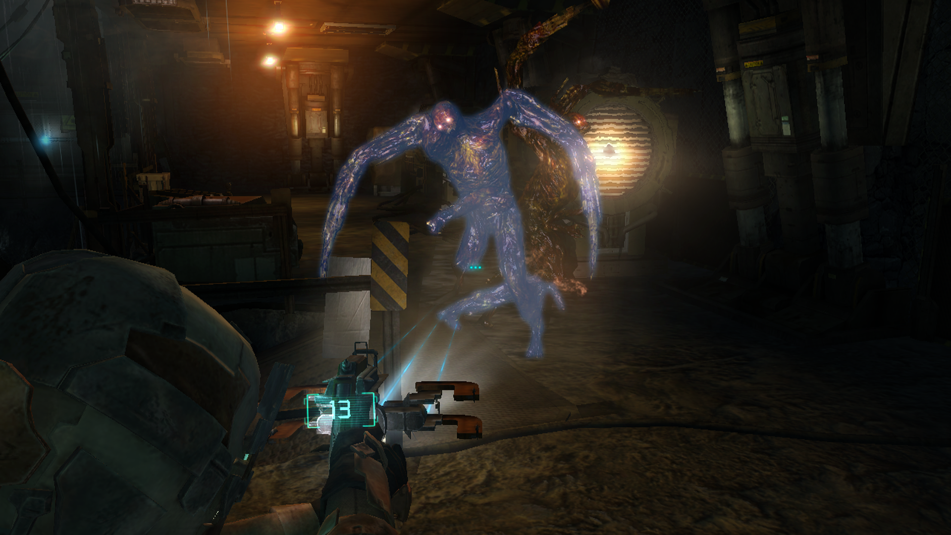
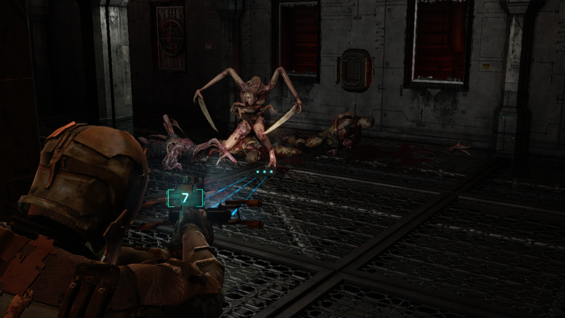
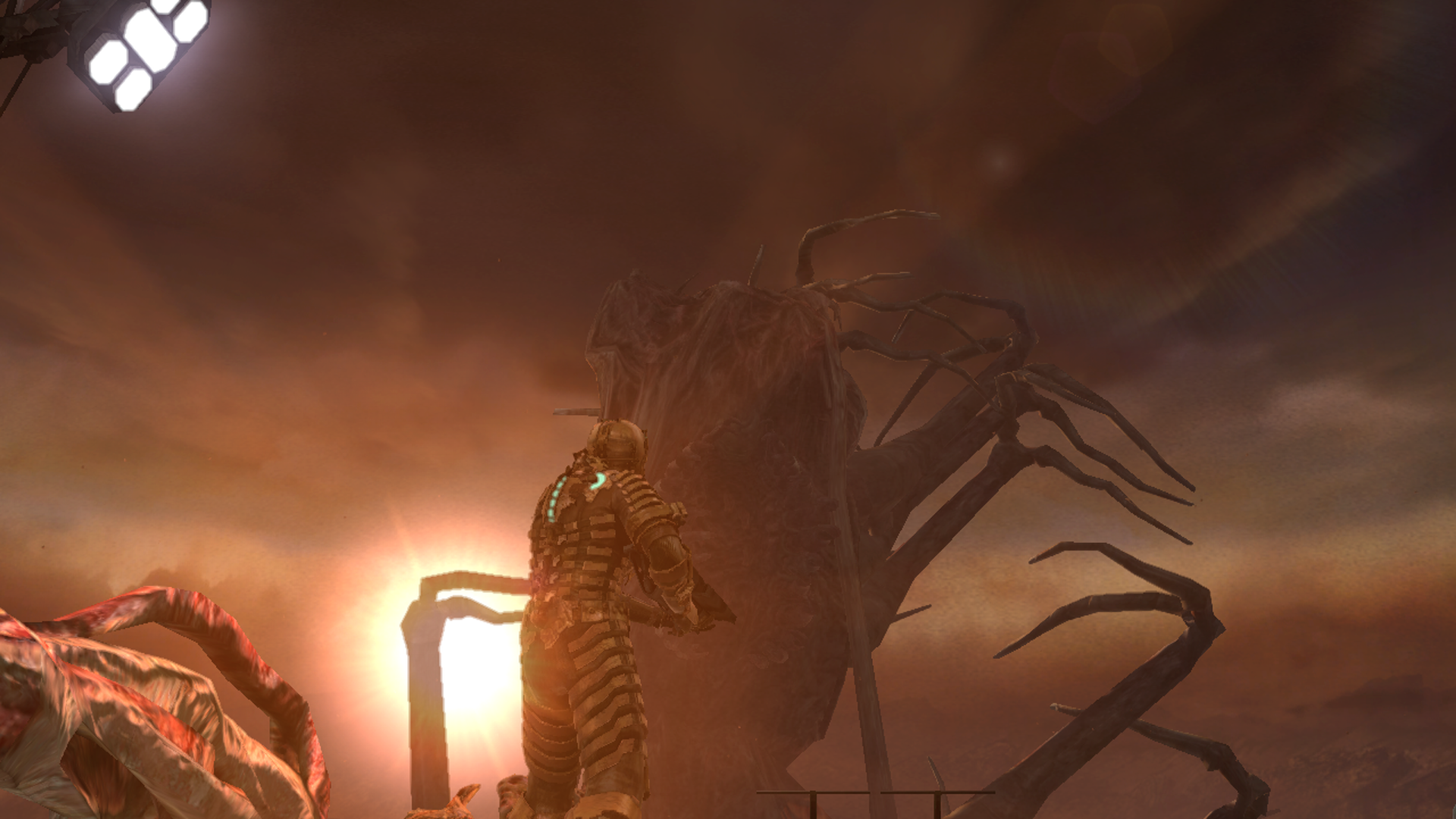
Dead Space also uses this standard method of denoting enemy type through monster design, but in addition, the enemy interface is everything to the game's iconic dismemberment system. A Necromorph takes no more damage from a headshot than it does from a bullet to the body. Although, without a head, they may lose their sense of direction, and if their limbs are severed, they will drop their weaponry, slow to a crawl, and eventually die. Based on whether they still have a skull, and on which limbs are severed, enemies can exist in many different states, each denoting a level of mobility and offensive capability. But picking up on those states is a frictionless and diegetic process because we all know what legs, arms, and sensory organs do for a person. Equally, it's highly intuitive to understand what losing any single body part will mean for the creature.
This concept even applies for non-humanoid enemies like the "Lurker" which attacks using three meaty tentacles, each of which ends in a barb. We can tell that when the enemy uses a ranged attack, its projectiles spew from these barbs, and spikes generally denote hazards. Typically, when we aim a weapon, it will also line up with the centre of these tentacles. So, it becomes apparent what we have to do to disarm the Lurker without the game using any arrows or flashing weak points to tell us.
Dead Space traps us in a lunar sarcophagus full of terrifying enemies with a clunky camera and then forces us to ration our ammo and health. But the UI is the bone it throws us. I feel attached to it because, in dire straits, it's the one thing that lets me quickly identify the danger, which is the first step to neutralising it. Many interfaces use a synthetic medium-specific visual language to convey information about the play state. The diegetic UI of Dead Space not only feels more at home in its world but because it uses familiar concepts from real-life and general electronics interfaces, we're quick to pick up what it's trying to communicate. It's these revolutionary developments that have given Dead Space's UI such sticking power in our heads. Thanks for reading.


Log in to comment