I Review Stupid Things #2: American Product Design

Avatar image for the_a_drain
The_A_Drain

4073

Forum Posts

577

Wiki Points

0

Followers

Reviews: 0

User Lists: 0

Edited By The_A_Drain

There's something i've come to notice a lot more recently, what with the amount of people showing off their videogame collections on the old interwebs. I have noticed that some of the product design seen in these collections, specifically i'm talking about game cases here (expanding on my previous entry, but this time not looking at box art specifically) and the manner in which they've been designed.
This post is rated 15. For... reasons...
Now, first up, a little background. I'm from the UK, and our products filter through as European but we have to apply our own laws to them as well, so i'm used to seeing a number of the same things pop up on all manner of different products, prime example being our good old buddy the BBFC logo, as well as PEGI and other types of rating, i'm also not used to flashy colours attempting to draw my attention or things that seem to be different purely for the sake of it.

Disclaimer: Images are from google search, so if they are yours many apologies i'll replace them if you want.

First up,
Gamecube games:

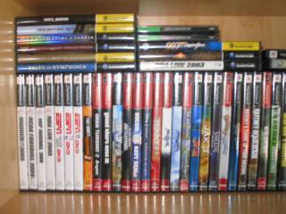
Ok, so i'm used to seeing video games a certain way, it's always been that way and changing that serves no purpose in my mind other than to confuse, bewilder, or differentiate simply for the sake of it. I can think of no reason at all, other than completely fucking with someones head why gamecube game cases should be, essentially, upside-down. It makes no sense, it confuses the eye, and it's already distracting/disorienting enough staring at a shelf of gamecube games because they have spine artwork instead of an easily readable font and solid colour background like most games.
Unnatural I say!
Unnatural I say!
The other thing i'm confused about it the unnecessary use of colour for (I assume) the budget release titles, I mean.. yellow? Seriously? Ok, so it's not that much worse than grey, and it's miles better than those ugly neon green PSX games we'll get to in a moment. But I see no reason for yellow, just for the sake of a bit of uniformity they should also be black. Although this is a problem I have with case design the world over, theres no reason that people should be embarrased to have a budget game on their shelf, don't give them one just for the sake of it.


Playstation 2 Games:

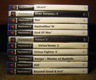
PS2 games in the UK, a uniform starfleet would be proud of... Maybe...
Now, this complaint doesn't apply too well for the gamecube games because they are the same in the UK (except the right way up...) but flashy artwork on the spine. It's something that has always irked me, I suppose it depends entirely on the box art design but i'm of the opinion that if I can't read what's on the spine from across the room, then what's the point of having the name on the spine? If I have to pull the goddamn thing off the shelf to see what it is that's just ridiculous. I'm all for flashy artwork on the front and back of a box, but the spine should be purely functional, and not distracting or difficult to read.

Look at all the colours, it's like standing in an arcade
In addition to that, again in europe we have grey cases and a grey spine for our budget releases, but i'm seeing red for the US releases? Red? Seriously, if you thought yellow was distracting and over the top, how about red? What kind of message does that send out to consumers as well, red is associatted with danger, anger and pain. Not the best colour to use if you want people to actually buy the product, but then I guess if a game as sold enough to make the grade for a budget re-release it just doesn't matter anymore whether or not it sells. (I'm hoping that the discs aren't red as well, that would just creep me the hell out)

That said, I do prefer the consistent black boxes of non-budget games, in the UK we have something like 95% come in nice blue boxes, then 5% will be in black cases just to fuck things up, it's pointless and annoying. All blue, or all black, what difference does it make? So why do we need both?

Also, why does the Playstation logo need to be in it's own little white box? Again, pointlessly distracting and honestly, I just think it looks hella ugly.

Playstation Games:

Look at those cheap tacky PC games... wait a minute...
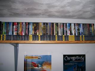
What were they thinking? These are some of the ugliest things i've ever seen. Ok, so everythings functional, fantastic, that works for me. But, going to the other extreme from the one above, they have uniform spines with plaintext, but it's so damned small, again making it unreasonably difficult to read for no good reason. Aside from that, the jewel case design lends them a certain, cheap looking quality. It looks like somones tatty cd collection or $0.99 PC games from the bargain bin at the local store.

So, aside from the fact that all I see in the picture to the left is what looks like 30 copies of Diablo II: LoD, PSX games are fine right? Wrong. Very wrong. I've seen some ugly product design in my day, but this has got to be the mother of them all. What better way to persuade people to go for a new, full priced retail game than to make your budget games snot green?
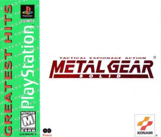
I can't be the only person who thinks these look nasty...

I suppose there are some redeeming features, some of the greatest hits range kept their original box art, which was the same with the platinum range in the UK (yet again we got silver/grey instead of some crazy psychadelic colour) and it's not as immidietely obvious from the side as it is with the UK design, the whole spine is silver for us.

Other Offenders:

There is a multitude of other similar things i'd like to talk about, but they don't need a whole section. Firstly, it would seem that Sega Saturn games suffered the same fate as Gamecube games, needlessly flipped spine artwork, the difference there being that this is the same in the UK. I still hate it though.

SNES games? They looks like building blocks. C'mon, tell me they don't looke like Lego bricks or something. But there's a downside to the UK ones as well, they don't have end labels (which as James Rolfe will tell you, is a bad thing) so you win some, you lose some.

C'mon... Which one?
C'mon... Which one?
A very similar argument to the PSX argument applies to Dreamcast games as well. Yet again the PAL versions got a thicker, sturdier looking case. While the US cases remained very similar to the Japanese design, with the jewel case and the black curved design on the face. We got chunkier boxes, and a blue design, i'm not gonna lie though, the paper inserts for the front and back designs literally fall out when you open the case, they aren't fastened down... Lame.

Most other things have only minor differences. DS games for example have a similar appearance in the US to PS2 games, they have the logo atop the spine, then artwork and the games logo below. In the UK however, I feel that they've struck a nice balance. We have a slightly enlarged DS logo (no reason, I guess) and a white background on the spine with the games logo on it. This makes the logo itself slightly easier to read, but maintains some of the appeal of the artwork. Although some games choose to use the generic text for it's title instead of displaying a logo.

Overall, i'd honestly say that while PAL product design is arguably just as shitty, i'm glad my PSX  and DC games look the way they do. I'm not going to actually score this review, as that would be a bit pretentious and honestly I have no position to gauge from, after all it's whats on the disc that counts right? Not what box the game comes in.

What do you guys reckon? Like them the way they are? Hate them? Hate PAL designs instead? Discussion and ideas for the next stupid thing to review are welcomed.
Avatar image for the_a_drain
The_A_Drain

4073

Forum Posts

577

Wiki Points

0

Followers

Reviews: 0

User Lists: 0

#1  Edited By The_A_Drain

There's something i've come to notice a lot more recently, what with the amount of people showing off their videogame collections on the old interwebs. I have noticed that some of the product design seen in these collections, specifically i'm talking about game cases here (expanding on my previous entry, but this time not looking at box art specifically) and the manner in which they've been designed.

This post is rated 15. For... reasons...
Now, first up, a little background. I'm from the UK, and our products filter through as European but we have to apply our own laws to them as well, so i'm used to seeing a number of the same things pop up on all manner of different products, prime example being our good old buddy the BBFC logo, as well as PEGI and other types of rating, i'm also not used to flashy colours attempting to draw my attention or things that seem to be different purely for the sake of it.

Disclaimer: Images are from google search, so if they are yours many apologies i'll replace them if you want.

First up,
Gamecube games:

Ok, so i'm used to seeing video games a certain way, it's always been that way and changing that serves no purpose in my mind other than to confuse, bewilder, or differentiate simply for the sake of it. I can think of no reason at all, other than completely fucking with someones head why gamecube game cases should be, essentially, upside-down. It makes no sense, it confuses the eye, and it's already distracting/disorienting enough staring at a shelf of gamecube games because they have spine artwork instead of an easily readable font and solid colour background like most games.

Unnatural I say!
Unnatural I say!
The other thing i'm confused about it the unnecessary use of colour for (I assume) the budget release titles, I mean.. yellow? Seriously? Ok, so it's not that much worse than grey, and it's miles better than those ugly neon green PSX games we'll get to in a moment. But I see no reason for yellow, just for the sake of a bit of uniformity they should also be black. Although this is a problem I have with case design the world over, theres no reason that people should be embarrased to have a budget game on their shelf, don't give them one just for the sake of it.


Playstation 2 Games:

PS2 games in the UK, a uniform starfleet would be proud of... Maybe...
Now, this complaint doesn't apply too well for the gamecube games because they are the same in the UK (except the right way up...) but flashy artwork on the spine. It's something that has always irked me, I suppose it depends entirely on the box art design but i'm of the opinion that if I can't read what's on the spine from across the room, then what's the point of having the name on the spine? If I have to pull the goddamn thing off the shelf to see what it is that's just ridiculous. I'm all for flashy artwork on the front and back of a box, but the spine should be purely functional, and not distracting or difficult to read.

Look at all the colours, it's like standing in an arcade
In addition to that, again in europe we have grey cases and a grey spine for our budget releases, but i'm seeing red for the US releases? Red? Seriously, if you thought yellow was distracting and over the top, how about red? What kind of message does that send out to consumers as well, red is associatted with danger, anger and pain. Not the best colour to use if you want people to actually buy the product, but then I guess if a game as sold enough to make the grade for a budget re-release it just doesn't matter anymore whether or not it sells. (I'm hoping that the discs aren't red as well, that would just creep me the hell out)

That said, I do prefer the consistent black boxes of non-budget games, in the UK we have something like 95% come in nice blue boxes, then 5% will be in black cases just to fuck things up, it's pointless and annoying. All blue, or all black, what difference does it make? So why do we need both?

Also, why does the Playstation logo need to be in it's own little white box? Again, pointlessly distracting and honestly, I just think it looks hella ugly.

Playstation Games:

Look at those cheap tacky PC games... wait a minute...
What were they thinking? These are some of the ugliest things i've ever seen. Ok, so everythings functional, fantastic, that works for me. But, going to the other extreme from the one above, they have uniform spines with plaintext, but it's so damned small, again making it unreasonably difficult to read for no good reason. Aside from that, the jewel case design lends them a certain, cheap looking quality. It looks like somones tatty cd collection or $0.99 PC games from the bargain bin at the local store.

So, aside from the fact that all I see in the picture to the left is what looks like 30 copies of Diablo II: LoD, PSX games are fine right? Wrong. Very wrong. I've seen some ugly product design in my day, but this has got to be the mother of them all. What better way to persuade people to go for a new, full priced retail game than to make your budget games snot green?
I can't be the only person who thinks these look nasty...

I suppose there are some redeeming features, some of the greatest hits range kept their original box art, which was the same with the platinum range in the UK (yet again we got silver/grey instead of some crazy psychadelic colour) and it's not as immidietely obvious from the side as it is with the UK design, the whole spine is silver for us.

Other Offenders:

There is a multitude of other similar things i'd like to talk about, but they don't need a whole section. Firstly, it would seem that Sega Saturn games suffered the same fate as Gamecube games, needlessly flipped spine artwork, the difference there being that this is the same in the UK. I still hate it though.

SNES games? They looks like building blocks. C'mon, tell me they don't looke like Lego bricks or something. But there's a downside to the UK ones as well, they don't have end labels (which as James Rolfe will tell you, is a bad thing) so you win some, you lose some.

C'mon... Which one?
C'mon... Which one?
A very similar argument to the PSX argument applies to Dreamcast games as well. Yet again the PAL versions got a thicker, sturdier looking case. While the US cases remained very similar to the Japanese design, with the jewel case and the black curved design on the face. We got chunkier boxes, and a blue design, i'm not gonna lie though, the paper inserts for the front and back designs literally fall out when you open the case, they aren't fastened down... Lame.

Most other things have only minor differences. DS games for example have a similar appearance in the US to PS2 games, they have the logo atop the spine, then artwork and the games logo below. In the UK however, I feel that they've struck a nice balance. We have a slightly enlarged DS logo (no reason, I guess) and a white background on the spine with the games logo on it. This makes the logo itself slightly easier to read, but maintains some of the appeal of the artwork. Although some games choose to use the generic text for it's title instead of displaying a logo.

Overall, i'd honestly say that while PAL product design is arguably just as shitty, i'm glad my PSX  and DC games look the way they do. I'm not going to actually score this review, as that would be a bit pretentious and honestly I have no position to gauge from, after all it's whats on the disc that counts right? Not what box the game comes in.

What do you guys reckon? Like them the way they are? Hate them? Hate PAL designs instead? Discussion and ideas for the next stupid thing to review are welcomed.
Avatar image for the_a_drain
The_A_Drain

4073

Forum Posts

577

Wiki Points

0

Followers

Reviews: 0

User Lists: 0

#2  Edited By The_A_Drain

Nobody has any feelings about case design? At all?

Avatar image for log
Log

183

Forum Posts

0

Wiki Points

0

Followers

Reviews: 0

User Lists: 0

#3  Edited By Log

Honestly the green never bothered me, its what i grew up knowing. I think its just a matter of where you are from.

Edit: talking about the PSX greatest hits ^

Avatar image for dr_feelgood38
Dr_Feelgood38

1582

Forum Posts

780

Wiki Points

0

Followers

Reviews: 4

User Lists: 1

#4  Edited By Dr_Feelgood38

...I don't mind the color. In fact, I think I prefer it to black/white/gray spines, those look bland. And on the subject of Dreamcast, once again, I like them the way they are. American product design is shitty, but not in this case.

Avatar image for the_a_drain
The_A_Drain

4073

Forum Posts

577

Wiki Points

0

Followers

Reviews: 0

User Lists: 0

#5  Edited By The_A_Drain
@Dr_Feelgood38:

I do quite like the dreamcast ones, the article is not meant to be taken 100% seriously. The PAL cases are very very prone to breaking at the hinges, and must has been unecessarily expensive to produce. Differences in this sort of thing have always fascinated me though, I never quite understoond why products have to differ so much between regions. Surely it saves everyone a bit of hassle by keeping the same designs worldwilde? I dunno, I guess someone has to justify their own paycheque by designing a new face for a product.
Avatar image for jayge_
Jayge_

10269

Forum Posts

2045

Wiki Points

0

Followers

Reviews: 1

User Lists: 3

#6  Edited By Jayge_

I don't really have feelings about case design. As long as it holds my game and doesn't let it fling around inside the case and scratch itself up, I'm fine with it. My issue is with game manuals. The last great game manual I saw was for Fallout 3, and then Assassin's Creed's before it. It's a dieing? dying? (shit) art.

Avatar image for video_game_king
Video_Game_King

36563

Forum Posts

59080

Wiki Points

0

Followers

Reviews: 54

User Lists: 14

#7  Edited By Video_Game_King
The_A_Drain said:
Nobody has any feelings about case design? At all?
No, it's just that people tend to ignore other people's blogs if they are long. On subject, I find them annoying, too. Doesn't come up often, but still...
Avatar image for the_a_drain
The_A_Drain

4073

Forum Posts

577

Wiki Points

0

Followers

Reviews: 0

User Lists: 0

#8  Edited By The_A_Drain
@Jayge:

Very good observation. Although tbh manuals have been shit almost universally throughout, it's rare enough to see one in colour let alone a decently written one. The last decent one I read was, well, not so much a manual really, but the help screen on Plants VS Zombies.

What irks me (i'm not sure if you guys get it in the states) is a big chunky ass manual (we're talking, literally 160 pages or something) that's in like 12 different languages and only 3 pages of it are important to you, and it's still written terribly.
Avatar image for dr_feelgood38
Dr_Feelgood38

1582

Forum Posts

780

Wiki Points

0

Followers

Reviews: 4

User Lists: 1

#9  Edited By Dr_Feelgood38
Jayge_ said:
I don't really have feelings about case design. As long as it holds my game and doesn't let it fling ... [more]
This is true. I actually just stopped reading the manuals altogether, though. But if Fallout's and Assassin's Creed's were really great, then I guess I'll go read them now.
Avatar image for carlos1408
Carlos1408

1635

Forum Posts

0

Wiki Points

0

Followers

Reviews: 0

User Lists: 2

#10  Edited By Carlos1408

Interesting blog... I'm quite indifferent to all this box design business, but that Playstation greatest hits box was quite disgusting; can't stand that green there it looks awful...lol

Avatar image for feanor
Feanor

1440

Forum Posts

1760

Wiki Points

0

Followers

Reviews: 2

User Lists: 2

#11  Edited By Feanor

The PSX cover is a victim of the 90's.  And the different colors make it a bit easier to identify the game.

and why does this bother you so much? its not like you have to live with it.

Avatar image for stephen_von_cloud
Stephen_Von_Cloud

2030

Forum Posts

844

Wiki Points

0

Followers

Reviews: 3

User Lists: 3

Interesting, but I'm a fan of the color.  I'm glad I don't just have a bunch of black and white on my shelf.  It adds character.

Avatar image for the_a_drain
The_A_Drain

4073

Forum Posts

577

Wiki Points

0

Followers

Reviews: 0

User Lists: 0

#13  Edited By The_A_Drain
@Feanor:

It doesn't bother me :) It's just meant to be something different to read inbetween the E3 threads. And c'mon :D You can't tell me that snot green colour isn't horrible, and green is my favorite colour haha.
Avatar image for feanor
Feanor

1440

Forum Posts

1760

Wiki Points

0

Followers

Reviews: 2

User Lists: 2

#14  Edited By Feanor
@The_A_Drain: yeah it is pretty dreadful.  At least the design they use now is a bit better.
Avatar image for the_a_drain
The_A_Drain

4073

Forum Posts

577

Wiki Points

0

Followers

Reviews: 0

User Lists: 0

#15  Edited By The_A_Drain
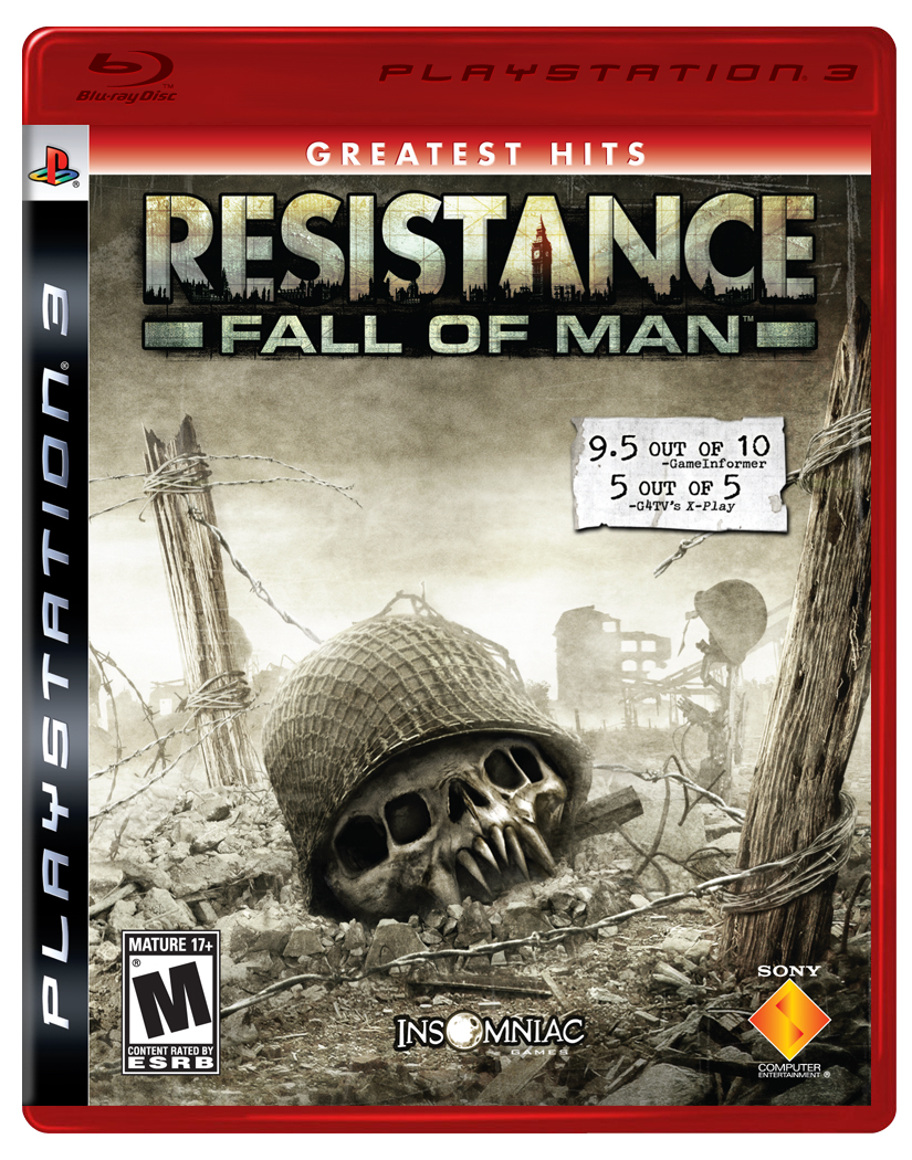
@Feanor:

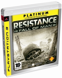
I havn't seen the PS3 design for budget stuff yet in the US, the Europe one has a yellow border top and left, and a yellow spine. I don't mind it at all, it's not as major a departure from the normal boxart as these things normally are.
Avatar image for jayge_
Jayge_

10269

Forum Posts

2045

Wiki Points

0

Followers

Reviews: 1

User Lists: 3

#16  Edited By Jayge_
The_A_Drain said:
@Jayge: Very good observation. Although tbh manuals have been shit almost universally throughout, it's rare enough to see one in ... [more]
We might get sum o dat dere hispanol dat the migrants speak, but not usually. Most manuals are entirely in English, with warnings and legal jargon in like 5 different languages in the back.

Dr_Feelgood38 said:
Jayge_ said: I don't really have feelings about case design. As long as it holds my game and doesn't let ... [more]
Assassin's Creed's manual actually integrated into the story, which I thought was pretty cool. Fallout's was like a mini strategy guide full of useful information and tips, and it was really well done. I don't recall any other remarkable ones recently that I've seen.
Avatar image for the_a_drain
The_A_Drain

4073

Forum Posts

577

Wiki Points

0

Followers

Reviews: 0

User Lists: 0

#17  Edited By The_A_Drain
@Jayge:

I can't remember what game it was, but I remember one that was just a bloodstained notebook and was written like one too (aside from the legal jargon and obligatory controls and how to save/load page) it had no title on the front either, just a notebook style artwork, and some bloodstains.

Edit: The Rockstar manuals are always pretty cool as well.

I've only just remembered it, but my personal award has to go to the Wario Land book (the Wii version, its got so many different names) it's written really well and made me laugh more than a few times, and the bottom third or so of each page is level artwork. Then stapled to the middle are two pages of stickers with coins, wario, enemies, etc and it invites you to stage your own Wario scenes on the pages :D
Avatar image for natetodamax
natetodamax

19464

Forum Posts

65390

Wiki Points

0

Followers

Reviews: 32

User Lists: 5

#18  Edited By natetodamax
Jayge_ said:
I don't really have feelings about case design. As long as it holds my game and doesn't let it fling ... [more]
I love reading the manuals, and I agree that those two were really cool.
Avatar image for jayge_
Jayge_

10269

Forum Posts

2045

Wiki Points

0

Followers

Reviews: 1

User Lists: 3

#19  Edited By Jayge_
The_A_Drain said:
@Jayge: I can't remember what game it was, but I remember one that was just a bloodstained notebook and was ... [more]
That's awesome.
Avatar image for feanor
Feanor

1440

Forum Posts

1760

Wiki Points

0

Followers

Reviews: 2

User Lists: 2

#20  Edited By Feanor
@The_A_Drain:  This is what it looks like. 
No Caption Provided

Avatar image for the_a_drain
The_A_Drain

4073

Forum Posts

577

Wiki Points

0

Followers

Reviews: 0

User Lists: 0

#21  Edited By The_A_Drain
@Feanor:

Looks like an HDDVD :D (Well, they looked like that in Europe at least, same shorter case as BluRays but red)

Not a scan, couldnt find one, but this is what they look like here. I actually prefer the red in this instance.

No Caption Provided

Avatar image for feanor
Feanor

1440

Forum Posts

1760

Wiki Points

0

Followers

Reviews: 2

User Lists: 2

#22  Edited By Feanor
@The_A_Drain: I'm digging the yellow.  Its kind of silly that there is even a difference between the two.
Avatar image for the_a_drain
The_A_Drain

4073

Forum Posts

577

Wiki Points

0

Followers

Reviews: 0

User Lists: 0

#23  Edited By The_A_Drain
@Feanor:

Yeah, I don't see why they have to constantly redesign stuff all the time.