
User Interface Week - Evolution of the XBOX
By DrRandle 7 Comments
When good ideas go bad.
I'm not going to mince words here: Microsoft's console experience has been an exercise in alienation, confusion, and burying content under needless menus. But just how did it get to such a state? Logically, the interface should be improving, right? Well, unfortunately, it's only been getting worse since it started.
The King of Blades
I'm always blown away when I remember just how easy the original interface was. It was clean, simple, and snappy. A tap of the right and left bumpers moved you between blades, and you could navigate the individual menus to find what you wanted. Sure, when you actually dove into the Marketplace, it was kind of a nightmare. But actually digging into your media selections and navigating your game list was simple. Plus, you could activate your game from any of these blades. This was back when Microsoft remembered their console was a gaming system. I have nothing against them trying to expand it into other areas, in fact I welcome the idea, but the steps they've taken to get away from selling video games have become glaringly obvious.
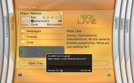
The New XBOX Experience

Now as much as I think the Blades interface was the best, I think the NXE (above) was my favorite. It was stylish, it managed to lay things out in an organized manner. It had it's share of problems, and a complete lack of customization really kept it from being what people would want it to be, but it was nice. It had potential; none of which was ever lived up to, unfortunately. But for what it was it was kind of a fun interface. Zooming along those menus had a tactile experience that made it subconsciously fun to navigate. Plus, all of my libraries were right there and easy to access. The Marketplace also received a considerable upgrade, at least until it all became Zune-ified. Then everything started to chug and take forever to load. That was the start of a bad way for the XBOX experience.
The New New XBOX Experience
It wasn't so much of a 'total upgrade' as it was an 'upgrade' to help focus on Kinect interfacing. What it was was more boring, and only furthered to bury the content I was looking for. My biggest problem with this interface is the way they handled the games marketplace, separating games and content into weird categories, getting rid of the easy "Stuff that came out this week!" section and forcing you to go into each and every separate category. But while it was a downgrade from the previous exeprience, nothing could compare it to the current state of affairs.
The "We Hate You" XBOX Experience

It's telling that Games isn't even the first thing next to Home, but is stuck behind two additional layers of virtually identical tabs. This is where everything just became awful. There's so much garbage here, and so many advertisements for paid members. The other systems don't even have advertisements for non-paying services, although they do offer a place where you can go receive game advertisements if you want them. This interface, however, just serves to hide the thing you want, in a pathetic attempt to expose you to something new.
I have spent less money on my XBOX since this interface came out than I've spent on my Virtual Console. The only things I've purchased at this point are season passes to shows like 30 Rock and Archer, because Hulu is a miserable service and I like to keep up to date. If Microsoft has improved one thing, it's their video services... once you actually figure out how to get to them, and how to purchase them.
The fact that they have a "Quickplay" is neat, but it takes longer to load off the bat than flipping through the god-awful menus it's designed to save you from. The fact that the game you want to play is a tiny icon in the upper left and not the biggest thing on the screen, only furthers my assessment that they just don't want you playing games on this box anymore. And that's fine. I've moved on to more powerful systems like my PS3 and my PC, and the upcoming WiiU will likely become my dedicated Netflix box.
At this point, one shudders to think of how bad a ground-up design for the next system will look, and we can only hope against logic that Microsoft is actually looking at feedback for this and trying to improve the user experience. If not? Well, we still have Steam, Sony, and Nintendo, all of whom are much more excited to get you playing the games you came here to play.
-Make it a Good One.
7 Comments