Something went wrong. Try again later
    Follow

    BioShock Infinite

    Game » consists of 20 releases. Released Mar 26, 2013

    The third game in the BioShock series leaves the bottom of the sea behind for an entirely new setting - the floating city of Columbia, circa 1912. Come to retrieve a girl named Elizabeth, ex-detective Booker DeWitt finds more in store for him there than he could ever imagine.

    Bioshock Infinite will have a reversible cover!

    • 146 results
    • 1
    • 2
    • 3
    Avatar image for cloudenvy
    Cloudenvy

    5896

    Forum Posts

    8

    Wiki Points

    0

    Followers

    Reviews: 0

    User Lists: 1

    #1  Edited By Cloudenvy

    It's been announced that Bioshock Infinite will have a reversible cover! Ken Levine has uploaded 6 designs on Irrational's site we can all vote on right now and if that's not enough, Ken is going to upload even more covers later we can print out ourselves.

    Design #1

    Design #2

    Design #3

    Design #4

    Design #5

    Design #6

    Poll closes on December 19th, so get on it duders! http://irrationalgames.com/insider/poll/

    I voted on number 4 myself, because goddamn it if that does not look rad.

    Avatar image for ulain
    Ulain

    329

    Forum Posts

    0

    Wiki Points

    0

    Followers

    Reviews: 0

    User Lists: 0

    #2  Edited By Ulain

    I am loving some #4 and #6. Whats the site to vote?

    Avatar image for dylabaloo
    Dylabaloo

    1573

    Forum Posts

    7

    Wiki Points

    0

    Followers

    Reviews: 0

    User Lists: 5

    #3  Edited By Dylabaloo

    I'm liking design 4.

    Avatar image for musubi
    musubi

    17524

    Forum Posts

    5650

    Wiki Points

    0

    Followers

    Reviews: 8

    User Lists: 17

    #4  Edited By musubi

    Fuck man Elizabeth is the most strikingly beautiful female character I've seen in some time. I vote #5 I want her on my cover.

    Avatar image for cloudenvy
    Cloudenvy

    5896

    Forum Posts

    8

    Wiki Points

    0

    Followers

    Reviews: 0

    User Lists: 1

    #5  Edited By Cloudenvy

    @Ulain: It's at the end of my post.

    Avatar image for gkhan
    gkhan

    1192

    Forum Posts

    2

    Wiki Points

    0

    Followers

    Reviews: 0

    User Lists: 4

    #6  Edited By gkhan

    First one is the best, easily. And I'm not even saying that because of the very visible cleavage.

    EDIT: The fourth one hadn't loaded for me until I refreshed. Yeah, that's the best one.

    Avatar image for laserbolts
    laserbolts

    5506

    Forum Posts

    4

    Wiki Points

    0

    Followers

    Reviews: 0

    User Lists: 1

    #7  Edited By laserbolts

    Greatt now the whiners can stop bitching about a video game cover. I'd go with #4 out of those. They all look pretty sweet though.

    Avatar image for uniform
    uniform

    1843

    Forum Posts

    33

    Wiki Points

    0

    Followers

    Reviews: 0

    User Lists: 1

    #8  Edited By uniform

    Remove Elizabeth and I'd vote for #3.

    Avatar image for mooseymcman
    MooseyMcMan

    12786

    Forum Posts

    5577

    Wiki Points

    0

    Followers

    Reviews: 0

    User Lists: 13

    #9  Edited By MooseyMcMan

    Yay!

    I voted for design 4. Looks rad!

    Is robot bird guy throwing up the devil horns in design 4? ROCK!

    (I know it's not, but still.)

    Avatar image for bacongames
    bacongames

    4157

    Forum Posts

    5806

    Wiki Points

    0

    Followers

    Reviews: 2

    User Lists: 8

    #10  Edited By bacongames

    Y'all are crazy, 2 is where it's at, especially since its box art. I agree that 4 and 6 are cool too but man, 2 tells me everything I need to know and also to play that fucking video game.

    I wonder how many votes 3 will get given that it's the same ass shit.

    Avatar image for sooperspy
    Sooperspy

    6485

    Forum Posts

    935

    Wiki Points

    0

    Followers

    Reviews: 9

    User Lists: 17

    #11  Edited By Sooperspy

    Definitely number 4. Love the color and look.

    Avatar image for justin258
    Justin258

    16684

    Forum Posts

    26

    Wiki Points

    0

    Followers

    Reviews: 11

    User Lists: 8

    #12  Edited By Justin258

    This is no contest. Number 4

    Avatar image for chainreaction01
    chainreaction01

    230

    Forum Posts

    21

    Wiki Points

    0

    Followers

    Reviews: 0

    User Lists: 4

    #13  Edited By chainreaction01

    I like #2 the best but more as a poster design rather than something that I'd put as a video game cover. For that I would have to agree on #4, reminds me like a cover for a novel which is a nice contrast compared the reversed side of it.

    Avatar image for bog
    BoG

    5390

    Forum Posts

    42127

    Wiki Points

    0

    Followers

    Reviews: 3

    User Lists: 5

    #14  Edited By BoG

    4 is so delicious.

    Avatar image for skrutop
    skrutop

    3810

    Forum Posts

    23630

    Wiki Points

    0

    Followers

    Reviews: 48

    User Lists: 14

    #15  Edited By skrutop

    I didn't care for #3 or #5 because they look pretty standard for action games. I voted for #4; it's awesome looking, and stands out.

    Avatar image for ravenlight
    Ravenlight

    8057

    Forum Posts

    12306

    Wiki Points

    0

    Followers

    Reviews: 0

    User Lists: 2

    #16  Edited By Ravenlight

    #4 is dope. The orange is really striking.

    Avatar image for jadegl
    jadegl

    1415

    Forum Posts

    26

    Wiki Points

    0

    Followers

    Reviews: 0

    User Lists: 4

    #17  Edited By jadegl

    4,5,6 are awesome, but I think 4 may be my favorite.

    Avatar image for bacongames
    bacongames

    4157

    Forum Posts

    5806

    Wiki Points

    0

    Followers

    Reviews: 2

    User Lists: 8

    #18  Edited By bacongames

    Wait, I'm just going to buy this through the internet anyway, so either way I can make the box in my Steam list whatever picture I want.

    Avatar image for pyromagnestir
    pyromagnestir

    4507

    Forum Posts

    103

    Wiki Points

    0

    Followers

    Reviews: 0

    User Lists: 23

    #19  Edited By pyromagnestir

    @uniform said:

    Remove Elizabeth and I'd vote for #3.

    Isn't that basically the actual regular cover if you remove her?

    It's good to see everyone here's taste align's with mine, I'm liking me some #4. 6 is pretty sweet too.

    Avatar image for re_player1
    RE_Player1

    8074

    Forum Posts

    1047

    Wiki Points

    0

    Followers

    Reviews: 0

    User Lists: 0

    #20  Edited By RE_Player1

    4 is great.

    Avatar image for deactivated-5c5cdba6e0b96
    deactivated-5c5cdba6e0b96

    8259

    Forum Posts

    51

    Wiki Points

    0

    Followers

    Reviews: 3

    User Lists: 3

    @BaconGames said:

    Y'all are crazy, 2 is where it's at, especially since its box art. I agree that 4 and 6 are cool too but man, 2 tells me everything I need to know and also to play that fucking video game.

    I wonder how many votes 3 will get given that it's the same ass shit.

    I'm with you on that, 2 is awesome.

    Avatar image for musubi
    musubi

    17524

    Forum Posts

    5650

    Wiki Points

    0

    Followers

    Reviews: 8

    User Lists: 17

    #22  Edited By musubi

    Really? Everyone loves 4? I do not like that at all.

    Avatar image for video_game_king
    Video_Game_King

    36563

    Forum Posts

    59080

    Wiki Points

    0

    Followers

    Reviews: 54

    User Lists: 14

    #23  Edited By Video_Game_King

    @Cloudenvy said:

    Design #3

    Design #5

    Aren't these pretty much the same cover?

    Avatar image for kerned
    Kerned

    1246

    Forum Posts

    2517

    Wiki Points

    0

    Followers

    Reviews: 0

    User Lists: 2

    #24  Edited By Kerned

    Four is amazing. Six is no slouch either.

    Avatar image for deactivated-5c5cdba6e0b96
    deactivated-5c5cdba6e0b96

    8259

    Forum Posts

    51

    Wiki Points

    0

    Followers

    Reviews: 3

    User Lists: 3

    @Video_Game_King: Yes, and they look way too similar to the original cover in my opinion.

    Avatar image for pr1mus
    pr1mus

    4158

    Forum Posts

    1018

    Wiki Points

    0

    Followers

    Reviews: 4

    User Lists: 4

    #26  Edited By pr1mus

    @Video_Game_King said:

    @Cloudenvy said:

    Design #3

    Design #5

    Aren't these pretty much the same cover?

    5 is better because of additional lens flares.

    Avatar image for video_game_king
    Video_Game_King

    36563

    Forum Posts

    59080

    Wiki Points

    0

    Followers

    Reviews: 54

    User Lists: 14

    #27  Edited By Video_Game_King

    @Bucketdeth:

    I thought #3 was the original cover.

    Avatar image for devilzrule27
    devilzrule27

    1293

    Forum Posts

    0

    Wiki Points

    0

    Followers

    Reviews: 0

    User Lists: 0

    #28  Edited By devilzrule27

    I think they all look terrible... I voted for 5 because thats the one I ended up randomly clicking on.

    Also I think 4 is one of the worst ones on there.

    Avatar image for uniform
    uniform

    1843

    Forum Posts

    33

    Wiki Points

    0

    Followers

    Reviews: 0

    User Lists: 1

    #29  Edited By uniform

    3 is better because less flag burning, more giant blimp..Flying through the sky so fancy free.

    Avatar image for angeln7
    AngelN7

    3001

    Forum Posts

    0

    Wiki Points

    0

    Followers

    Reviews: 0

    User Lists: 4

    #30  Edited By AngelN7

    Number 3 is great even if it's half the original cover, 2 looks fancy as well but I don't know if I would go out of my way to print one so is great one of these is will be reversible

    Avatar image for deactivated-5c5cdba6e0b96
    deactivated-5c5cdba6e0b96

    8259

    Forum Posts

    51

    Wiki Points

    0

    Followers

    Reviews: 3

    User Lists: 3

    @Video_Game_King said:

    @Bucketdeth:

    I thought #3 was the original cover.

    Basically is, BUT WITH ADDED FEMALE.

    Avatar image for zippedbinders
    Zippedbinders

    1198

    Forum Posts

    258

    Wiki Points

    0

    Followers

    Reviews: 1

    User Lists: 14

    #32  Edited By Zippedbinders

    4 is amazing, it directly reflects the style of novel illustrations and political cartoons of that era. Its also damn awesome looking, seems to be winning on the current poll too.

    Avatar image for sooty
    Sooty

    8193

    Forum Posts

    306

    Wiki Points

    0

    Followers

    Reviews: 2

    User Lists: 3

    #33  Edited By Sooty

    I don't understand why people care about box art. The spine is the only thing you actually really see in a collection.

    This stuff is nice, but I will not be reversing the cover, actually wait, I won't even have one because I'll buy it on PC.

    Avatar image for awesomeusername
    awesomeusername

    4651

    Forum Posts

    242

    Wiki Points

    0

    Followers

    Reviews: 0

    User Lists: 3

    #34  Edited By awesomeusername

    @Demoskinos: #5 is actually a real chick. They paid her just like what Grasshopper/Warner did with Jessica Nigri with Lollipop Chainsaw. Proof. She's prettyfuckinggorgeous. nwbchbkewubvc nwad290her43894jwdm

    Avatar image for gizmo
    Gizmo

    5467

    Forum Posts

    329

    Wiki Points

    0

    Followers

    Reviews: 1

    User Lists: 0

    #35  Edited By Gizmo

    That 'thing' in 6? What is that? Is that the new Big Daddy?

    Avatar image for shadowconqueror
    ShadowConqueror

    3413

    Forum Posts

    1275

    Wiki Points

    0

    Followers

    Reviews: 1

    User Lists: 1

    #36  Edited By ShadowConqueror

    4 is the best, and 6 isn't too bad either.

    Avatar image for devilzrule27
    devilzrule27

    1293

    Forum Posts

    0

    Wiki Points

    0

    Followers

    Reviews: 0

    User Lists: 0

    #37  Edited By devilzrule27

    @Sooty said:

    I don't understand why people care about box art.

    People like having nice looking things regardless of how meaningless it may be.

    Avatar image for jay_ray
    jay_ray

    1571

    Forum Posts

    5

    Wiki Points

    0

    Followers

    Reviews: 0

    User Lists: 6

    #38  Edited By jay_ray

    4 then 2 then 6

    Avatar image for cloudenvy
    Cloudenvy

    5896

    Forum Posts

    8

    Wiki Points

    0

    Followers

    Reviews: 0

    User Lists: 1

    #39  Edited By Cloudenvy

    @Gizmo: Basically! I believe it's called Songbird.

    Avatar image for explodemode
    ExplodeMode

    851

    Forum Posts

    0

    Wiki Points

    0

    Followers

    Reviews: 0

    User Lists: 0

    #40  Edited By ExplodeMode

    It's all about 6.

    Avatar image for musubi
    musubi

    17524

    Forum Posts

    5650

    Wiki Points

    0

    Followers

    Reviews: 8

    User Lists: 17

    #41  Edited By musubi
    @awesomeusername Oh yeah I saw that last week sometime. Even the in game model of Elizibeth is pretty too.
    Avatar image for tobbrobb
    TobbRobb

    6616

    Forum Posts

    49

    Wiki Points

    0

    Followers

    Reviews: 0

    User Lists: 13

    #42  Edited By TobbRobb

    4 is the best one by far if that doesn't win, I vote for 6. The rest range from mediocre to terrible.

    Avatar image for mosespippy
    mosespippy

    4751

    Forum Posts

    2163

    Wiki Points

    0

    Followers

    Reviews: 4

    User Lists: 8

    #43  Edited By mosespippy

    The last time I was promised reversible cover art I got blank white as the other side. Now I'm stuck with that shit ICO/SotC collection cover art.

    Avatar image for wacomole
    Wacomole

    1194

    Forum Posts

    681

    Wiki Points

    0

    Followers

    Reviews: 0

    User Lists: 2

    #44  Edited By Wacomole

    I must admit I'm surprised at so many people liking number 4.

    As a piece of concept art, yes the image of Songbird perched overlooking the city I believe is great as a starting point for something that was going to be worked into a proper bit of imagery. But as a finished piece of artwork, it doesn't appeal to me much.

    Different things appeal to different people though, and that's cool too.

    Avatar image for kyreo
    Kyreo

    4680

    Forum Posts

    5544

    Wiki Points

    0

    Followers

    Reviews: 0

    User Lists: 9

    #45  Edited By Kyreo

    4 reminds me of the Resistance 3 cover.

    No Caption Provided
    Avatar image for howdire
    HowDire

    327

    Forum Posts

    3

    Wiki Points

    0

    Followers

    Reviews: 1

    User Lists: 3

    #46  Edited By HowDire

    4 or 6

    Avatar image for nmc2008
    NMC2008

    1248

    Forum Posts

    2

    Wiki Points

    0

    Followers

    Reviews: 0

    User Lists: 8

    #47  Edited By NMC2008

    Are game covers really that important to gamers? I am curious because I see people who get upset over covers.

    Avatar image for deactivated-5e49e9175da37
    deactivated-5e49e9175da37

    10812

    Forum Posts

    782

    Wiki Points

    0

    Followers

    Reviews: 0

    User Lists: 14

    @MoleyUK said:

    I must admit I'm surprised at so many people liking number 4.

    As a piece of concept art, yes the image of Songbird perched overlooking the city I believe is great as a starting point for something that was going to be worked into a proper bit of imagery. But as a finished piece of artwork, it doesn't appeal to me much.

    Different things appeal to different people though, and that's cool too.

    You're exactly right. I think people are going "look how different it looks, it must be great" when the image is actually kind of a mess in terms of composition. Most of these are. People are making the Brad Mistake, which is going "this must have artistic value beyond the normal because it looks different". The only one that actually works with the font treatment is the third one (which is essentially the basic cover). Some of them just look slapdash and lazy (1 looks like they just cropped out a Liz picture and put it on a gradient) and others just ... they don't work from a compositional, directing the eye standpoint. 2 and 6 probably come closest. 5 is a mess.

    4 might work if they lose the background image of the floating city in the left portion and replace it or leave it blank. Maybe move Songbird a little lower, and closer.

    Avatar image for zippedbinders
    Zippedbinders

    1198

    Forum Posts

    258

    Wiki Points

    0

    Followers

    Reviews: 1

    User Lists: 14

    #49  Edited By Zippedbinders

    @Sooty said:

    I don't understand why people care about box art. The spine is the only thing you actually really see in a collection.

    This stuff is nice, but I will not be reversing the cover, actually wait, I won't even have one because I'll buy it on PC.

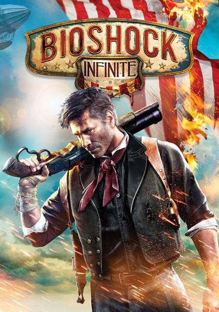
    As an illustrator, or in more accurate terms, "someone who spends a lot of time drawing and thinking about composition, narrative in art, and color schemes", box art is pretty important to me. I understand that the game itself is the real meat and potatoes, however, the box art is something that exists to fill many purposes. There's no narrative in many game boxes nowadays, no visual story being conveyed other than "here is a dude, there is action" or "here is a dude's close up face" or "here is a dude and he looks solemn". There's a real lack of actual artistry being done for games and movies like this, novels too. Everything decent is relegated to fancy repackaging (like those amazing Barns and Noble classics). They should exist to not only catch your attention, but to tell you what you need to know (who is this about, what are they doing, or what are they looking for), and then it makes you ask further questions, ideally enough to make you care and buy it.

    However, none of that shit means anything anymore, its all name recognition and advertising.

    Avatar image for tobbrobb
    TobbRobb

    6616

    Forum Posts

    49

    Wiki Points

    0

    Followers

    Reviews: 0

    User Lists: 13

    #50  Edited By TobbRobb

    @Brodehouse:@Brodehouse said:

    You're exactly right. I think people are going "look how different it looks, it must be great" when the image is actually kind of a mess in terms of composition. Most of these are. People are making the Brad Mistake, which is going "this must have artistic value beyond the normal because it looks different".

    Or you know. It looks good. To the eye. I like it.

    This edit will also create new pages on Giant Bomb for:

    Beware, you are proposing to add brand new pages to the wiki along with your edits. Make sure this is what you intended. This will likely increase the time it takes for your changes to go live.

    Comment and Save

    Until you earn 1000 points all your submissions need to be vetted by other Giant Bomb users. This process takes no more than a few hours and we'll send you an email once approved.