In the third game in Insomniac's Resistance franchise, you will play as Joseph Capelli, murderer of previous protagonist Nathan Hale, as he journeys across the Chimera-controlled United States.
@Napalm: Exactly. I'm not a huge fan of the series but this is some great cover art. Reminds me of the video game version of the Criterion Collection that started on NeoGAF: The GAF Collection
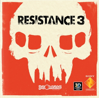
Exactly! It has the alien consuming the city, since it is under attack, and the man walking towards the city, representing the resistance that wants to rid the aliens. It just makes sense.
Yeah...you're right...all those covers of random dudes staring at you or looking at a battlefield are wayyyy better than actual you know...artwork.
That being said the logos hurt it.
No... you're right. A splotch or orange and white is totally "art"
Just think of all the money they'll save on ink!
Don't be dumb. The art works because it's a clever way to tie up the game without just putting the generic "fallen city with aliens looking at you" shit that has been churned out for so long. And the two-color works amazingly.
It may be clever, but it certainly doesn't help it from looking absolutely atrocious. And picking orange as the main color was the wrong way to go...
This edit will also create new pages on Giant Bomb for:
Beware, you are proposing to add brand new pages to the wiki along
with your edits. Make sure this is what you intended. This will likely
increase the time it takes for your changes to go live.
Comment and Save
Until you earn 1000 points all your submissions need to be vetted by other
Giant Bomb users. This process takes no more than a few hours and we'll
send you an email once approved.


Log in to comment