
I think this belongs in the "worst box art" section of the video game Hall of Shame.

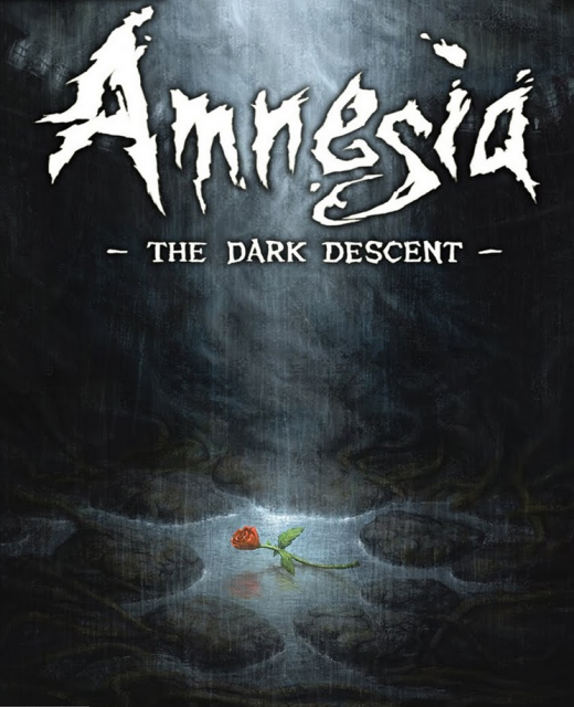
This is the original box art for reference:


Game » consists of 3 releases. Released Sep 08, 2010
I think this belongs in the "worst box art" section of the video game Hall of Shame.

If I saw an awful cover like that knowing nothing else about the game, I'd pass it up.

The creature doesn't look anything close to terrifying. It looks like somebody was trying to draw something messed up but halfways through decided to draw a clown and now it's just ugly.
Fan-made one is my favourite. Reminds me of House of Leaves.
The original isn't all that good, but yeah that is terrible.
The fan-made one is pretty good tho.

I think it's bad in a "so bad it's good" way.

It's bad, but you gotta think about the legitimately massive market for crappy, budget PC titles out there and how that box art will actually get those people's attention. Then they'll get a really awesome game, surprise! So, yeah, it's for real bad, of course, but for actual retail shelf reasons, I think they at least have the right idea. The other two covers are better, but would not sell as well.
Man I'd pass by a whole section of that box-art without picking it up.
For what's supposed to be one of the scariest games ever, it looks like shit.
"Oh hey, I got this lamp. I bet that horrible screaming behind me has nothing to do with horrific flesh monsters, I'll just continue looking really tired and bored"

Oh the horror

I don't think this is the kind of horror they were aiming for in this game...


It's because there's some stupid thing with publishers/marketers that they feel the need to always have characters on the front of any boxart, because they feel that is what sells and gets people's attention in stores. Japanese and Pal versions even moreso tend to try and capture the feel and atmosphere of the game which doesn't mean the characters face has to take up 50% of the cover. In nearly all cases Pal versions are way better than NA versions and a PAL boxart like RE4, ICO and Heavy Rain make me way more interested in the game. Same deal with this boxart. PAL original is intriguing, NA looks like a joke.
Oh wow, that is pretty hideous. I wouldn't give that game second glance at the store.

XD Oh shit, I haven't laughed this much in ages.
This is bad in almost every way a cover can be bad. And it completely misses the point of how the game is scary; it was a game with a creepy and isolated atmosphere, not a game where monsters are jumpin' in yo face. You're not even really supposed to look at the monsters in the game.
Also, I really like the original cover, it definitely captures the game's mysterious atmosphere.

"It's because there's some stupid thing with publishers/marketers that they feel the need to always have characters on the front of any boxart, because they feel that is what sells and gets people's attention in stores. Japanese and Pal versions even moreso tend to try and capture the feel and atmosphere of the game which doesn't mean the characters face has to take up 50% of the cover. In nearly all cases Pal versions are way better than NA versions and a PAL boxart like RE4, ICO and Heavy Rain make me way more interested in the game. Same deal with this boxart. PAL original is intriguing, NA looks like a joke. "

" Looks like that duck mutant thing from South Park. The one that always goes "wooooooooooeeeep!" "


Looks like a game about ducks with Down's Syndrome

Dude, that's terrible!
I'm so glad to own the European version ^^
That's not even what the monster looks like!
If it were my decision, I would have just made the cover black. Solid black with the title. Maybe a small flame. This is almost like a parody of bad covers, though I doubt it's meant that way. And even if it were, it would inappropriate for this game.
Now whenever I play, I'm going to think I'm being chased by that thing. At least its funny to look at.
That's awful. And holy fuck Heavy Rain's Japanese box art is awesome. Goddamn.

That cover art is making me die of laughter.
Please Log In to post.
This edit will also create new pages on Giant Bomb for:
Beware, you are proposing to add brand new pages to the wiki along with your edits. Make sure this is what you intended. This will likely increase the time it takes for your changes to go live.Until you earn 1000 points all your submissions need to be vetted by other Giant Bomb users. This process takes no more than a few hours and we'll send you an email once approved.


Log in to comment