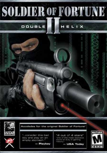
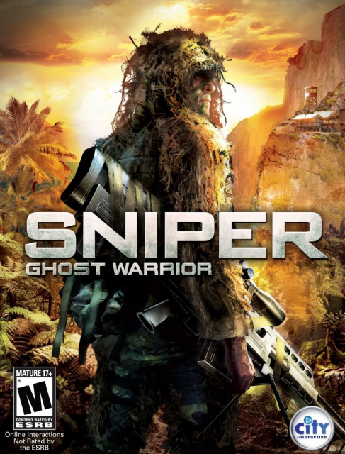
Box Art Clichés: Guys-with-guns Edition
Because there are only so many ways you can pose with a gun:
| Stock Pose | Number of Occurrences |
|---|---|
 | 19 |
 | 20 |
 | 18 |
 | 25 |
 | 10 |
 | 6 |
 | 8 |
 | 15 |
Because there are only so many ways you can pose with a gun:
| Stock Pose | Number of Occurrences |
|---|---|
| 19 |
| 20 |
| 18 |
| 25 |
| 10 |
| 6 |
| 8 |
| 15 |
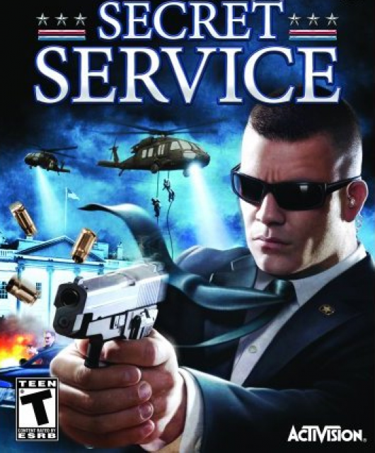
Sgt. Griggs is about to shoot you!
Sgt. Griggs' grandpa is about to shoot you ?
<br><br>I guess if I had a billion dollar franchise on my hands, I would be very apprehensive about any drastic changes as well.
Rangers lead the way...and don't look at explosions!
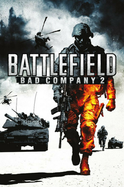
BC2 tried to get a little creative with the above formula by adding some fake multiplayer tags & the B/W color scheme. It's good but not as eye-catching as the first Bad Company cover (which was oddly reminiscent of the GB logo); and being four months late out of the gate meant most perceived it as copying a more successful franchise...
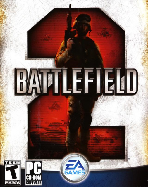
...when it was really Battlefield 2 that started this whole thing back in 2005. On second thought, maybe they really do deserve all the scorn for starting this conspicuous trend in the first place ? Please guys, it's time to oscar mike.
D'oh!
Hello Bad Company 2, look at your man. Now back to me. Now back at your man. Now back to me. Sadly, he is...uh...hmmm.
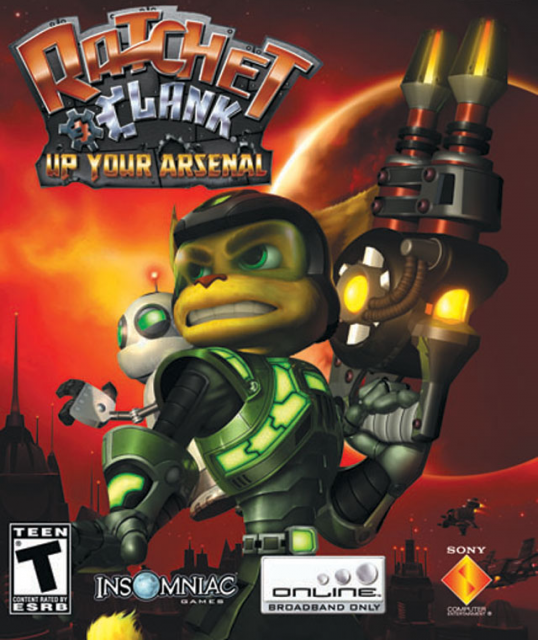
Not to make a huge clank but Insomniac have been ratcheting up the puns with each subsequent entry in the series.
Now I know the movie took place in the middle of a desert but even the Makgadikgadi has more scenery & color than this. It's like someone screwed up the background layer in Photoshop and they decided it was just easier to use the paint bucket tool.
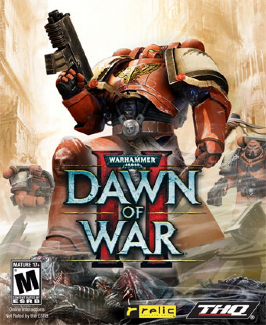
I approve of curb stomping in all forms. But it would have helped this game's sales if it was actually visible. That logo placement makes me think Relic were embarrassed about how edgy that Space Marine looks. I'm also eagerly awaiting the day Relic decides to use that adorable <a href="http://goo.gl/sKD1M">Pink Space Marine</a> pic.
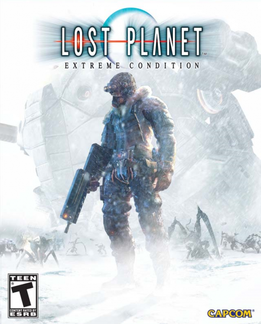
There have been a lot of subtle variants on the same theme in the past as well. Lost Planet had a snow-filled scenery to spruce up the look. The soldier here seems to be in deep contemplation, I'm not sure if it's about his lost memories, lack of bug spray or choice of thermal underwear.
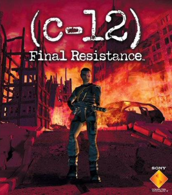
Makes sense that a game named after the most abundant Carbon isotope uses the most abundant cover shot.
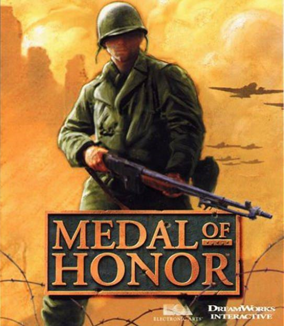
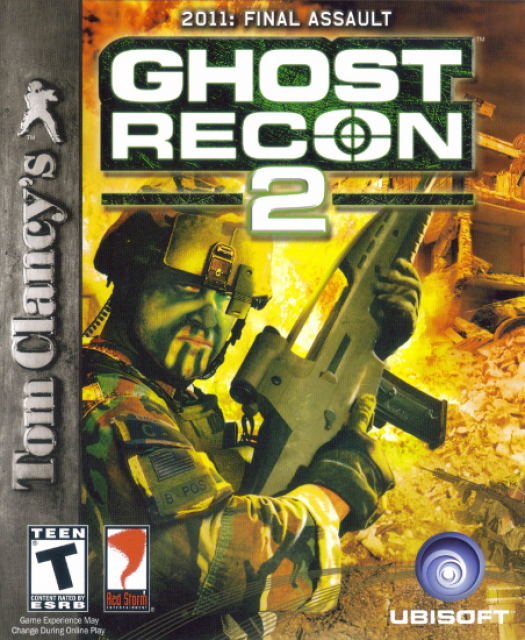
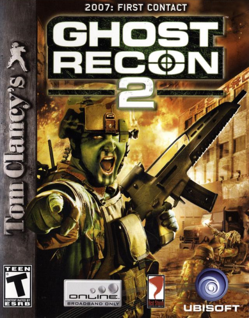
Ah, the WW2 paratroopers. You guys are heroes. It's too bad we can't find any creative ways to portray you in our box arts. I mean, have a look at the next three entries.
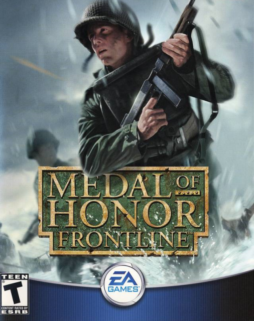
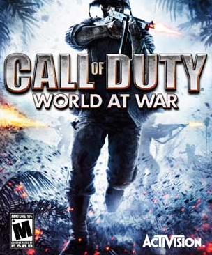
It's depressing to see how little they changed over time.
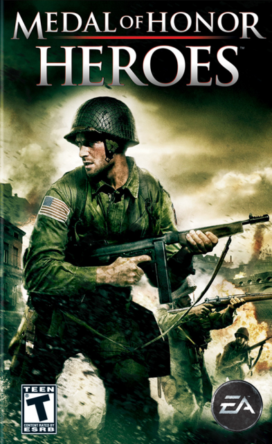
No wonder some people thought they were putting out the same game over and over again.
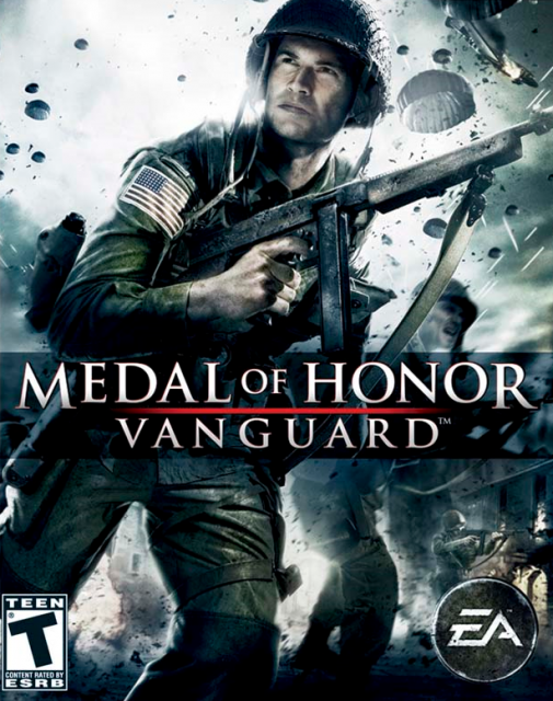
Well, I guess there is something to be said for being consistent though, like the food at McDonalds.
I find it a little amusing when box arts portray characters who vacantly stare at something far off. It's like you pissed them off with a bad joke. Like the one above.
In future Russia, bad memes cringe at YOU!
Things you'll find in this box-art and not in-game: Leaning.
Things you won't find in this box-art but plentiful in-game: Chest-high walls. What happened Epic ? You run a bulldozer on your terrain before taking this shot ? Gears 4 should be a brick-breaking game.
The artist was apparently told to let his imagination fly.
False advertising people. This game DOES NOT come with a sepia filter.
The placement of that blue logo is somewhat compromising. The phrase U-BI-SOFT doesn't help their case either.
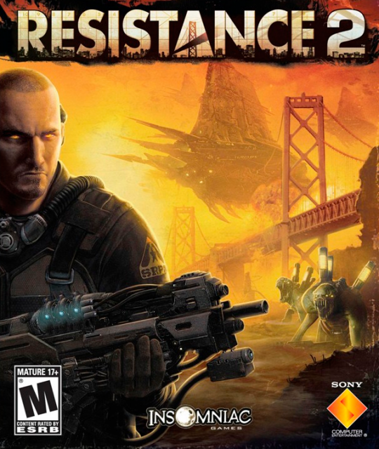
<i>Damn it Nathan, stop trying to get in the shot! We are trying to shoot the Golden Gate Bridge and you keep butting in!</i>
A solid Xbox exclusive with an unremarkable box-art, until...
AAAAAAAAAAAAAAHHHHH!!!
<br><br>I've heard of adverse fanboy reactions before but this is transcendental.
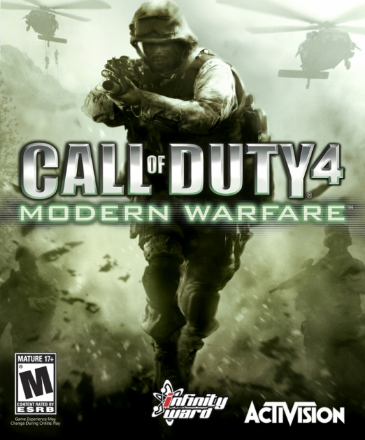
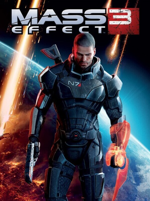
Not that I don't appreciate the green initiative, but the tint on Shepherd's mask was a tad much. Makes me think he is getting gassed INSIDE a gas mask, which is just wrong.
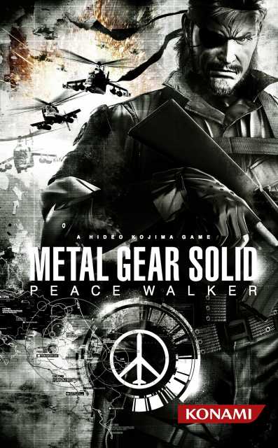
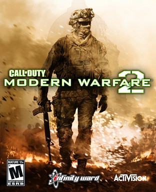
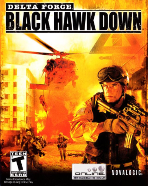
Those Black Hawks look more like a couple of bothersome bees than actually providing a depth of field. Big Boss is rightfully pissed.
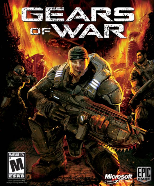
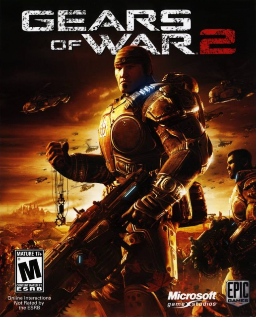
This will sound really weird but at first look, I actually thought Marcus had huge burning wings - like a hipster angel w/ a do-rag. I would still play as Marcus Angelus. I just wanna comfort Dom, okay ?!
This is the only franchise on the market that should use always a soldier on the box, yet this is the first time that they actually do. Good on them!
Is this guy in the middle of a Dirty Thirties documentary ? Where is all that dust coming from ?! Why isn't he wearing a mask ?!! Why am I talking like this ?!!!
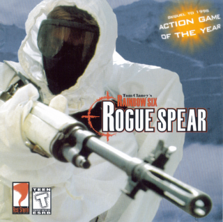
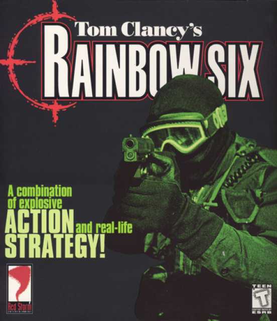
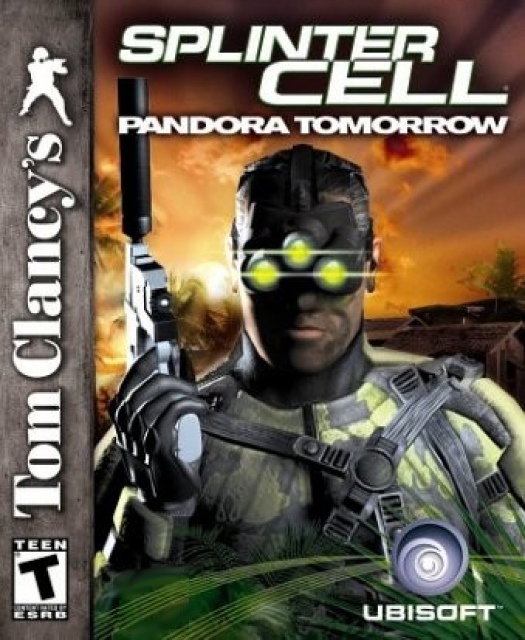
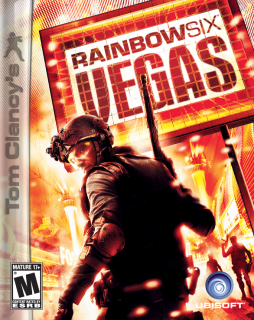
I have been a fan of the Rainbow Six series for over a decade now but when it comes to box art cliches, they have got the worst track record.
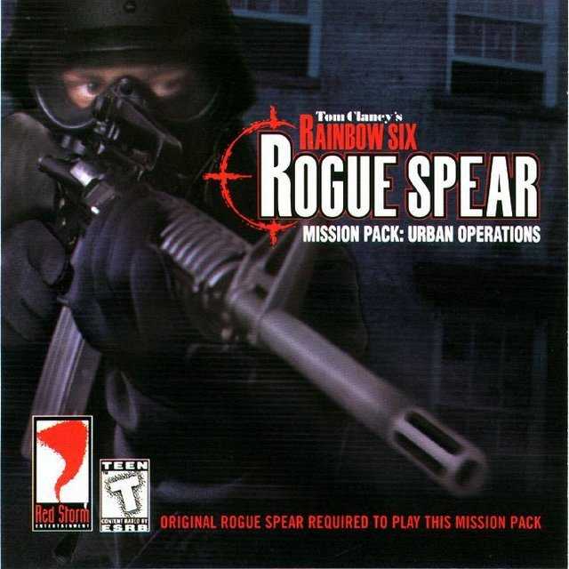
Now it's only fair that the mission pack follows the set pattern. But do they really have to take that weird angle where it looks like the dude is about to blow off my nadgers?
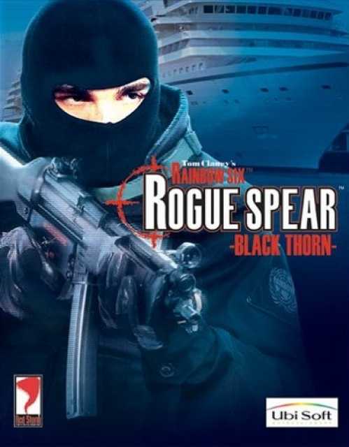
With Black Thorn, someone got really desperate and decided to cover half the box with the most generic ocean liner pic they could find. And then hurriedly added a strong blue hue to hide his/her laziness.
*Look, I'm one of the cover artists for the Rainbox Six series and I'm being held hostage by a gang of masked men. Seriously, send help!*
Emoticon equivalent: (>.<)
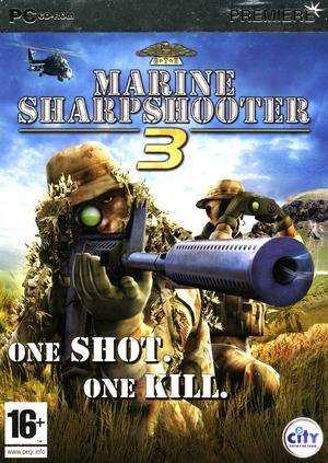
The ultra-generic name "Marine Sharpshooter 3" makes this feel like some kind of bland, off-brand toothpaste you would find at your local store.
<br><br> Marine Sharpshooter 3: with anti-terrorism agents. Helps prevent cavities, plaque and insurgencies.
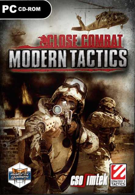
I said I would give bonus points for Black Hawks and Modern Tactics certainly earns it's 2000. But like Whose Line, they matter just as much as artistic expression to this box-art designer.
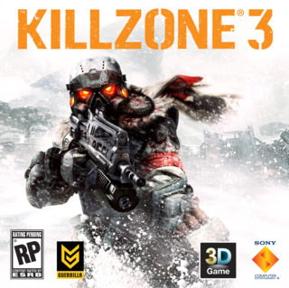
Even though KZ3 tries its absolute best to hide behind snow, dirt, smoke or a combination of all three, the gritty art design still shines through. Despite the cliched pose, I kinda like this one - it's the subtle blood splashes on the Helghan [I know, so edgy:( ]
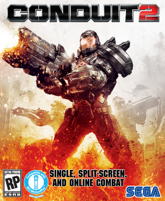
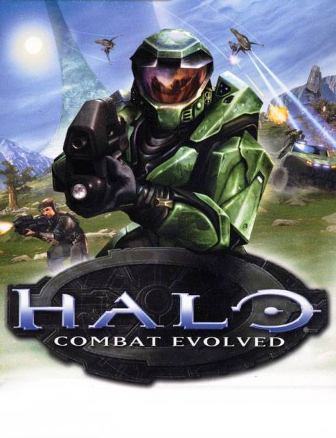
Sega Rep to cover artist: "No, we need more shinny metal plates. And that visor needs more reflections. No, I don't care if he looks like Master Chief now."
The Gun Pointed at the Head of the...player. Sorry, that might be the worst reference ever...of all time. Ellipses.
Oh hello mysterious masked man pointing an M16 at me on the cover of a modern military shooter with persistent online ranking. Have we met before?
I wanna know if there was ever an incident where the guy accidentally shot the camera while taking this pose. Murphy's law dictates there must be at least one exuberant chap who prematurely popped one in all the excitement.
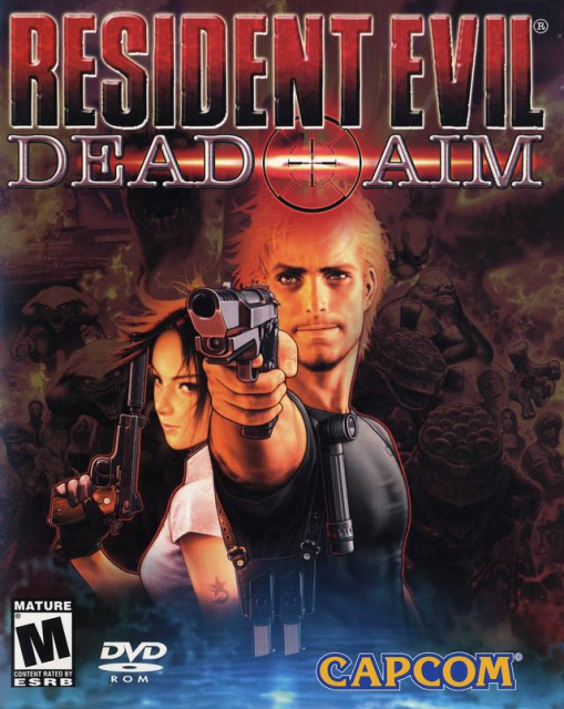
Oh RE: Dead Aim,
<br> Why do you take aim ?
<br> Don't be so lame...
<br> I just want a game.
<br> Say, who is that dame ?
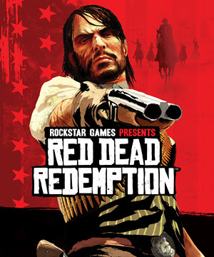
The box art is a red herring (no pun intended; seriously). Since the titular character from first game is curiously missing here, R★ decided to compensate by replacing all primary colors with red. Personally, I'm bigger fan of GB community's wheaty interpretation of this western: <a href="http://www.giantbomb.com/forums/off-topic/31/hilariously-misspelt-game-names-the-game/444389/" target="_blank">Bread Bread Breademption.</a>
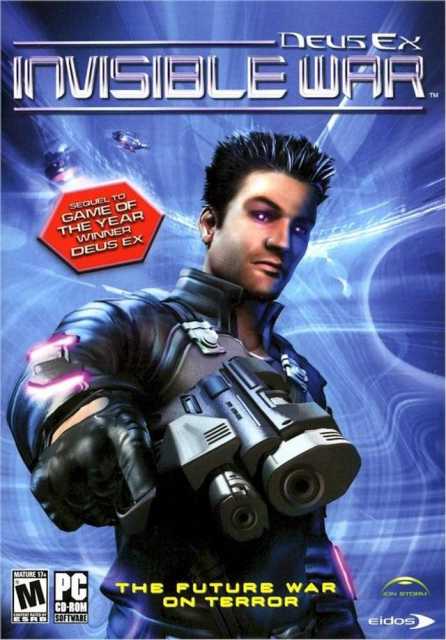
The box says "The future war on terror". I sure hope we get over the gangsta style by then or we are in big doodoo.
<a href="http://goo.gl/jHaLA">Hey, quit pointing your Johnson at me!</a> Huh? Huh? Am I right or am I right? High five! Let's go. C'mon. Don't leave me hanging dude!
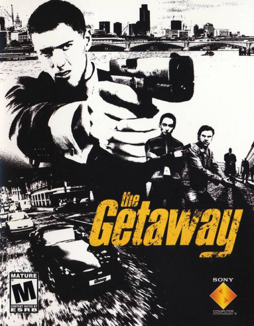
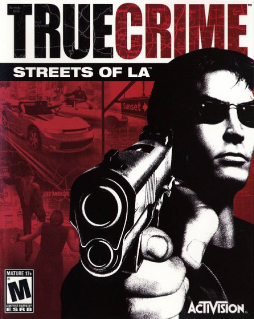
Even though the game is set in London, I get a distinct Boston crime thriller vibe from the box-art. Probably something to do with my obsession with Boston crime thrillers.
*Psst...Leo, they are BEHIND you!*
Sorry, I'm afraid to say anything here on account of Sam Fisher's inexplicable ability to find and kill anyone who displeases him. See that guy on the box ? He used to be Sam's lunch buddy, until one afternoon he made a bad pun involving fish & chips.
Either Red Storm hadn't yet discovered the magic of Photoshop layers or their artist got fired after turning green in real life. I can't think of any other reason for this.
Our old friend, Black Hawk, makes a double guest appearance. Sheesh...talk about getting "creative".
Neo?!
Snoop?!
It could be argued this colorful boxart is the "coolest Bond poster not to feature James Bond himself".

Would it get a better critical reception if the head here was upside down ? Perhaps temper expectations for the game's <a href="http://www.youtube.com/watch?v=ToKIkw3LIoQ">bizarre opening</a>.
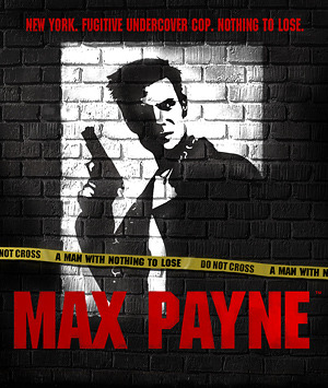
Max sports a new look on every occasion. But to me, he will always be Sam Lake and in no small part thanks to this cover art. Remedy made this stock pose their own with subliminal shadow work, subtly reflecting Max's struggle with his personal demons.
The only striking thing about this box is the little Ubisoft logo in place of the usual Eidos. Maybe 34C doesn't meet their publishing requirements ?
Silhouettes! Bond Girls! BMW! DNA! Comanches! I didn't know they could pack so many cliches into one 5x7 box.
C'mon Sam, it's 10 O'clock in the morning! Time to put down those goggles and take a shower.
An anagram for "Rung-on-Cliches Man!"
Can I avoid getting punched for saying this guy's helmet is <a href="http://www.youtube.com/watch?v=CSJXle3LP_Q"> coming undone </a> ?
Your box-arts. Give them to me, now.
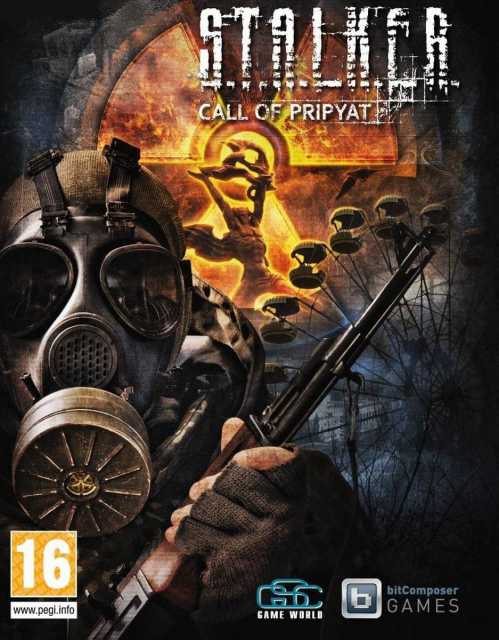
It's the best of the STALKER games, so GSC went the extra distance with this one: Orange & Teal. BAM!
You'd figure that a list about guns on box-art would feature more smoking guns but surprisingly, this is the only one I've seen so far. Extraneous tid-bit: I named my Shepard after Joanna.
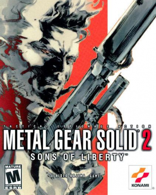
Has there ever been a more flagrant case of false advertising? The Solid Snake spread on the original box-art was all part of Kojima's grand scheme to make an absolute fool out of us.
Just look at that lady in the top left corner and tell me if that's not a perfect photobomb.
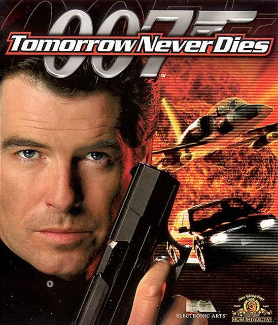
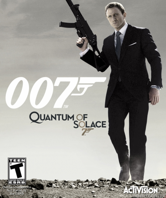
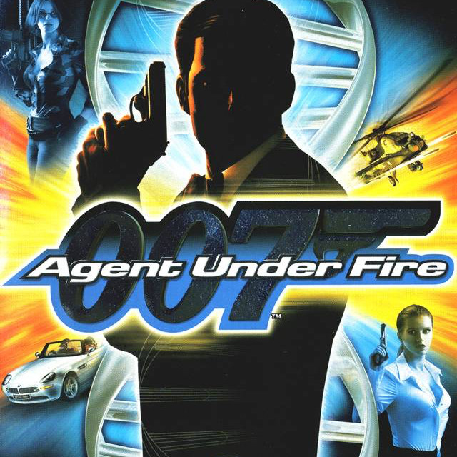
I'm starting to figure out these James Bond covers:
<br>1. Start with a huge explosion as your background.
<br>2. Cover half of it with Bond in an alluring pose.
<br>3. Slap jets, helicopters, cars, Bond girls et al on the rest.
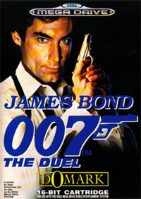
Perhaps it's not easy to see in the thumbnail, but that is totally Timothy Dalton's giant head copy/pasted on top of somebody else. Well, it's 1993 so I can't really blame them. Afterall, MS Paint didn't get its 'Resize' function until Windows 95.
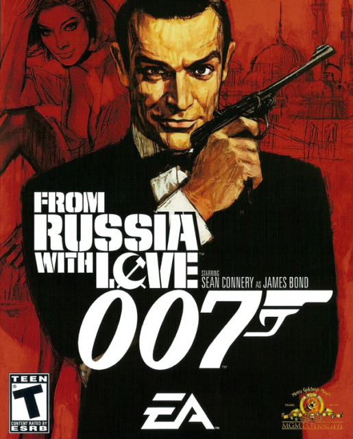
Sean Connery's boxart attributes:
<br>Panache: 9
<br>Charm: 10
<br>Eyebrows: -_~
I ought to start another list about all these orange and teal hues. These can't be the only two colors on the spectrum that create an interesting contrast. How about black/white? or yellow/violet or or or...ahhh crap! Nevermind, nevermind.
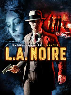
Team Bondi's name is a glaring omission from the box but it's no big deal. They will be going by the name of Rockstar Sydney pretty soon anyway.
I'm a box-art and this is my favorite Citadel on the Commander Shepard.
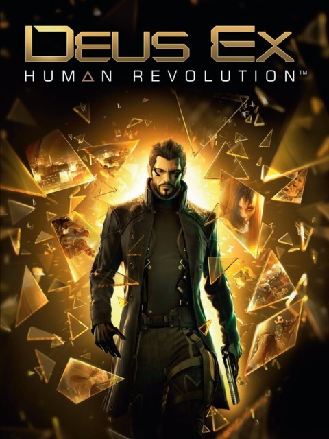
Adam Jensen's internal monologue: 'Don't look at explosions. Don't look at explosions. Ouch! that's a lot of broken glass. Don't look at explosions.'
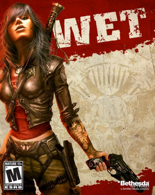
For whatever reason, this pose is really popular with female protagonist. First, it's Rubi posing the only way she knows how: like a WWE Wrestler from the Attitude Era.
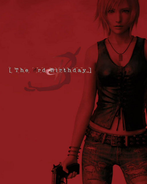
Next, it's Aya Brea - possibly covered in a pool of blood. Here's what the GB wiki says on Aya: "Because of her special powers, she has the looks of a woman in her 20's when, in fact, she is 35 years old." C'mon Japan, you're fooling no one with your bizarre justifications for pubescent female leads.
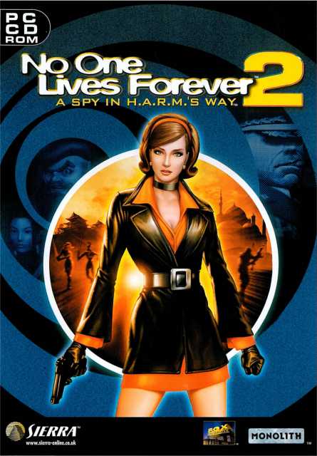
As always, Cate wears it best. Surely I'm biased, but is there a better realized female protagonist in games?
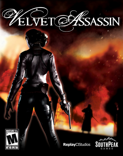
Last and possibly the least, Violet Summer: who is so busy being stealthy that she won't even show us her face. It's okay Violet, I prefer your behind anyway!
Say what you will about this game, but that beard is god damn amazing.
I think we can safely add 'cameras' to the list of things cool guys don't look at. The more you ignore it, the cooler you look!
Sepia: Ghost Artist
<br><br>There is a slight possibility that I might be getting lazier than these artists. But I assure you, it's only slight.
Take a wild guess as you what all the Rainbow Six box-arts have in common? Go on, I'll wait.
<br><br><br><br><br><br><br><br> Did you guess 'dude with gun'? If so, DUDE YOU'RE TOTALLY RIGHT! Please take this opportunity to reward yourself with a delicious cookie.
The game's protagonist is called James Grayson. Perhaps the artist interpreted that one a bit too literally.
Nothing like a little rain to set the mood. It's a very understated but significant detail that ends up turning this cliched pose into a moody piece. Or maybe it's even more cliched now? I'm too exhausted to decide either way. It's just so dry here. I could use a little rain.
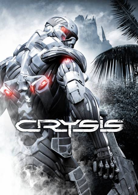
So did no one at CryTek realize what that smoke in the lower left corner looks like?
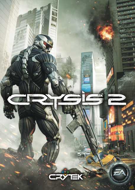
MAXIMUM RECYCLING.
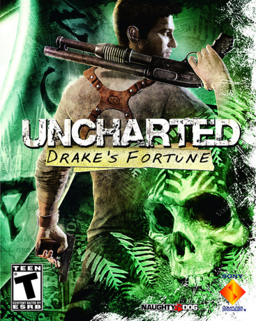
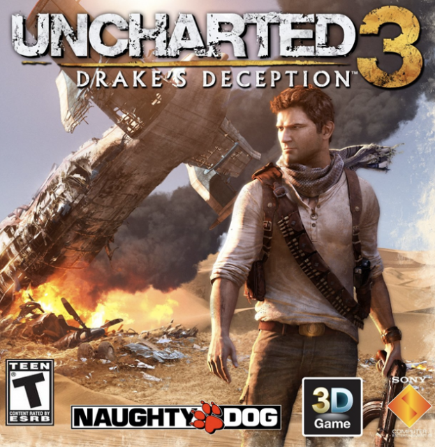
Drake: expert at covering his ass. Literally.
<br><br> I'm sorry - I've got over a hundred games to cover here.
You know, what's amazing? Chow Yun Fat's serene facial expression as he leaps through the air at supersonic speed. How does he do it? Chinese Fried Rice:
<iframe width="425" height="349" src="http://www.youtube.com/embed/G0fEJt54vxI?rel=0" frameborder="0" allowfullscreen></iframe>
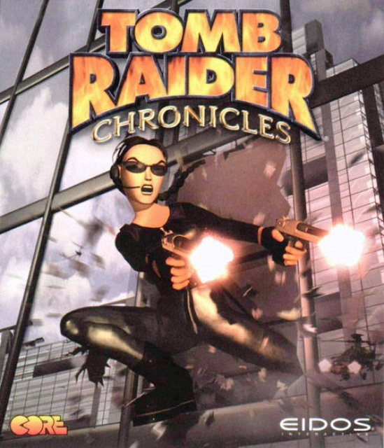
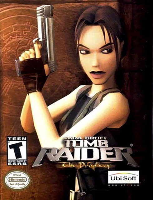
Latex Lara, busting through windows. Get it? Busting. Sigh.
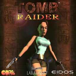
Next up: comically proportioned Lara, to remind you of the 90s when Pamela Anderson had the most desired body shape on the planet.
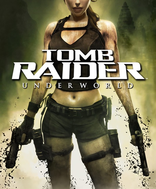
And finally, dirty Lara - subliminally reminding you to take a cold shower once you're done with the game.
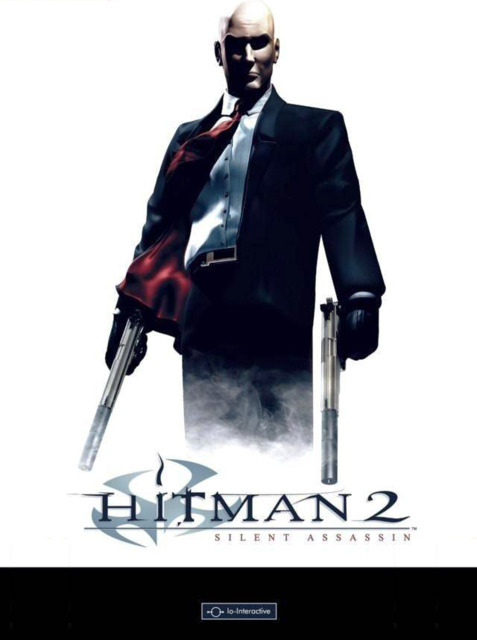
It should be glaringly obvious by now that I'm no art critic. But if you happen to be one, please let me know why this piece looks great while other minimalist box-arts end up looking bland? Is it the red tie? Or the chrome finish on 47's skull?
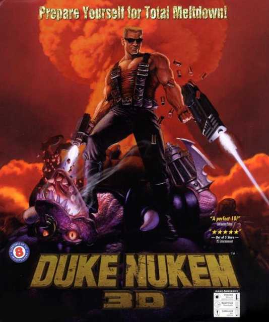
Damn it Duke, stop stealing <a href="http://goo.gl/BvfAY">Doomguy's pose</a>. And Roddy Piper's lines. And Arnie's wardrobe. Just...just stop stealing dude.
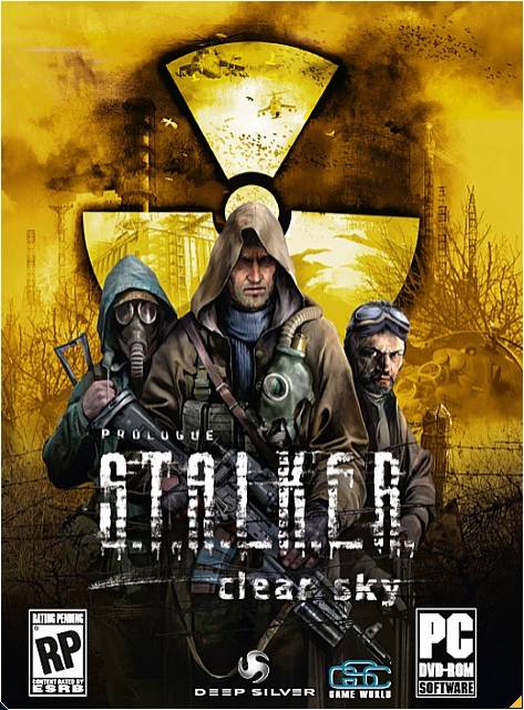
Three Stalkers walk into a bar. The bartender turns to them, takes a close look and says "What is this - some kind of joke? Get out of here, stalkers!"
In their defense, it IS the 3rd game in the series.
Aww c'mon, you aren't really reading all this....are you?
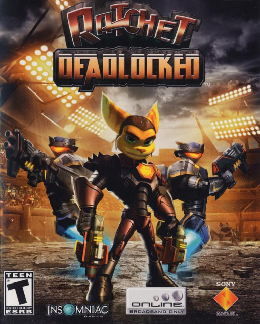
It's hard to criticize the art in the Ratchet & Clank series when they have been so wonderfully absurdist in their weapon & character design. I just love the Groovitron.
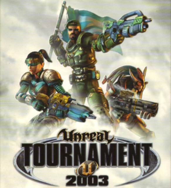
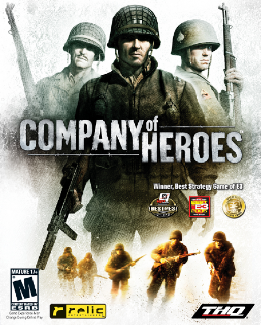
- Developed by Epic, 2002
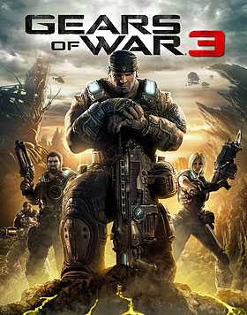
- Developed by Epic, 2011
<br><br> Not sure if this is some kind of metaphor for how the industry has progressed over the years. The addition of a grey/brown backdrop, strong desaturation, the orange/teal color scheme, the solemn looks on the characters, the absence of "cool shades" or crazy aliens with dreadlocks - its all a little too indicative of how Epic has evolved. Good to see they still like putting 3 dudes with guns on their box-arts though.
What do you do when you realize your cover-art as too much teal?
<br><br> Why, introduce some orange of course - preferably in the form of some surreptitious explosion in the background. They've done studies, you know. 60% of the time, it works everytime!